Brand Architecture, A City View
A blueprint to organizing brands
We see brands as members of our community, taking on human attributes, hopefully the better ones. We put them in houses, the branded house or house of brands concept (covered in more detail in our book, The Physics of Brand) used to understand a larger corporate brand strategy. It isn’t hard to then start to wonder about the relationship between brands inside of one organization and use architecture as your metaphor for the structure of relationships.
All good, yes, but there are other organic or human methods to organize information, architecture may not be the ideal metaphor. Some have used the structure of a family - parent brand, child, grandchild, and so on. I’ve found this approach quickly becomes awkward in conversations with business owners that are actually grandparents. So, maybe we use the structure and organizing principles of a community or village.
Before we go too far down this person hole to the underbelly of organized information, Edward Tufte (author of these books) needs a mention. Ed is a dude, an intellectual with a hankering for visualizing information. Tufte is to information as Frank Lloyd Wright is to architecture. And, because brands are containers of meaning and trust, they can be organized like any other information. Go deep on Tufte, it will change how you see the world around you.
Now back to our regularly scheduled programming, the relationships between brands. In a community model, the most experienced brand is the largest, most prominent building in the community. The other brands (buildings) are created for the purpose of appealing to specific audiences with specific services or products. The brands are all connected, by proximity or even by labeling.
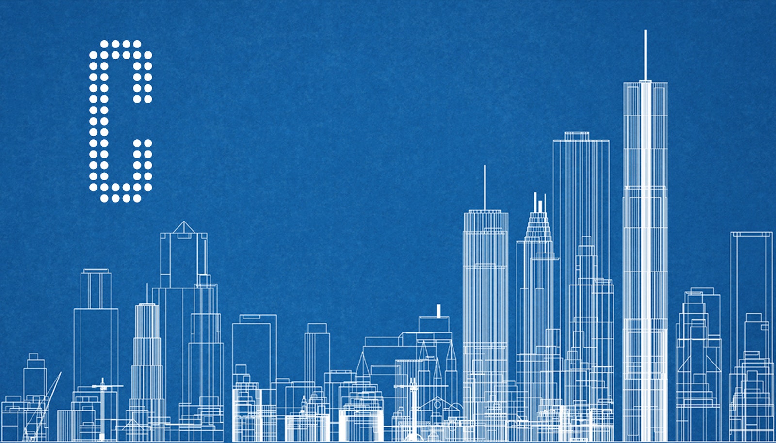
Let’s lay this over an existing blueprinted brand to see how it works. Apple is an easy one. There are iPhone, iPod, iPad, iMac, and iTunes buildings all precisely organized around the large Apple core. On the outskirts you’ll find the shell of a Newton building, burned to the ground two decades ago. You might even stumble upon an abandoned building called PowerBook, only used for illegal activities.
Look down on a small town from an airplane and you see how there are clusters, areas of development, and perhaps some patterns of how the city works as a unit. Each object built represents parts of a business; the streets as the communications, traffic lights and police as the process and buildings as the brand assets.
The primary brand, call it, city center, exists to support the larger community. The surrounding brands are built to serve specific purposes, but may serve the same audiences. This brings up the question of when to build a new brand. Only when you have a new purpose, not just a new audience. This creates high zoning hurdles to justify a new building in your community. There’s only so much room. Of course, you can build a bridge, which could be called an acquisition, where a brand is connected via other means.
Acquired brands create opportunities and challenges. The opportunities are what brought the deal together, (efficiencies, synergies, etc.). The challenge is renovating an existing building (brand) built for a specific purpose for a new or altered purpose. Now, upon acquisition, you’d like to change the purpose or somehow make it fit into the larger community of brands. The people who came with it are different, their processes are not your own, and they may have been successful but now you’ve acquired them. Seeing the intangible asset as a tangible object gives it more meaning and perhaps adjusts how you think about it post acquisition.
Back to the architecture of brands and how you might start looking differently at your portfolio of brand assets. Consider the audiences (tourists) in all of this, those who have to navigate the city of brands you’ve built. As they come to town, how do they know how these all relate? Consistent visual cues and written language helps the wandering out-of-towner get to the right destination.
One of our first projects in this area was for Red Wing Shoes, nearly twenty years ago. The brand is Worx, a lonely brand suburb barely connected to the larger, more valued community of Red Wing Shoes. The changes to the visual language (logo) and written language (“by Red Wing Shoes”) signaled a change in relationship that was already there, just not very clear. This boost in attention and clarity also delivered an increase in sales. It was more clear where this brand belonged and that the larger brand community supported it.
Working through brand architecture can be challenging, but when it’s done, your customers, consumers and other audiences will thank you. It will be easier on them by reducing the friction it takes to do business with you. It will be easier on your teams as you’ve provided the clarity needed to know the relationship each brand has to each other and the community.
Enjoy and if you’re ever in my hometown, be sure to meander down Keller Avenue.


