Smartwool
The Challenge
Smartwool is a coveted brand for people who have experienced the touch of premium Merino wool. Capsule was asked to redesign packaging to achieve some high marks in structural integrity, new materials, reduced cost, simplified messaging and innovative technology. The list of objectives was a high bar, but inside the reach of the Capsule team.
Smartwool knew their retail appearance needed to be more consistent and they needed to rein in all the different shapes and colors their packaging system had become. The product and package still needed to be readily accessible, easy to replace and durable. Smartwool also developed a desire to explore new technology in order to help them tell their story.
Armed with research findings, Capsule was charged with concepting a new package structure and improving the navigation and product visibility at shelf while creating a visually compelling design. This new design would be consistently applied to an expanding product line and possible new categories.
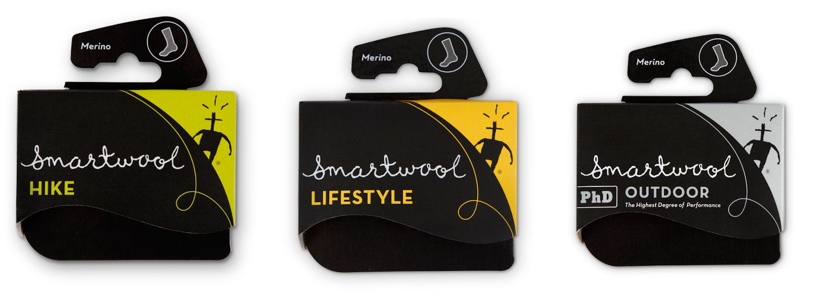
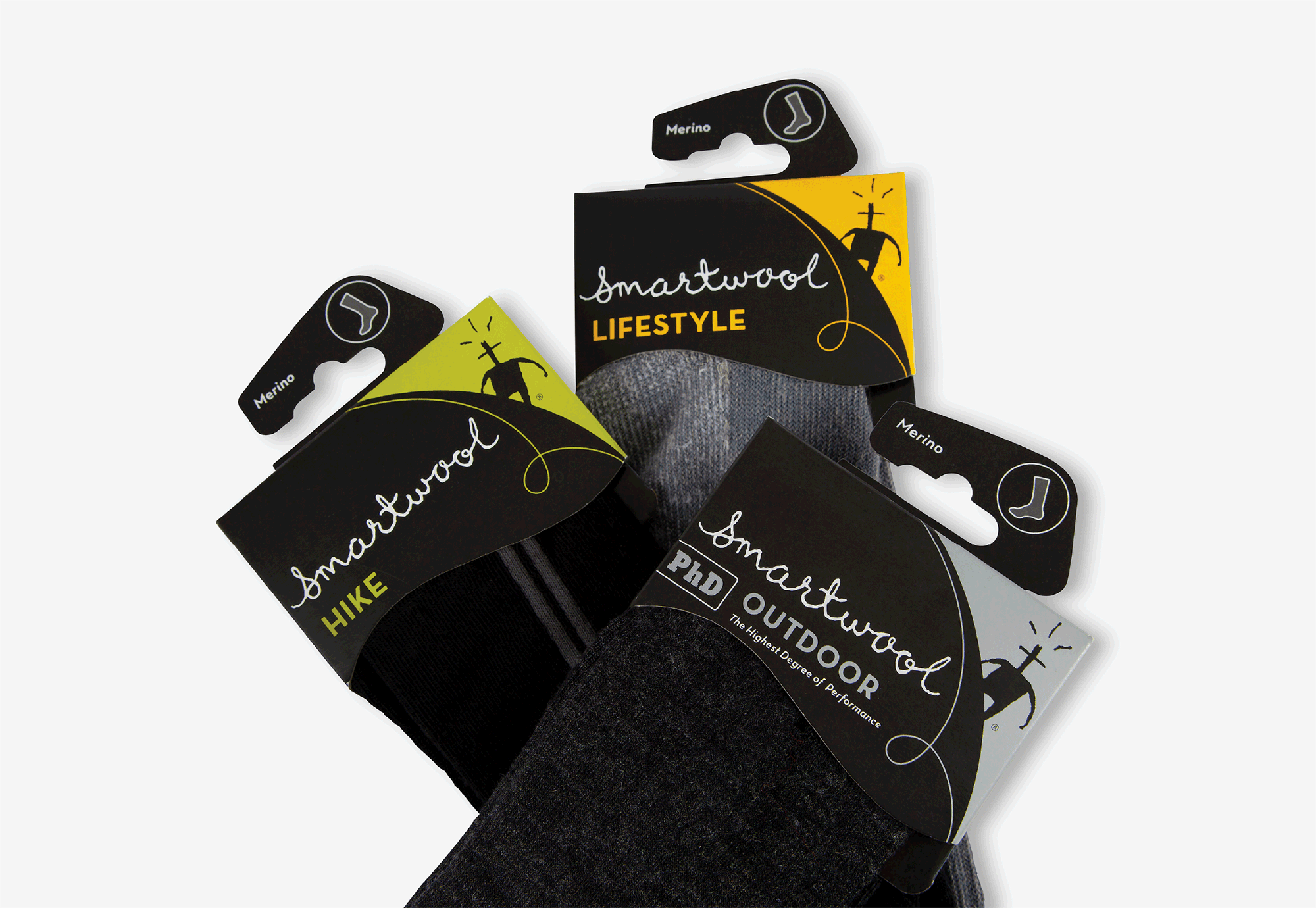
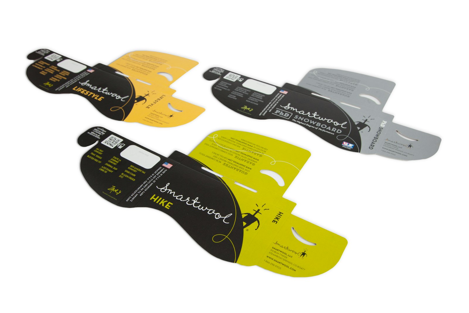
In the fall of 2012, shoppers saw a new Smartwool brand presence at the shelf. We created a consistent and recognizable brand look with large color cues to help identify categories of activity. Gender, cushion and size moved to a sticker, allowing much greater printing efficiency. Features and benefits were specific to the activity and used brief, easy-to-understand bullets.

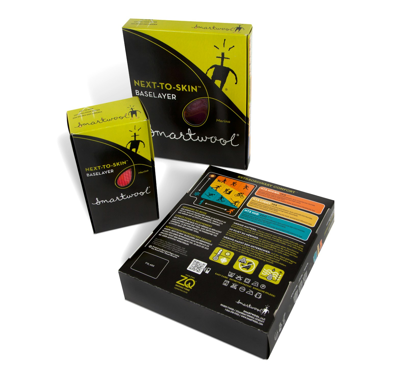
For the package structure, we removed all plastic by introducing a paperboard laminate that uses a corn-based polymer for greater strength and durability. For some technology intrigue, we added an activity-based QR code to allow shoppers access to every ounce of product and brand information directly from a smartphone.
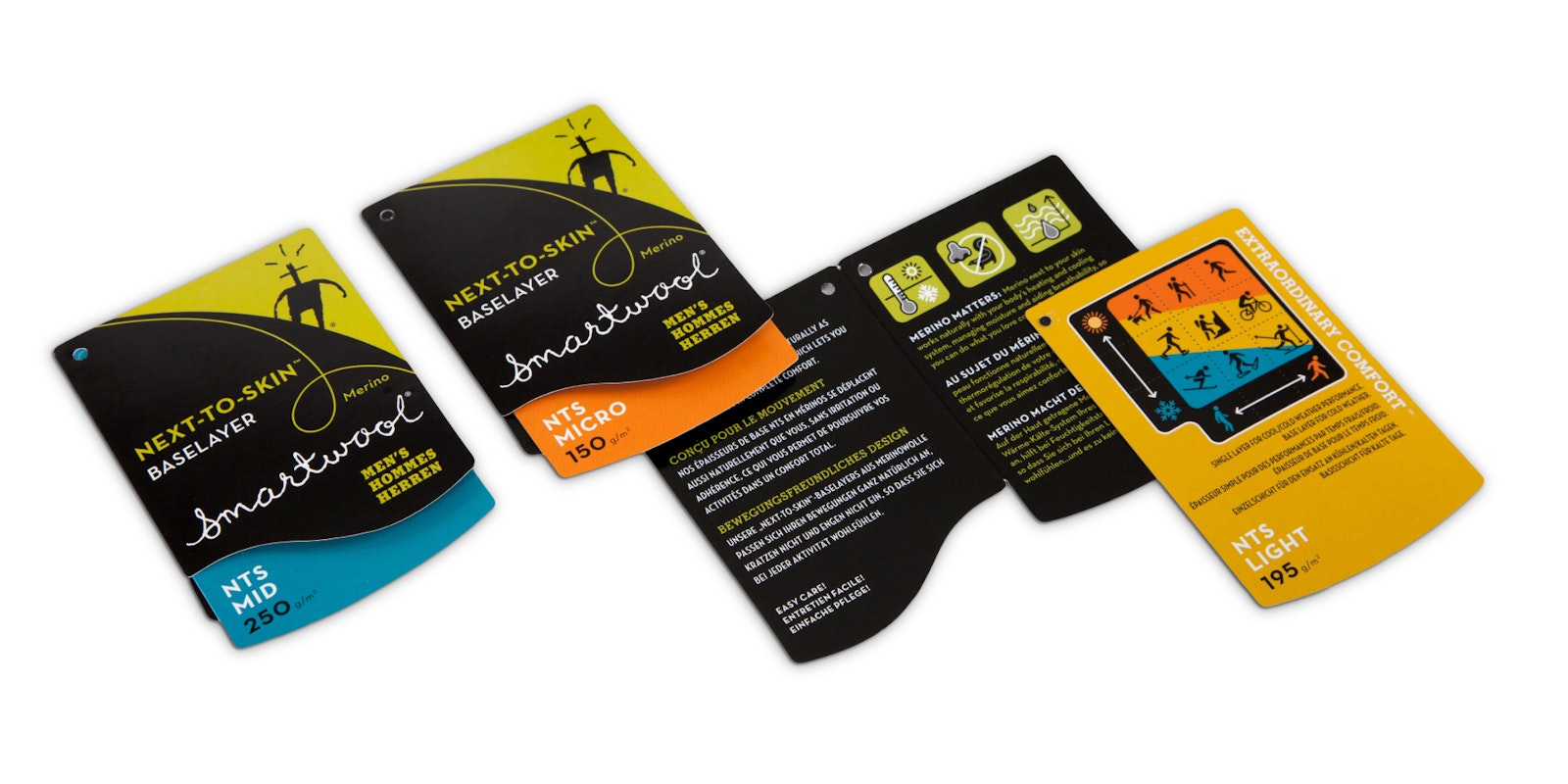
For the back of the package, Capsule took an infographic approach to the design. We clearly gave structure and intuitive organization to a large amount of product information.
All of this was accomplished on a small footprint, aesthetically pleasing package able to withstand the rigors of retail and without any increased packaging cost.
Client Testimonial
"Not only did Capsule do an amazing job of repackaging for Smartwool, they did it thoughtfully and without letting their ego get in the way. They listen, they respond, they do it on time and on budget. Did I mention that they are great people?"
Carol Davidson Vice President Global Brand Marketing, Smartwool