Select X Bites
The Challenge
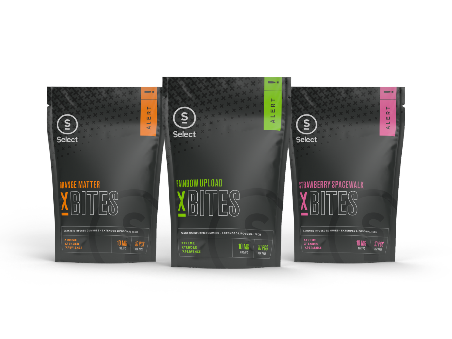
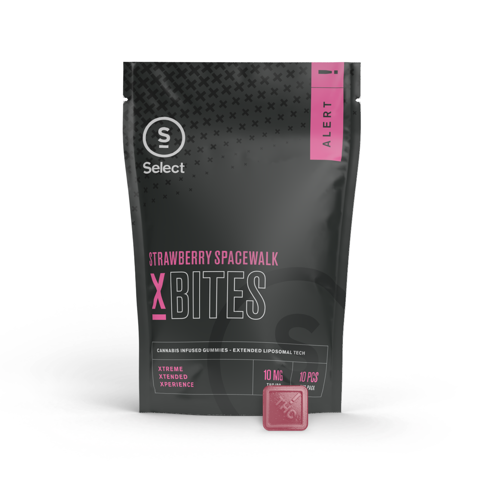
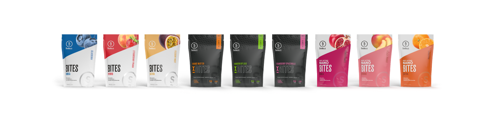
Our friends and continual collaborators at Curaleaf were preparing to take one giant leap in their Select product line with a new edible gummy that would provide seasoned cannabis explorers an elevated lift off. As they prepared for launch, Curaleaf tapped Capsule to help provide the new product line with a gravitational assist through the development of distinct product flavor names and a packaging design that would notably distinguish their newly dubbed X Bites in a crowded market space.

Not to get too technical, but...
Leveraging new and proprietary encapsulation technology, Curaleaf's Select brand had crafted a gummy edible designed to give consumers an extended trip. Seeking a naming convention that would highlight the deep scientific knowledge and skill poured into the creation of the X Bites line, Curalef asked Capsule to develop a set of flavor names that balanced feelings of technical expertise with approachable adventuring.
Taking this all into account, Capsule helped create a space themed naming convention that encouraged interstellar trips, while still remaining grounded in intensely engineered science.

One small step in design exploration, one giant leap for brand kind
With flavor names in hand, we delved into a relative black hole of materials, colors and edgy design elements to find the perfect combination that would bring the moody, deep space vibe of X Bites to life.
Capsule was careful not to design in a vacuum. While the look of X Bites packaging purposefully contrasts with work we'd previously produced for other Select product lines, we were intentional in carrying forward familiar structure and design elements that would cohesively fit within Select's larger packaging system, all while still pushing X Bites to the outer limits with a distinct visual look and feel.

Client Testimonial
“Our partnership with Capsule is both productive and fun. For X Bites, we asked them to push us to the limits of where we were comfortable, which led us to outside-the-box thinking while still being grounded in clear strategy and discipline.”
Brand Team Member Select
“In the cannabis industry, you will often hear how fast paced it moves and the Capsule team has always been right there with us tackling our aggressive deadlines. They are AMAZING partners and are such a joy to work with! Capsule creates beautiful, thoughtful artwork offering a wide range of ideations to help us hone in on our ideal brand vision for an impactful launch.”
Marketing Team Member Select
The Impact
Not only did the launch of X Bites meet a starry-eyed response from Select’s customers, it gained even more notoriety beyond the shelf, winning an award from AdFed Minnesota at 2022’s The Show.
