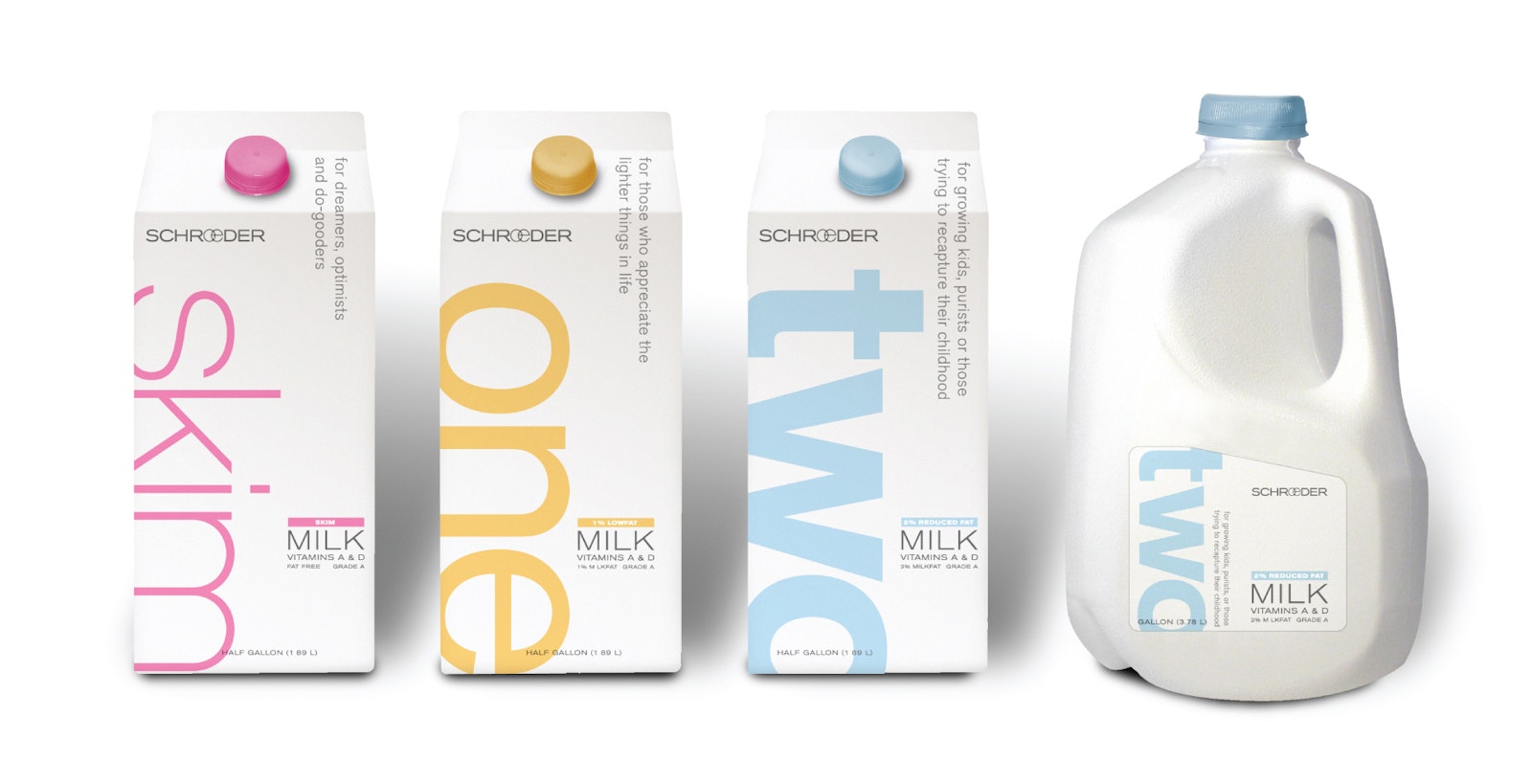
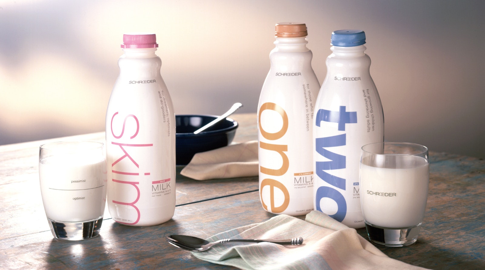
Schroeder
The Challenge
The milk fridge at your local grocer has probably looked the same for eons. America's milk supply is seeing rapid consolidation, driving down prices. Industry leaders have increasingly turned to the development of consumer brands as a way to increase both sales and margins. The resulting proliferation of brands has placed pressure on smaller, regional dairies to differentiate their offerings in the marketplace. Schroeder recognized this and knew it was time to do something drastic.

Next to water, can you name a better example of a commodity product? Most retailers use milk as a loss leader and therefore margins are razor thin for those who process and package liquid dairy products. We found this to be an ideal situation for our firm’s never-ending desire to bring value to things that others see as commodities.
Client Testimonial
“One of the most appropriate, clear and beautiful packages in this part of the supermarket. Congratulations Capsule!”
Louis Nelson, President IDSA
