Twin Cities PBS
Summary
Modernizing a mark for an established media organization
The Challenge
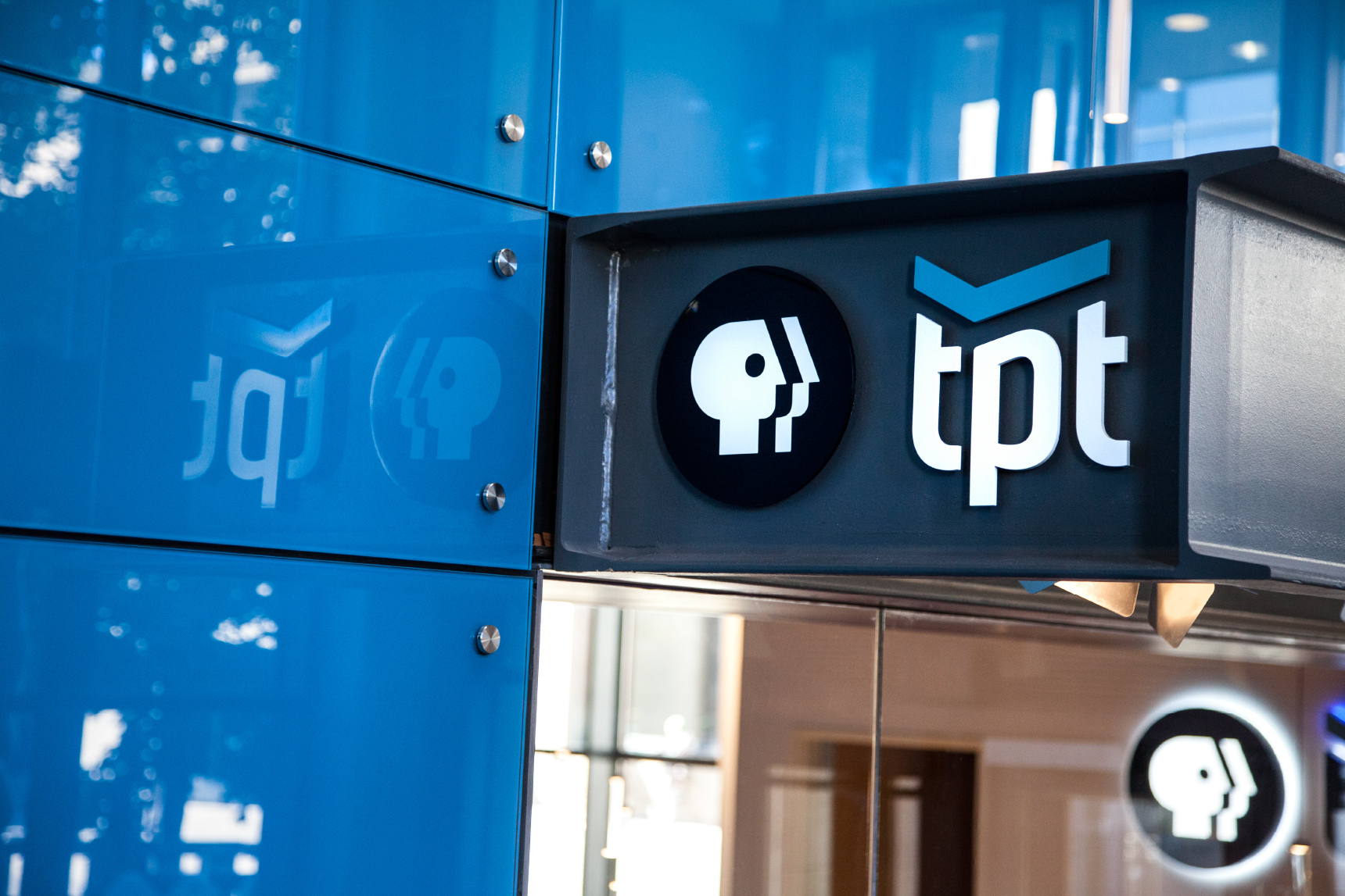
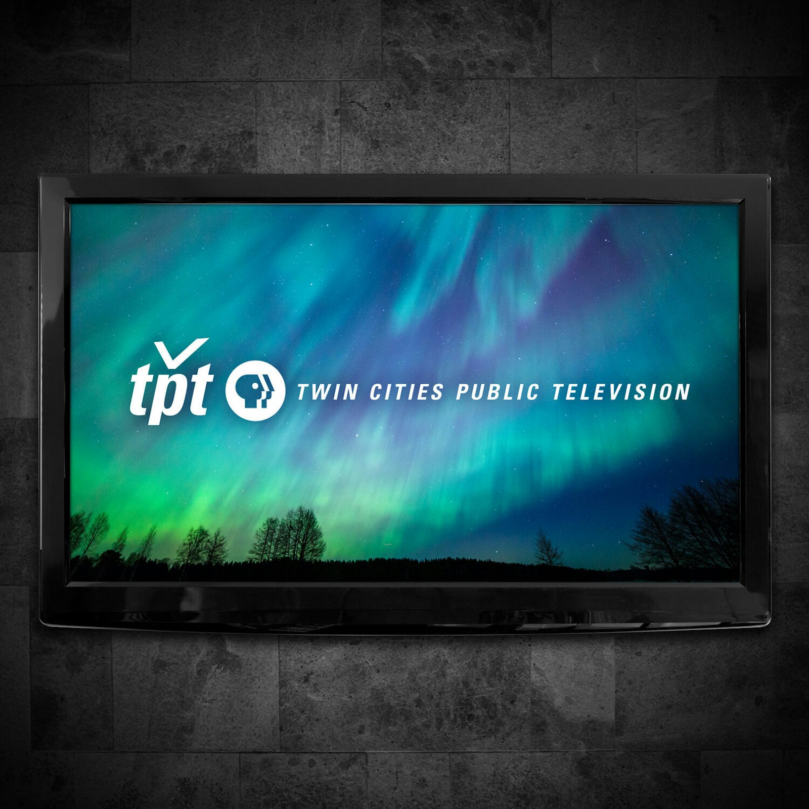
In conjunction with the renovation of their building, TPT asked Capsule to modernize their mark with a new look and feel, expressing TPT’s updated position as a 21st-century media organization. Capsule refreshed TPT’s identity while staying true to their desire to continue to nourish minds and serve as a trusted resource in the Twin Cities.


The Impact
Staying true to TPT’s core principles and values, TPT’s new mark retains a degree of familiarity and reinforces TPT’s local connection to the iconic and universally trusted PBS brand. A new reference to the station as Twin Cities PBS, rather than Twin Cities Public Television, is part of the refreshed branding work.


