Copeland Buhl
The Challenge
Copeland Buhl, a local and longstanding, Minnesota based accounting firm approached Capsule with an interest in a refresh of their brand collateral. Turns out we got a little excited and the ultimate result ended up being a reimagination of the entire brand. One that more closely aligned with the personality, progression and vision of the business, as well as pushed the brand into a more contemporary and competitive space.


The Mark
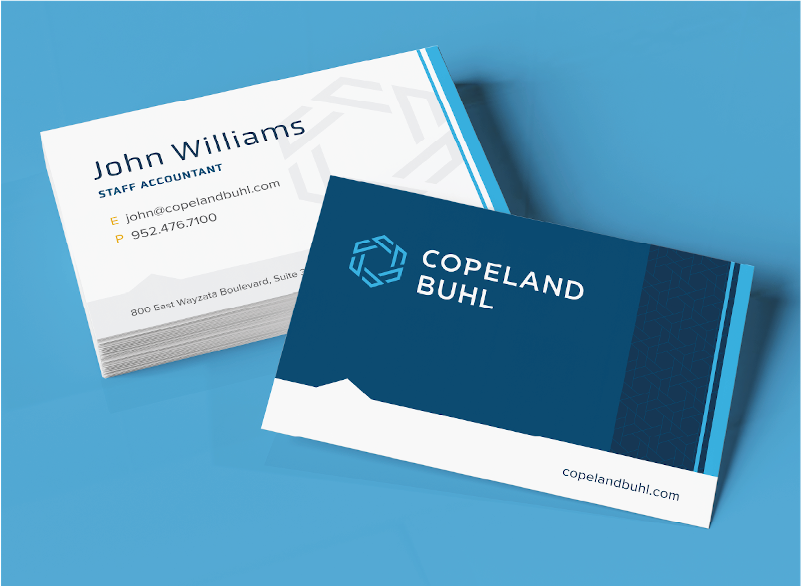
The logomark implies feelings of the infinite and is made up of a chain of “C’s” that give nod to the secure and trusted relationships Copeland Buhl has carefully built with their clients. Resembling a lens shutter, the mark speaks to both adaptability and precision—being able to hone into small details while still being capable of zooming out to view the big picture.
Digging in to Grow Understanding
Beginning with brand strategy and visioning alignment via our Foundations process, Capsule identified key audiences and areas of opportunity for further differentiation in its messaging and visual expression. Amongst those key differentiators was the evident care, compassion and creativity within each employee that complemented the firm’s precision and expertise in the accounting space.

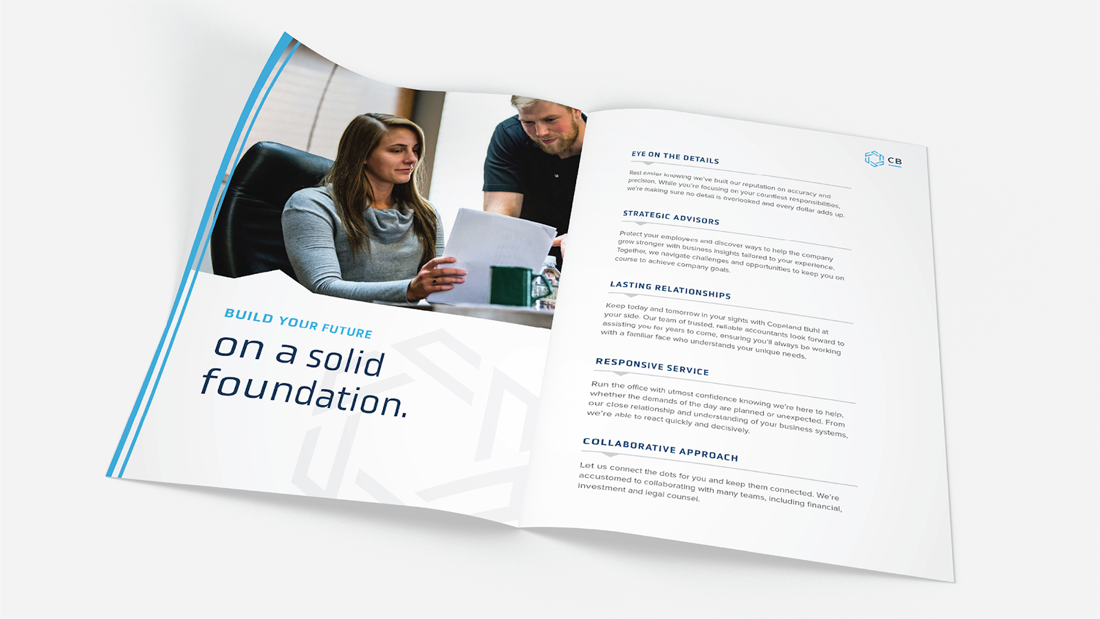
THE MESSAGING
Capsule developed a messaging strategy designed to match this personality and better reflect the brand of today and tomorrow.
Visual Identity
The supporting visual identity system includes a new color palette and custom patterns that were essential in creating a contemporary personality that still feels sophisticated and a touch traditional. These elements create a dynamic, yet consistent system used to guide all future branded materials.


The Impact
While the original scope may have been focused on specific pieces of brand collateral, Capsule wasn’t content with a simple update to one or two brochures. Instead, we found a perfect partner in Copeland Buhl to update the entirety of a dynamic and reputable brand. Focused on protecting components that made it the valued brand it is while updating other elements to help launch Copeland Buhl into a new era of prosperity.