Red Wing Shoes
The Challenge
Being a legacy brand should mean your logo can stand the test of time, not take a mind-numbing amount of time to apply across your brand assets. As Red Wing Shoes was looking for an updated mark system that could be more easily applied to a multitude of applications, while still remaining true to the original swan wing mark, Capsule was tasked with re-feathering the iconic logo to help it work even harder.
A METICULOUS REDESIGN
The Capsule process of visualizing and creating change was driven by both client and design teams with an ability to flex during the design process. It began with an exhaustive exploration of possibilities that helped the group visualize change. Studies were conducted to observe the shapes of various wings. The original swan wing was the model.
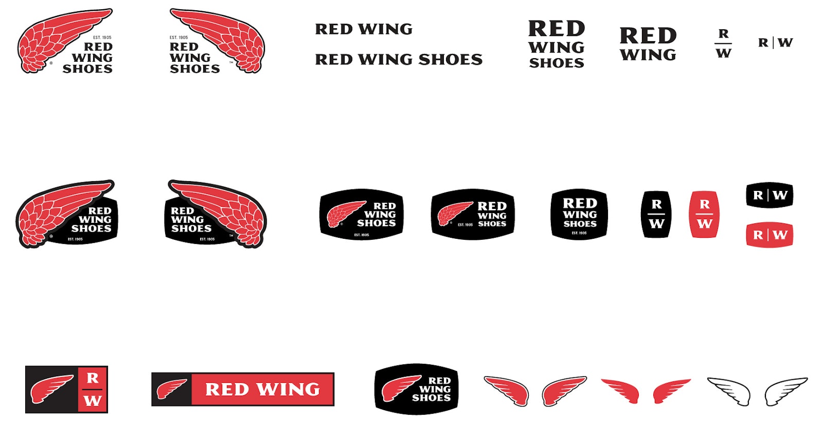
Type studies were conducted to ensure that the style remained similar enough to the original. The new design improved readability and other details, such as consistent thick and thins. A toolkit was also designed to provide a variety of options for use in specific contexts.

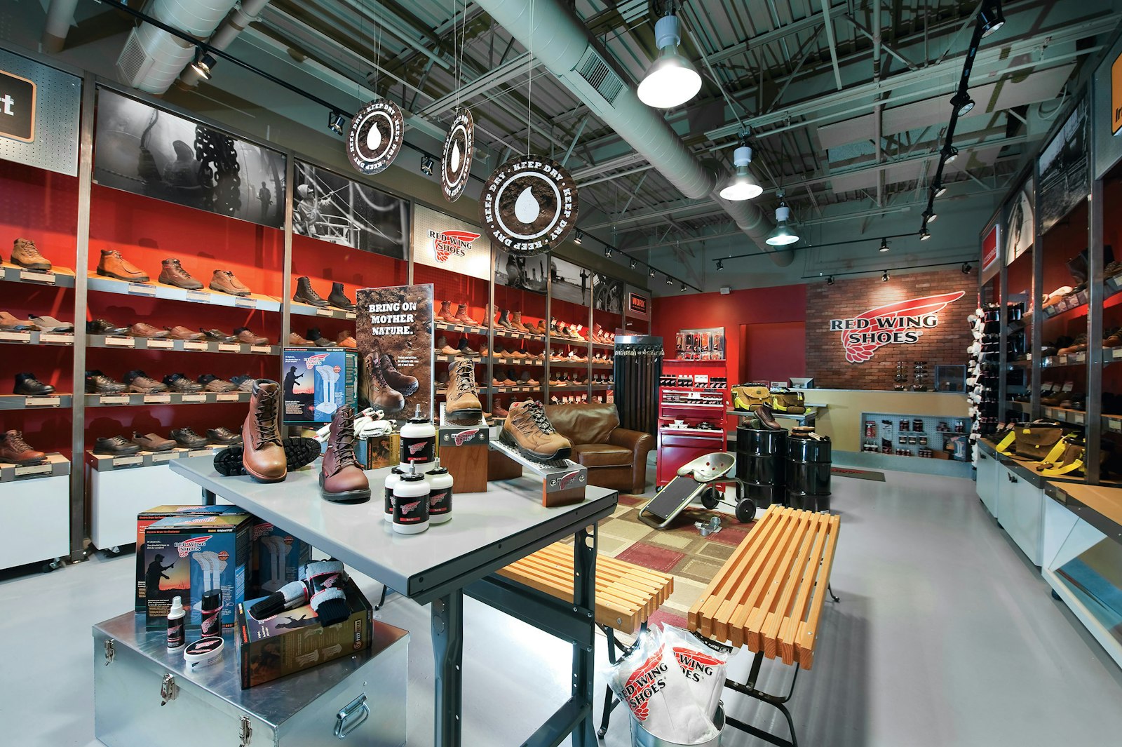
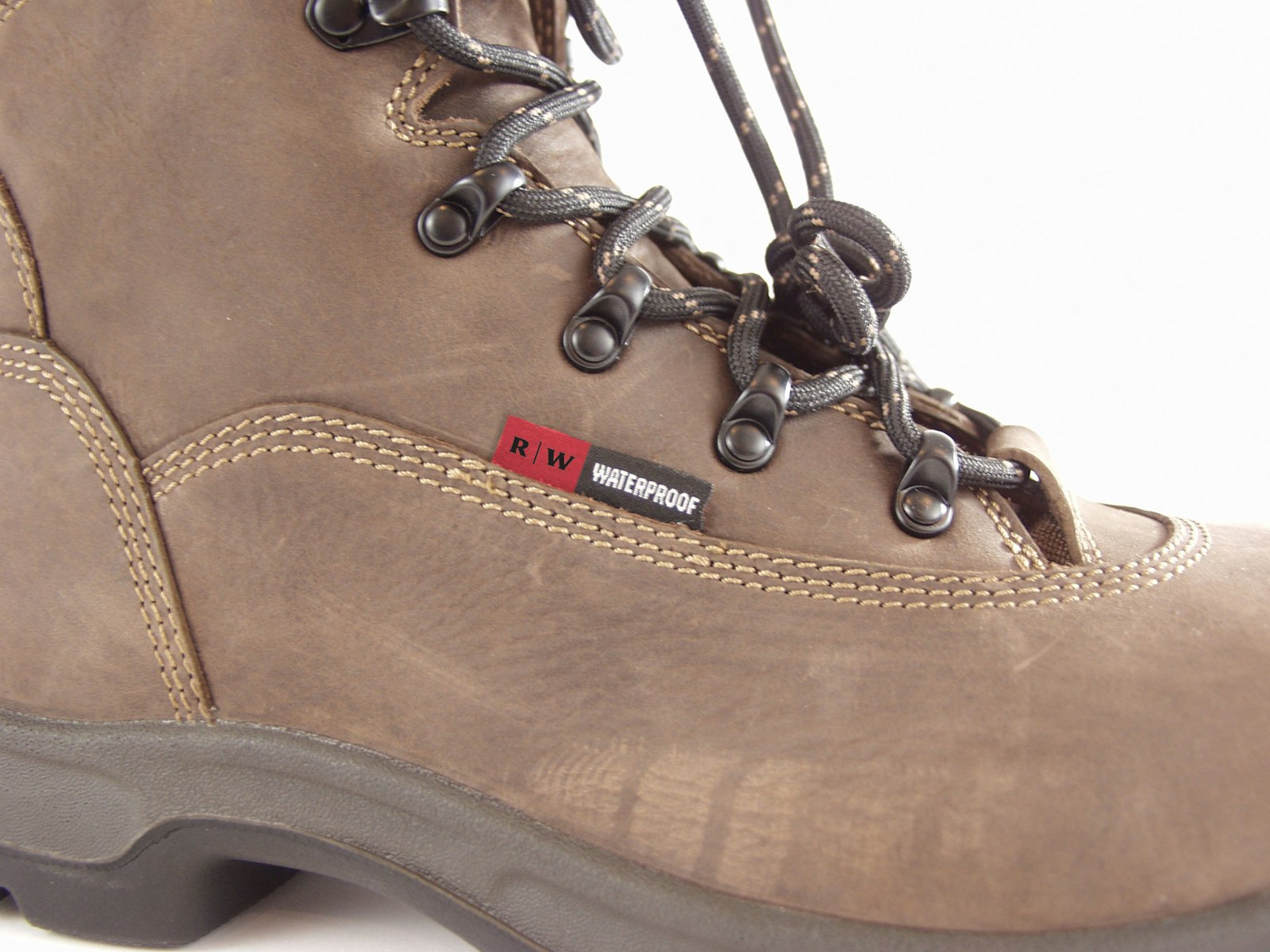
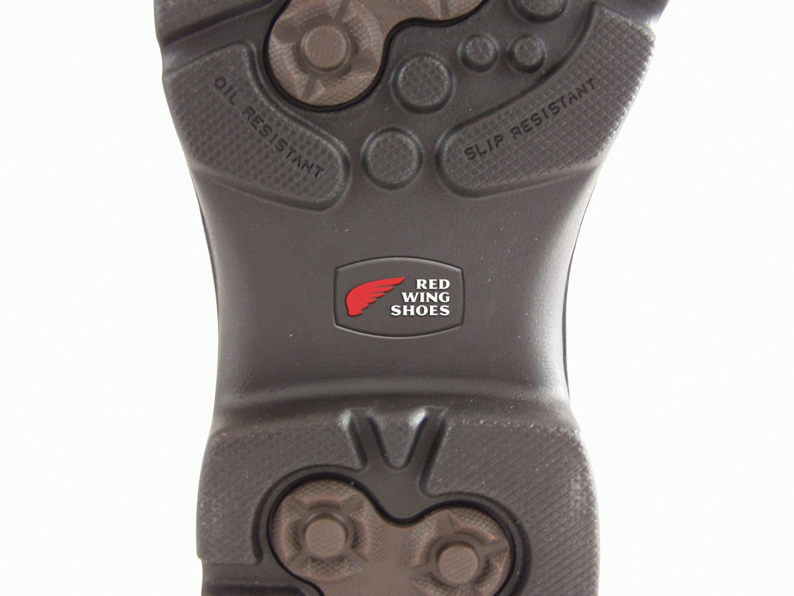
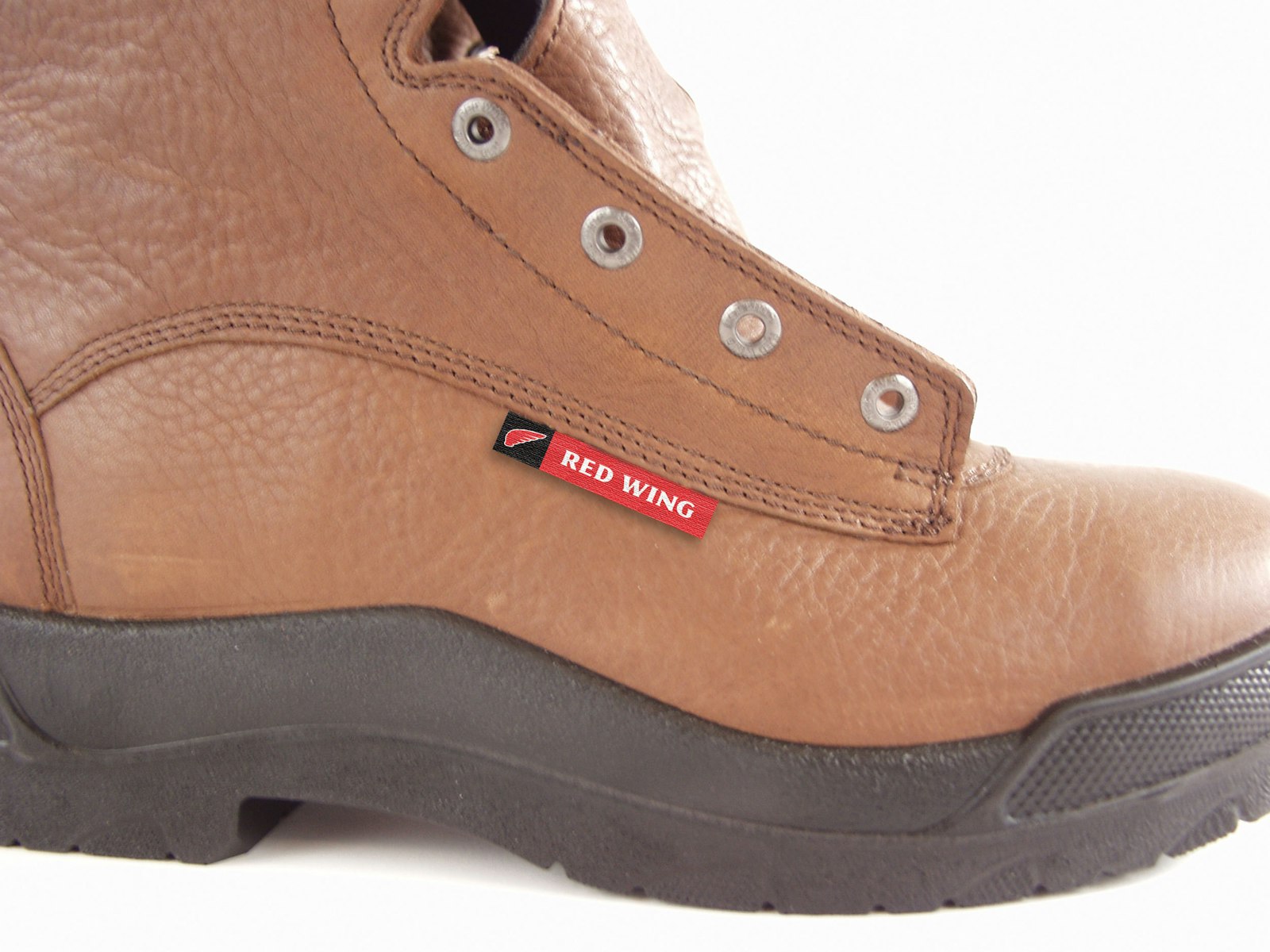
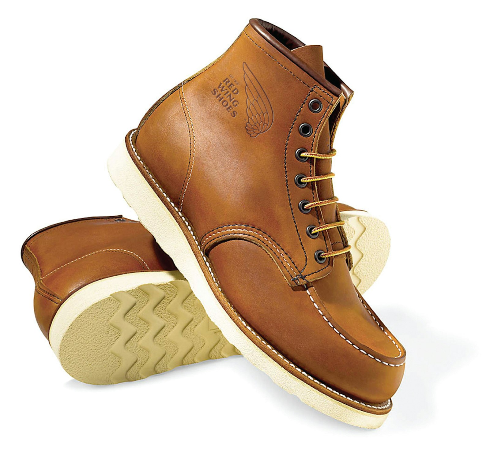
The new logo was implemented on everything from signage and advertising to shoes and other clothing accessories.


THE IMPACT
The result was a design that offers a multitude of options within a logo toolkit while retaining the original brand equity.
TESTIMONIAL
“Capsule’s approach to design gave our team the tools to make decisions quickly. The result was that we were able to get these changes to market fast and realize the results in sales.”
Peter Engel Director of Marketing, Red Wing Shoes


