Kenmore
The Challenge
Kenmore was in need of an update to their packaging to improve navigation and provide the customer faster access to the most pertinent information for each product. Capsule worked collaboratively with the Sears team to redesign the Kenmore packaging language and develop guidelines for implementation.
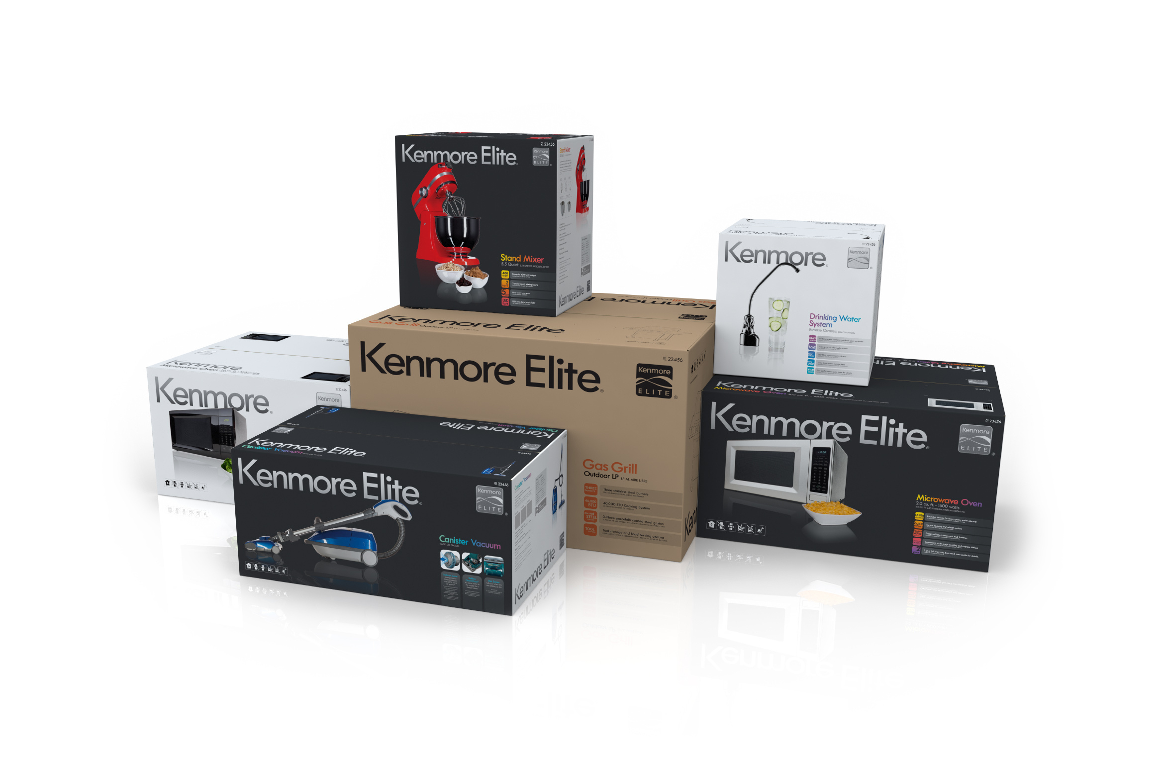
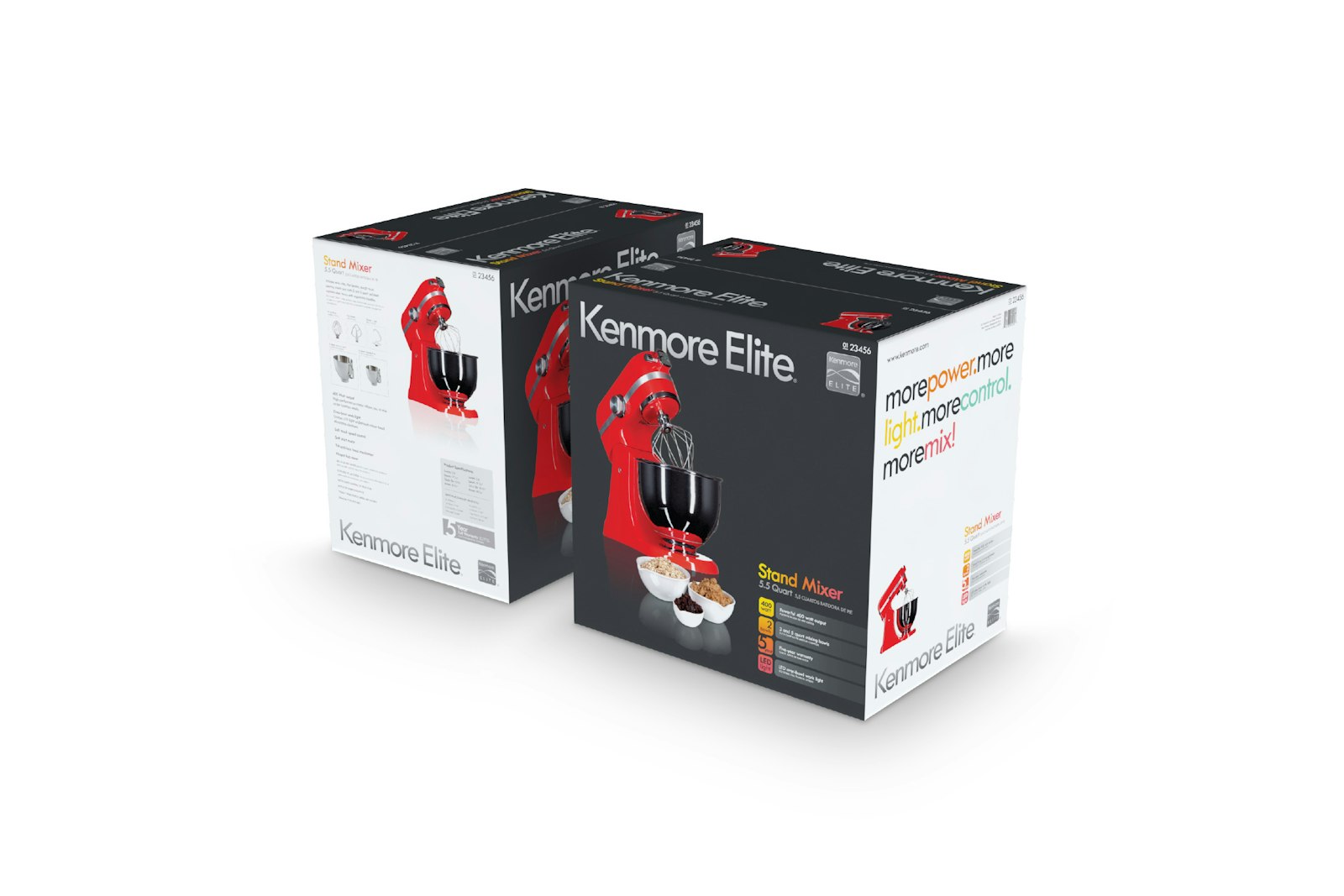
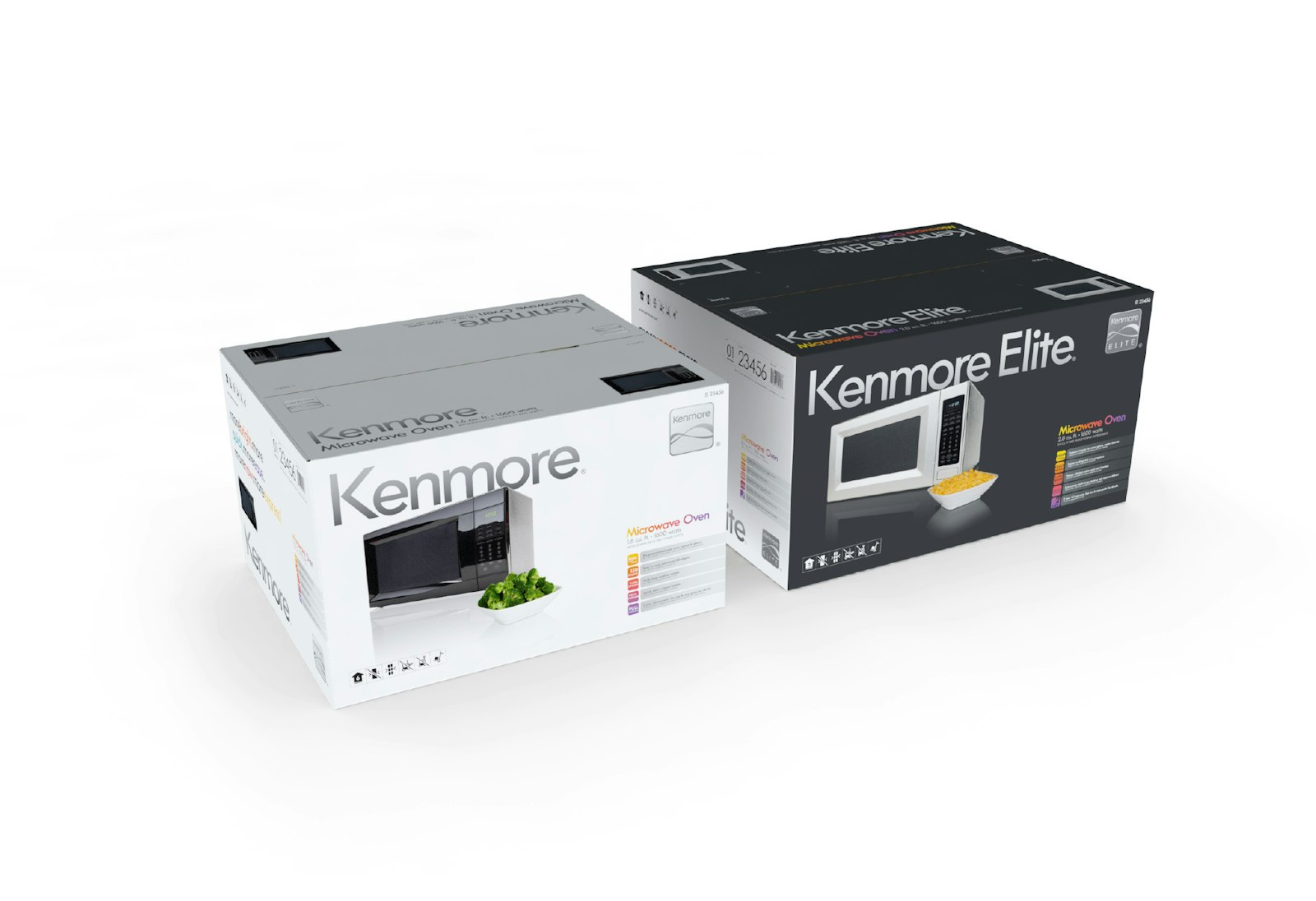
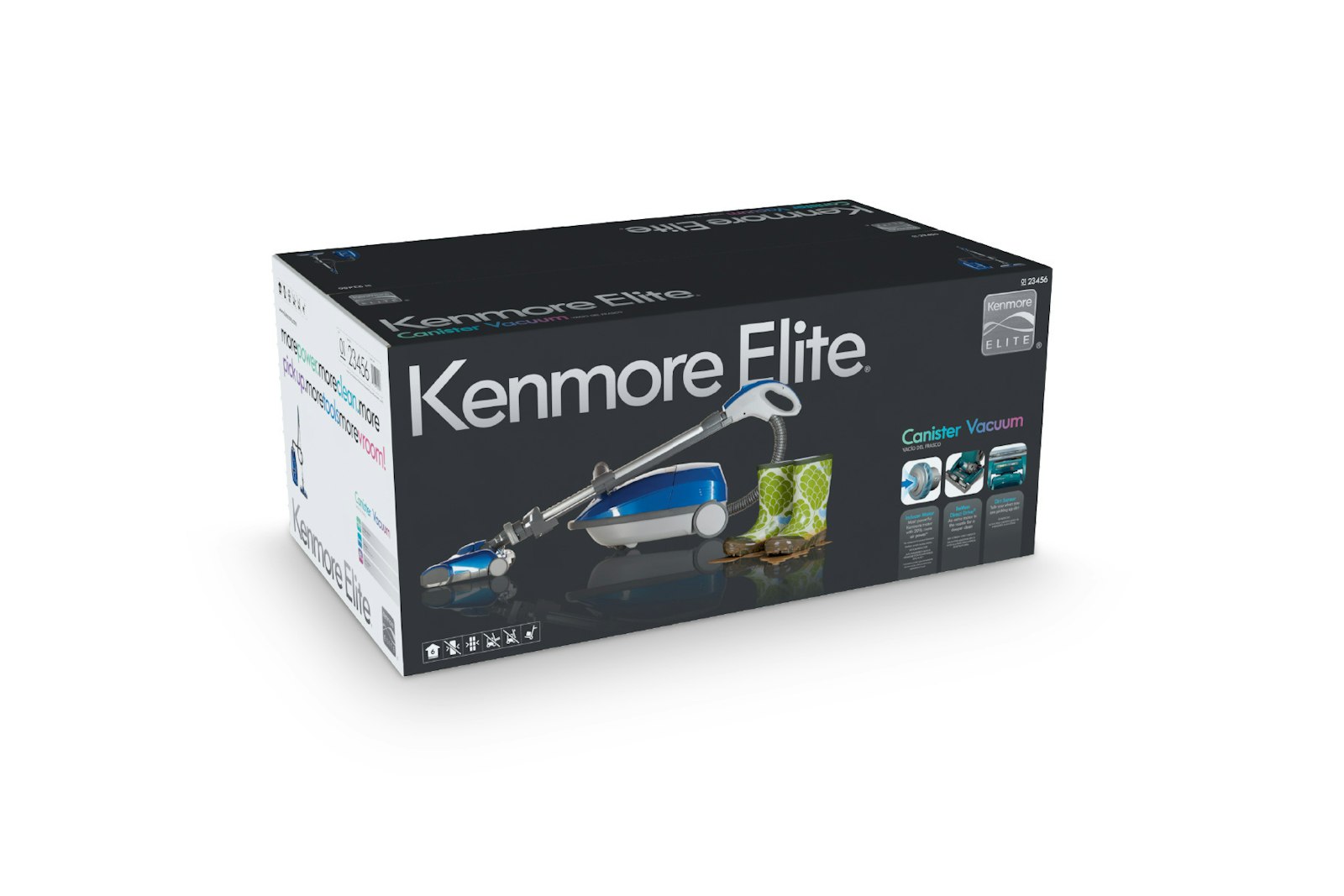
The refresh to the packaging system originally created by Ammunition was initiated to further strengthen and extend Kenmore brand's leadership position. Capsule began the project with in-store visits to observe how Kenmore packaging was being presented to customers. Then worked with the Kenmore team to determine the optimal hierarchy of information based on new customer insights. Adding an “Experience Image” quickly connects the customer to the product in a relevant and meaningful way. The new information hierarchy and presentation gives the customer easy and logical access to what they require in order to make the correct purchase decision and elicit an emotional connection. The resulting package has Kenmore and Kenmore Elite brands as a more prominent first read followed by a clear and logical visual path of product information.
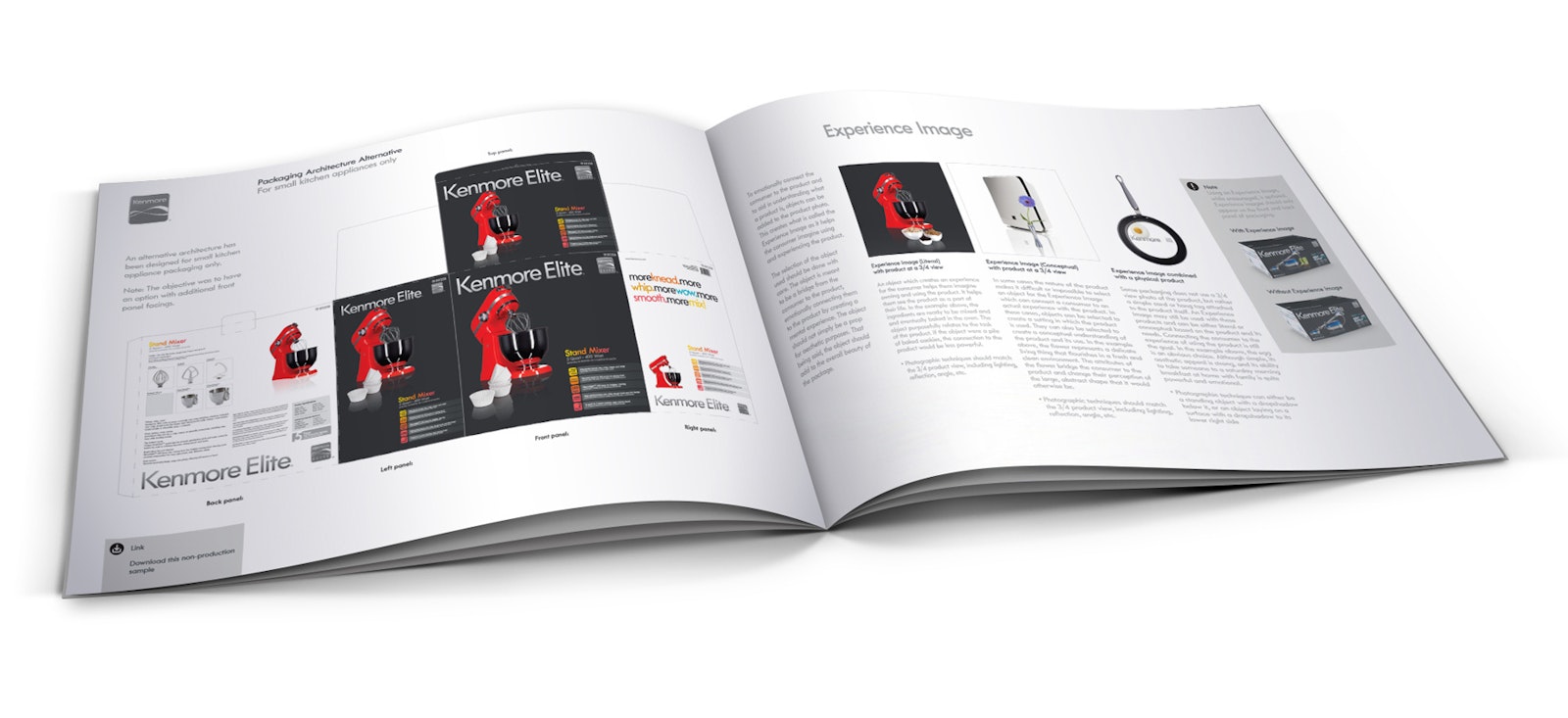
Packaging Guidelines
Following the development of the refined package design, the Capsule team updated the Kenmore brand guidelines document to ensure future consistencies. The varying product types and package sizes required extensive parameters and documentation, leaving no element of the package design unguided.
Client Testimonial
"Capsule has been an excellent design partner on the Kenmore 100th anniversary logo and Kenmore Packaging Brand Guidelines. The Capsule team clearly understood Kenmore's brand essence and the competitor landscape, providing design solutions that exceeded our expectations."
Jeff Klimek, Group Design Manager Kenmore, Craftsman, Diehard; at Sears Holdings Corporation


