Patagonia Baselayer
The Challenge
Every component of Patagonia's process is critically assessed to ensure it preserves the human connection to the earth. After witnessing a decline in their baselayer sales compared to primary competitors, Patagonia sought a visionary partner to redesign the “sushi roll” structure of their existing baselayer packaging. We were hand-selected by their team to lead this packaging initiative – outcomes from the launch include an amazing increase of 70% sell-through at retail.

The Research
We started with research. After careful analysis, our researchers, strategists and designers used the findings from mobile and in-person research to confidently put a strategy in place. This strategy acted as the guidebook for the execution of the package design.


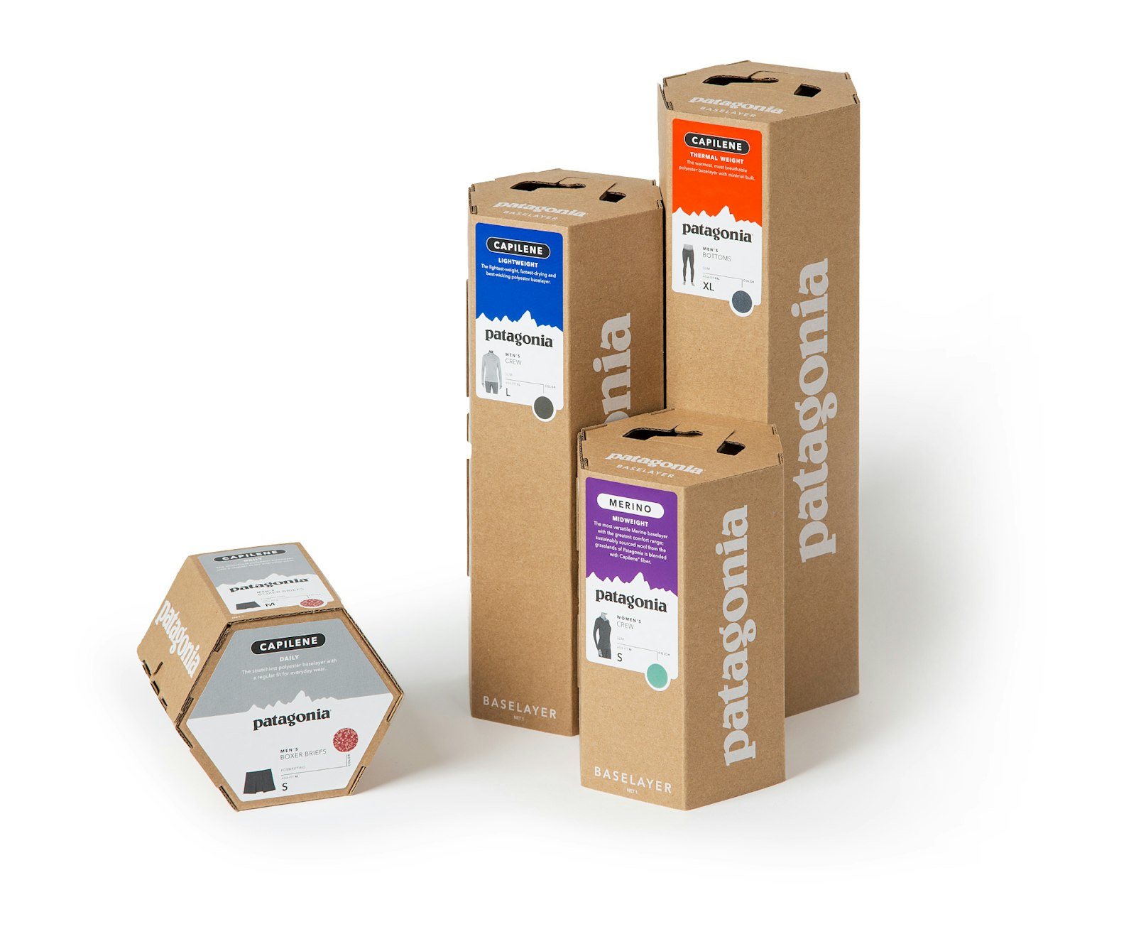
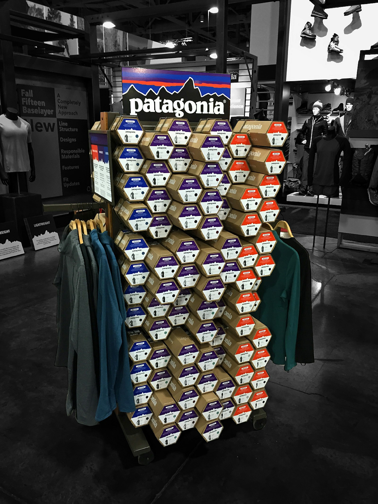
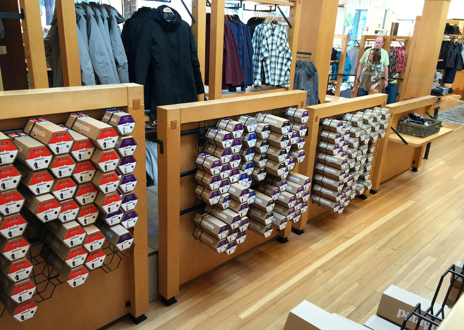
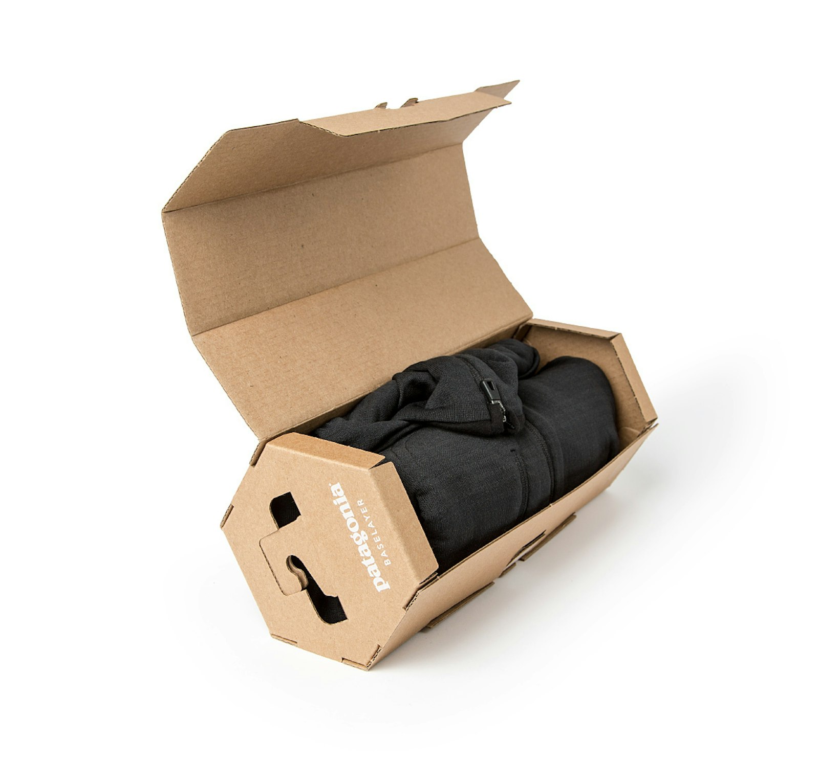
The look and feel was also kept functional and on-brand for Patagonia. The corrugate is left in its natural state with minimal printing, using stickers to designate style, color and size. The front of the package easily opens to reveal the baselayer inside and gives the customer easy access to touch the material or remove and replace the baselayer. This allows for a clean on-shelf look even after a customer has replaced the baselayer.


Client Testimonial
"The entire Patagonia organization is very stoked on the new direction and the packaging design. Thanks to Capsule, we are set up in a good way and have a compelling design that everyone feels is on brand. The packaging and the new fixture design concepts will deliver a best-in-class consumer experience that is elevated, unique and tailored to our Patagonia customer today and beyond."
Tyler LaMotte Global Business Unit Director, Patagonia


