Osprey
The Challenge
Worldwide purveyor of outdoor travel gear, Osprey, was looking to blaze new trails at point of purchase by improving their sustainable impact, updating their in-aisle customer experience, and further honing their distinct brand identity.
Seeking to enhance the information navigation experience on their packaging to engage audiences from the technical mountaineer to the everyday commuter, Osprey wanted to transform its EU and US packaging into a single, global solution that could be accessibly engaged with across multiple languages.
Exploring the best path forward
In order to hit the trail running, Osprey engaged Capsule with the mission of marrying smart engineering and boundless creativity into one cohesive and easily identifiable packaging solution. One that would not only efficiently and effectively translate key technical information, but reduce material usage, protect the product within, and optimize the unboxing experience to invite awe with every interaction.

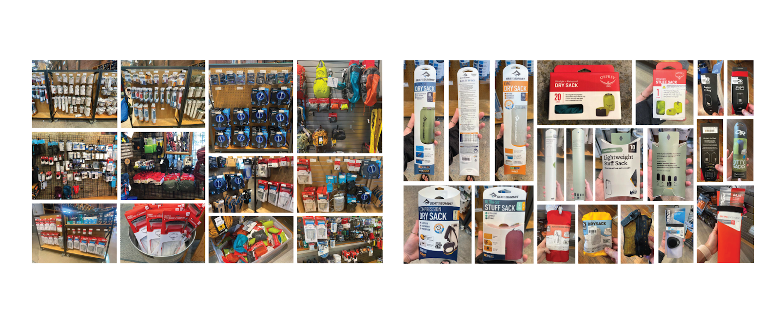
Our researchers, designers and strategists took to the aisle to immerse ourselves in the current state of the category as well as sustainable packaging trends. We conducted a qualitative exploratory diary study that sent avid outdoors enthusiasts into REI stores across the nation to authentically document the role packaging played in their shopping experience.
A hands on testing approach
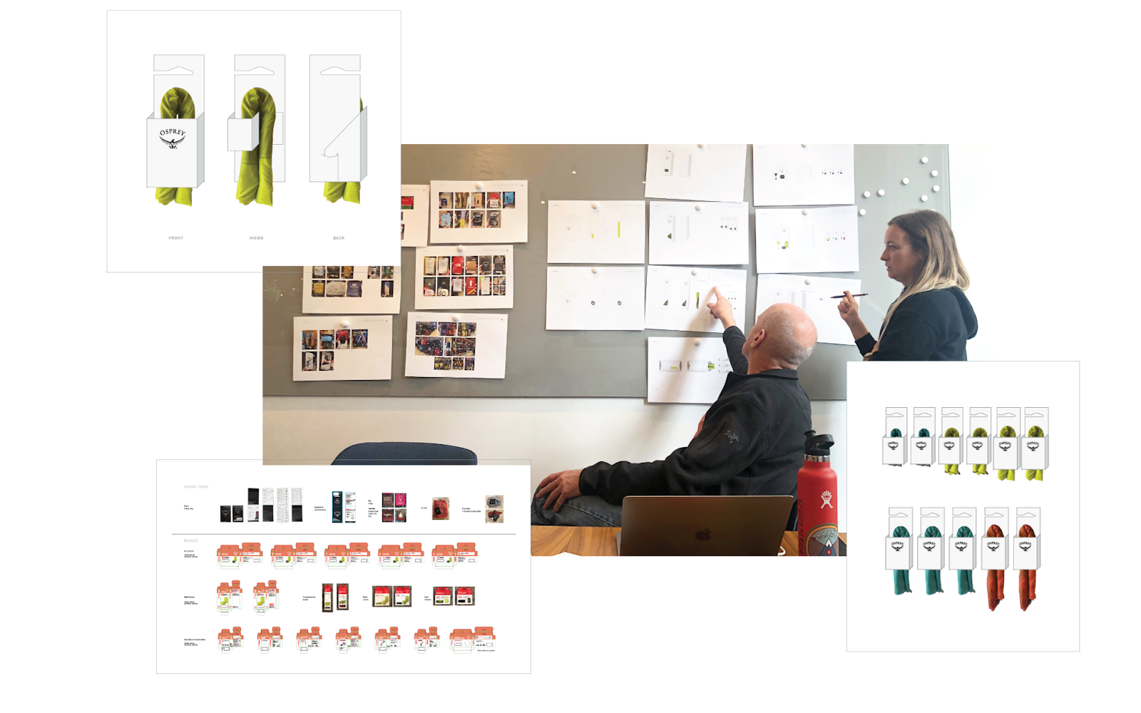
We carefully examined Osprey’s myriad of packaging to identify the 5 most efficient and effective SKUs on which to focus our ideation. Prototypes were crafted and placed in the hands of packaging engineers, retail reps, merchandisers and printing manufactures for in-depth stress testing of the concepts’ structural integrity, hang presentation, and overall look and functionality from supply chain to retail setting.
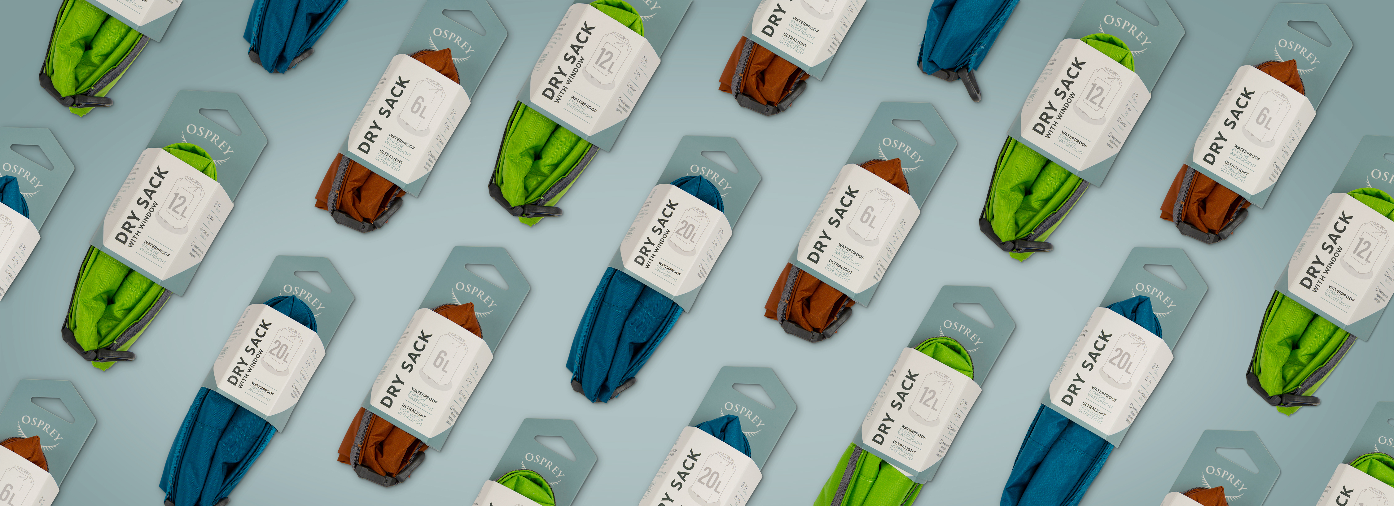
packaging that speaks volumes
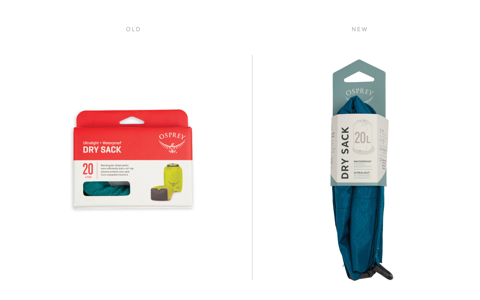
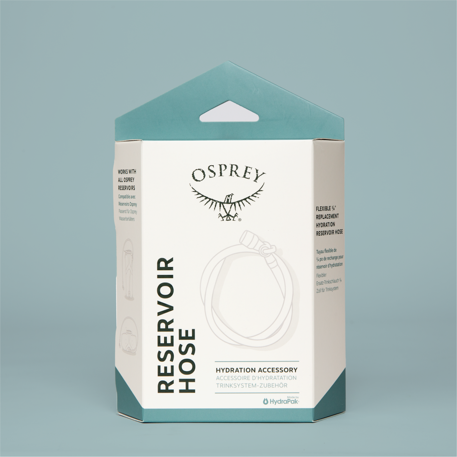
The previously utilized stark red was replaced with a green and blue color update across the entire packaging system to better align with the brand's personality and voice, and effectively communicate the reliability, quality and confidence that Osprey products are known for.
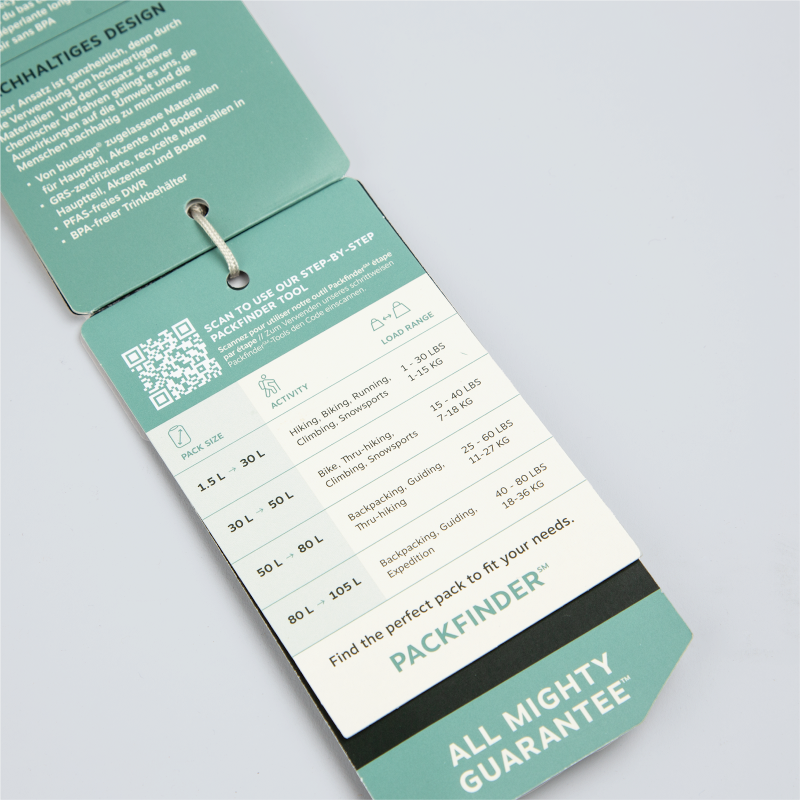
Modifying existing structures as well as crafting brand new ones, Capsule employed a diagonal system across all structures and hang tags to provide maximum brand cohesion from product to product, no matter the size or format.
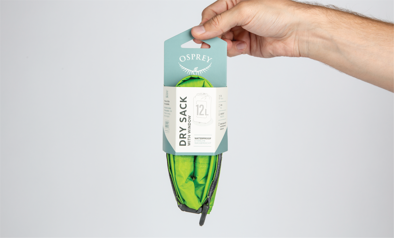
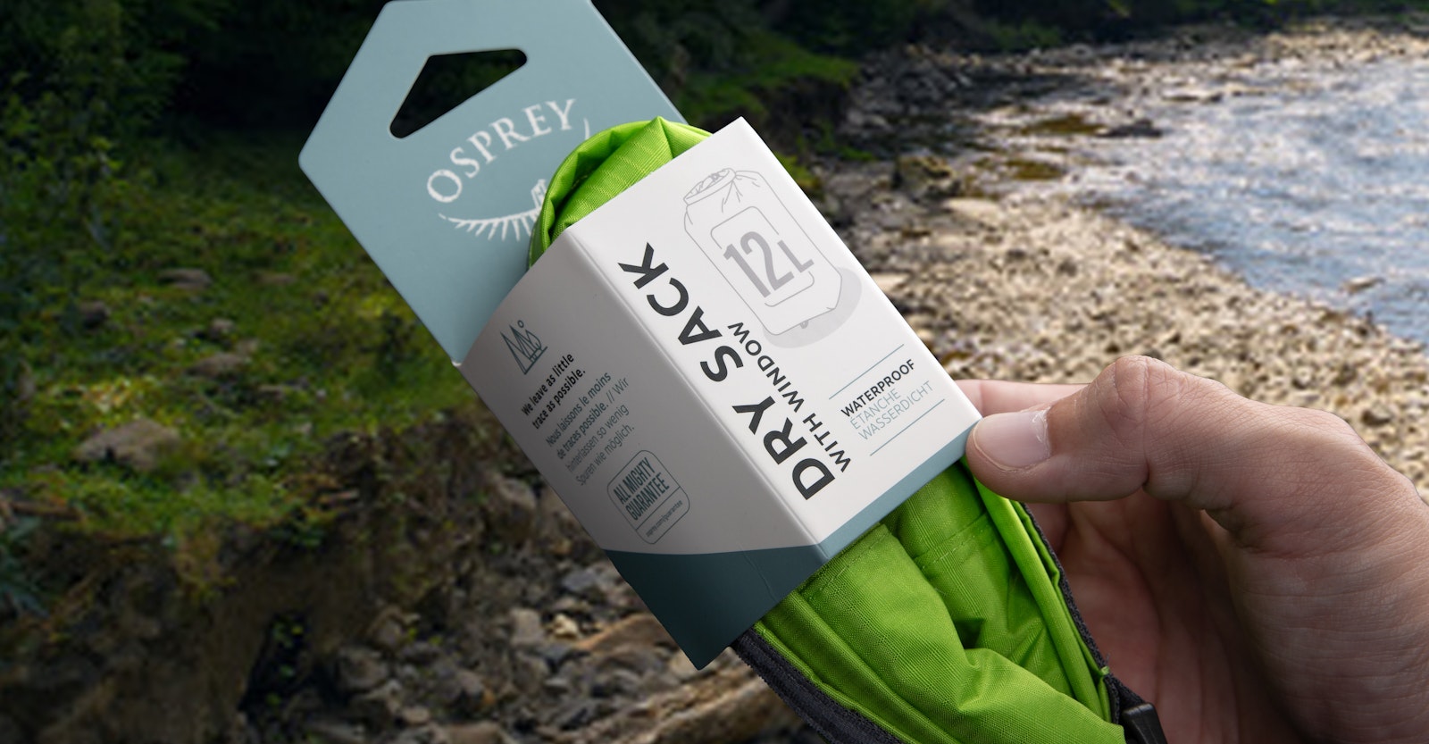
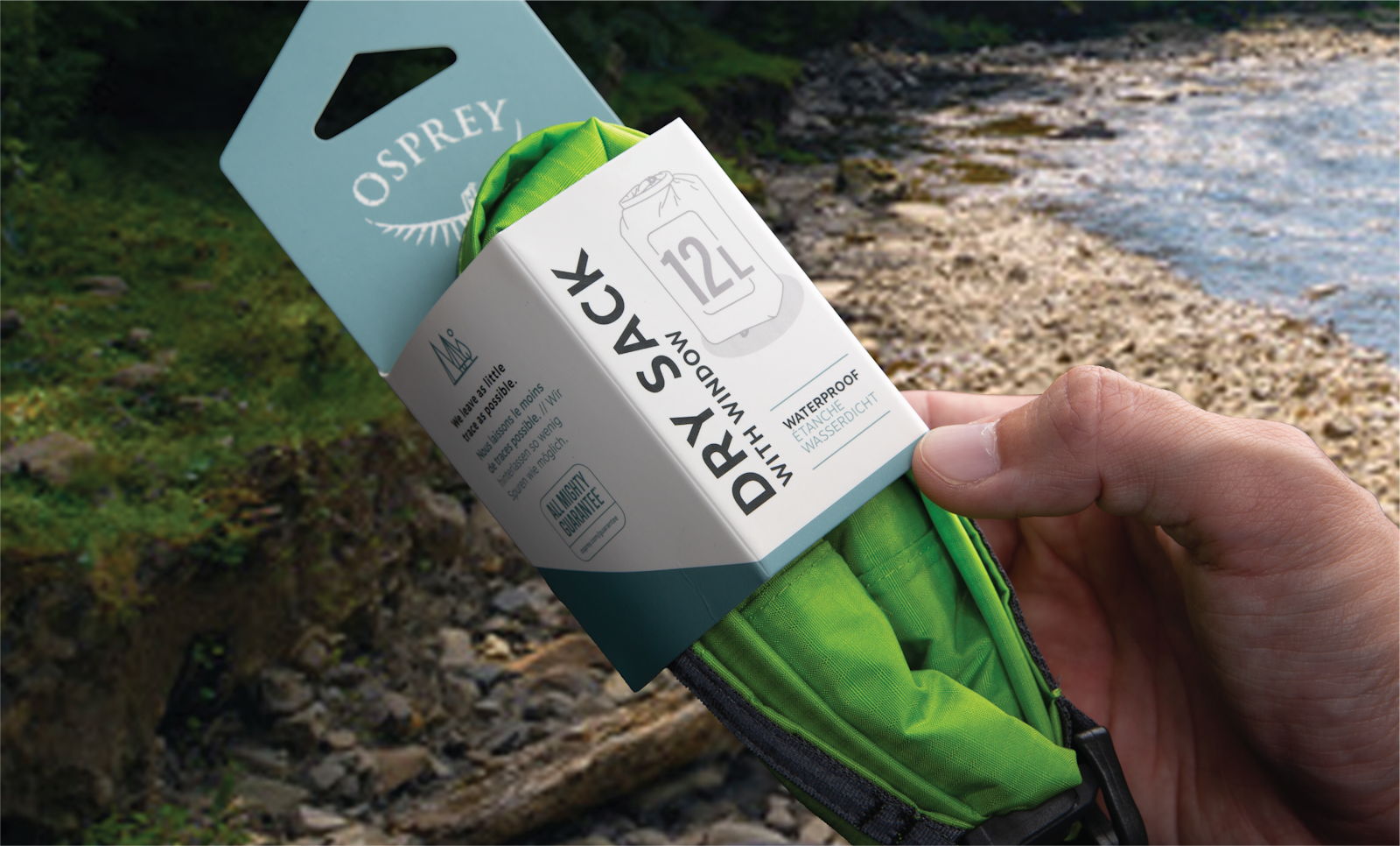
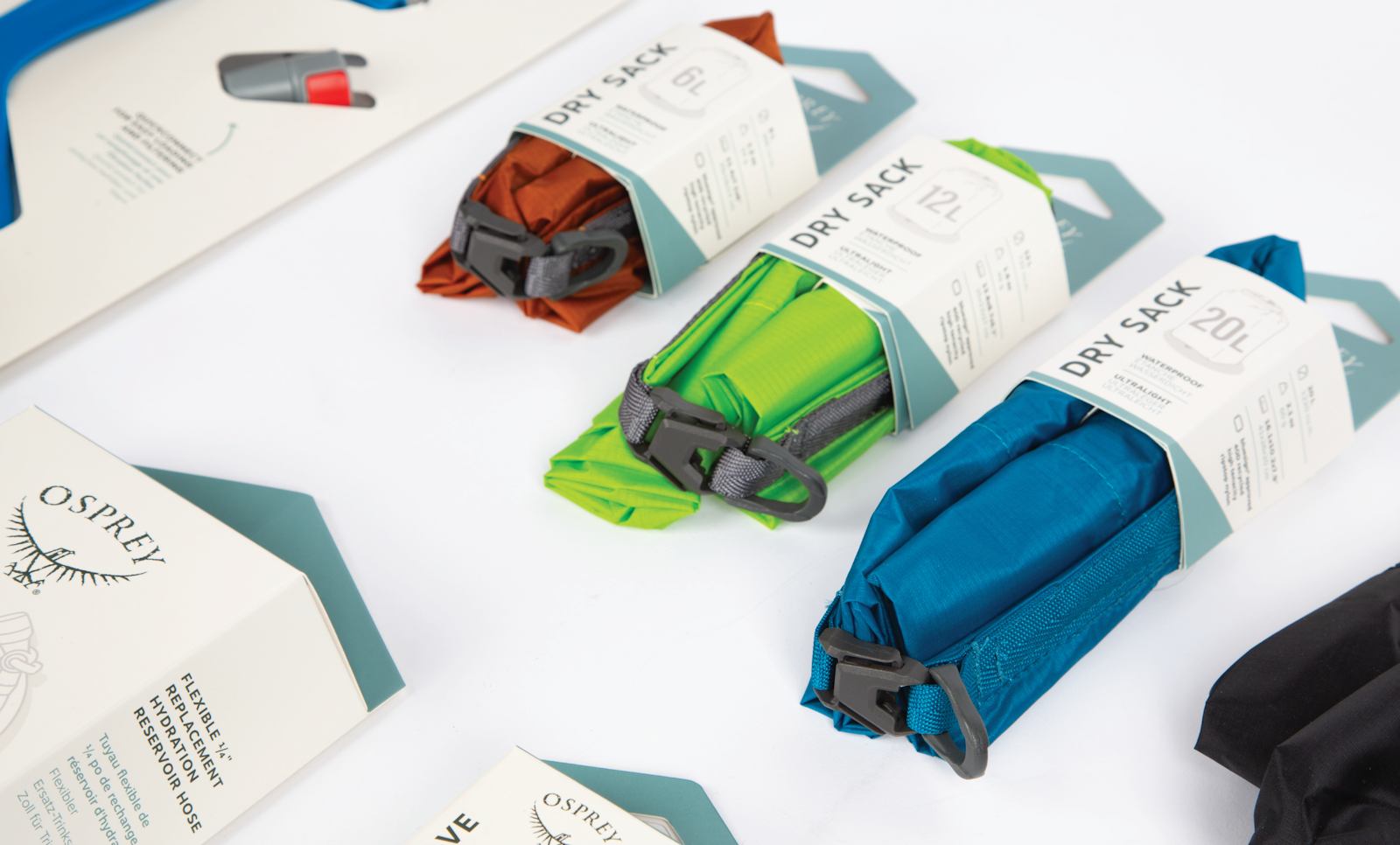
Creating cohesive size navigation across the system, both structurally and graphically, were a critical priority of design. Most notably, the stuff sack solution moved from a box to a wrap, championing the true durability of the product and significantly reducing packaging material in a way that allows consumers to easily see color and size variations and actually feel the material of the product.
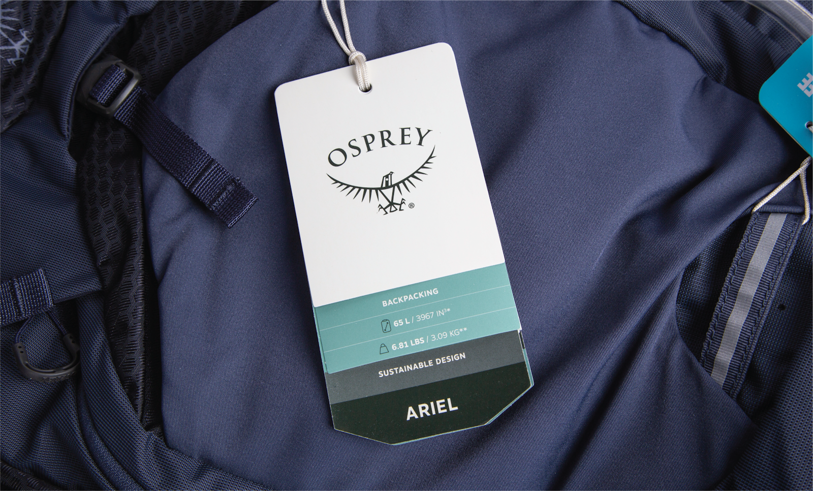
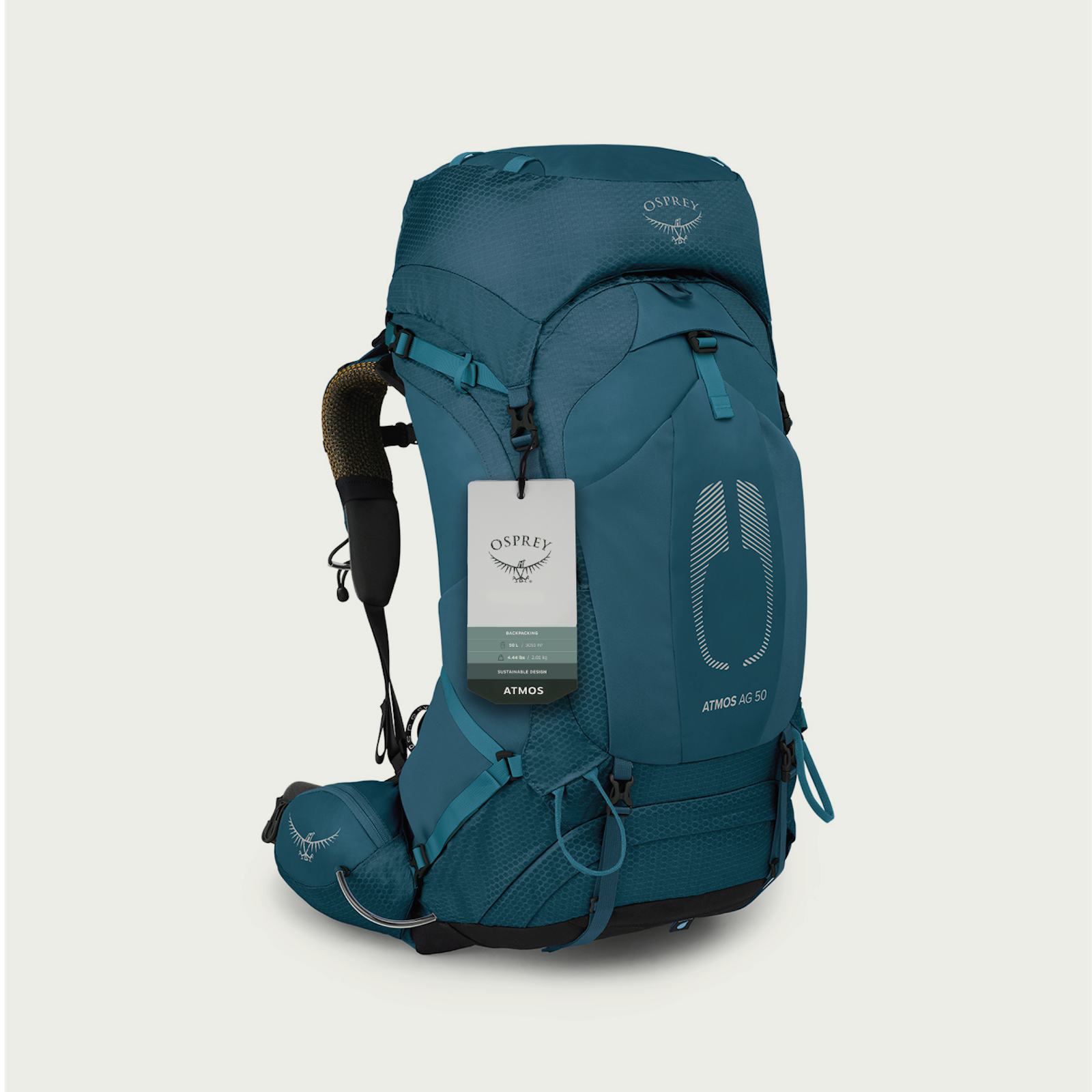
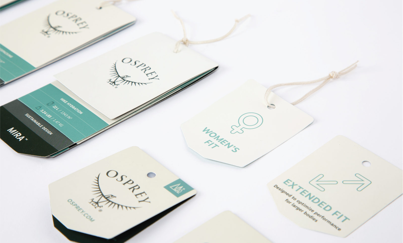
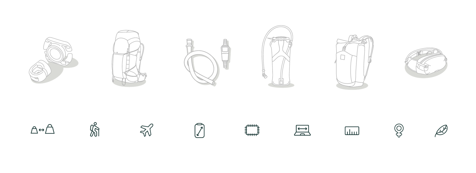
Product illustrations replaced photography across all hang tags and packaging, allowing for a smoother internal process to create new packaging SKUs and eliminating confusion around the product color and material found within each specific package.
Through evaluative qualitative research, Outdoor Enthusiast consumers were re-engaged to finalize packaging messaging and navigation, testing information hierarchy and language choice to ensure content was clear, concise and would help them make their purchasing decision.
Reducing waste, increasing impact
Launched in Spring 2023, Osprey’s new packaging system can be found in outdoor retailers internationally. Precisely engineered and thoughtfully crafted with the consumer at the center, the new packaging offers the most accurate expression of a quality, personality, accessibility and sustainability ethos already inherent to the brand.
The finalized packaging system utilizes sustainable recycled materials, smaller and more efficient dielines, less materials, water based inks, and certified PCW and FSC paper, reducing the environmental impact of the packaging while also delivering a look that increases its impact on consumers in aisle.
Client Testimonial
“It just looks like they put a lot of thought and effort into it and to making it easier for the consumer to buy into the product.”
Outdoor Enthusiast
"I really like the design of all the packaging and like how all the information is put out on the front, so I wouldn't even really need to do a Google search."
Outdoor Enthusiast