BGM
The Challenge
As the needs of its clients evolved and expanded, 40+ year old financial services parent brand, BGM, recognized an opportunity to shift its business model from a set of specialized service firms into a single, holistic solutions provider.
To accomplish this aim, BGM needed to merge its three distinct brands into one, and called on Capsule to bring this vision to life, reinventing the brand strategy and identity experience to add new value to this generationally built brand.


The solution
Capsule’s Foundations process brought leaders from three of BGM’s distinct business entities to the table, spanning everything from traditional tax and accounting, to wealth advising, to financial services specific to the cannabis industry. Together, we collectively defined the current landscape and positioning opportunities for the future in order to identify and then unify under one shared purpose for the firm’s future
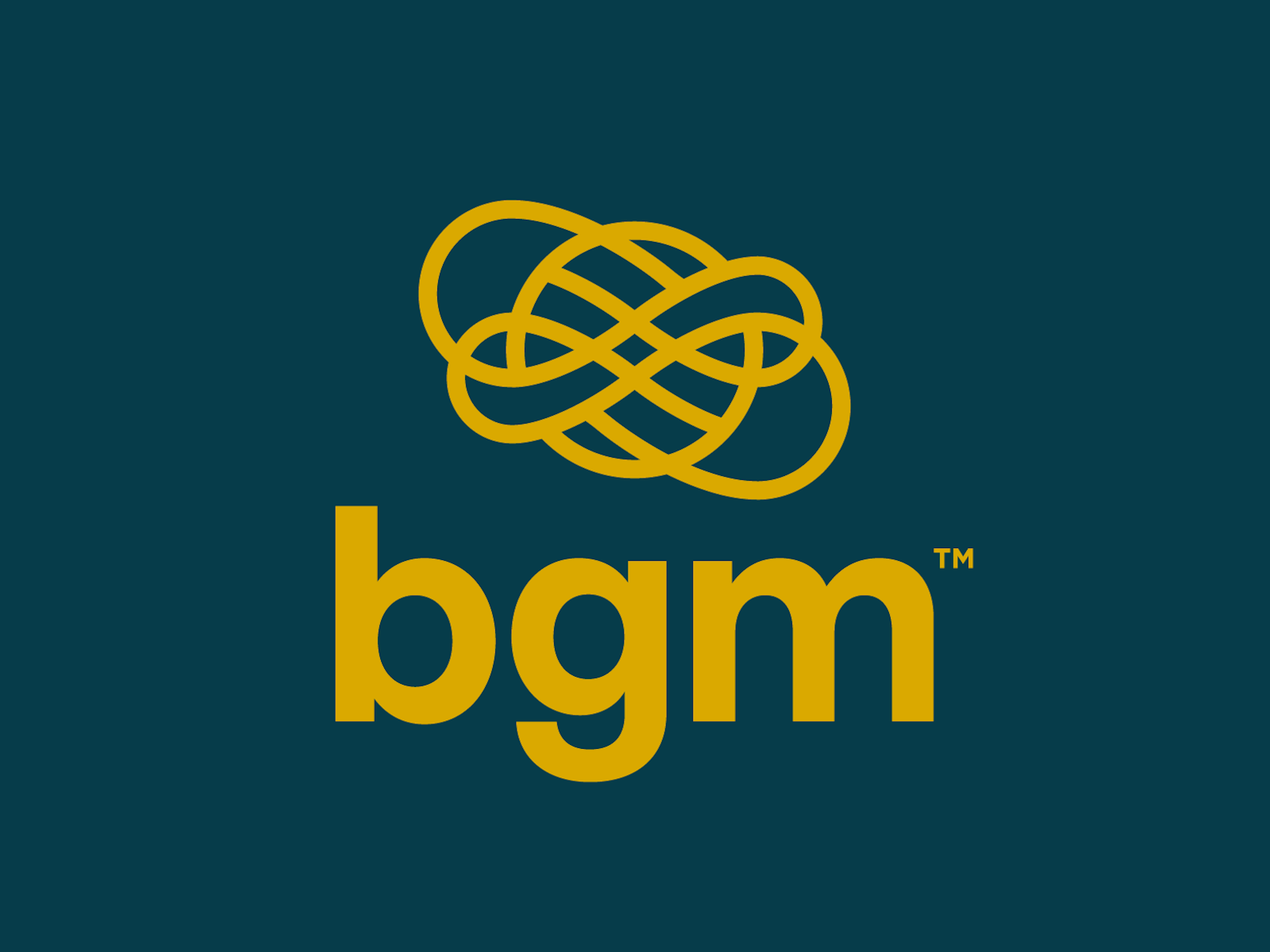
Mark Design
Bringing to mind a strong and interlocking Gordian Knot, the mark design represents the unification of BGM’s many innovative capabilities, diverse financial talent and distinct business parts as they seamlessly interweave to form a wholly greater sum.

The Logomark
The mark is formed from a contiguous line that flows in and out of itself, representing the free flowing flexibility needed to navigate complexity and respond to change. At the heart of the varying pieces in orbit within the mark, a diamond is found, nodding to a strong core of wealth and prosperity that BGM brings into the midst of every unique client interaction.

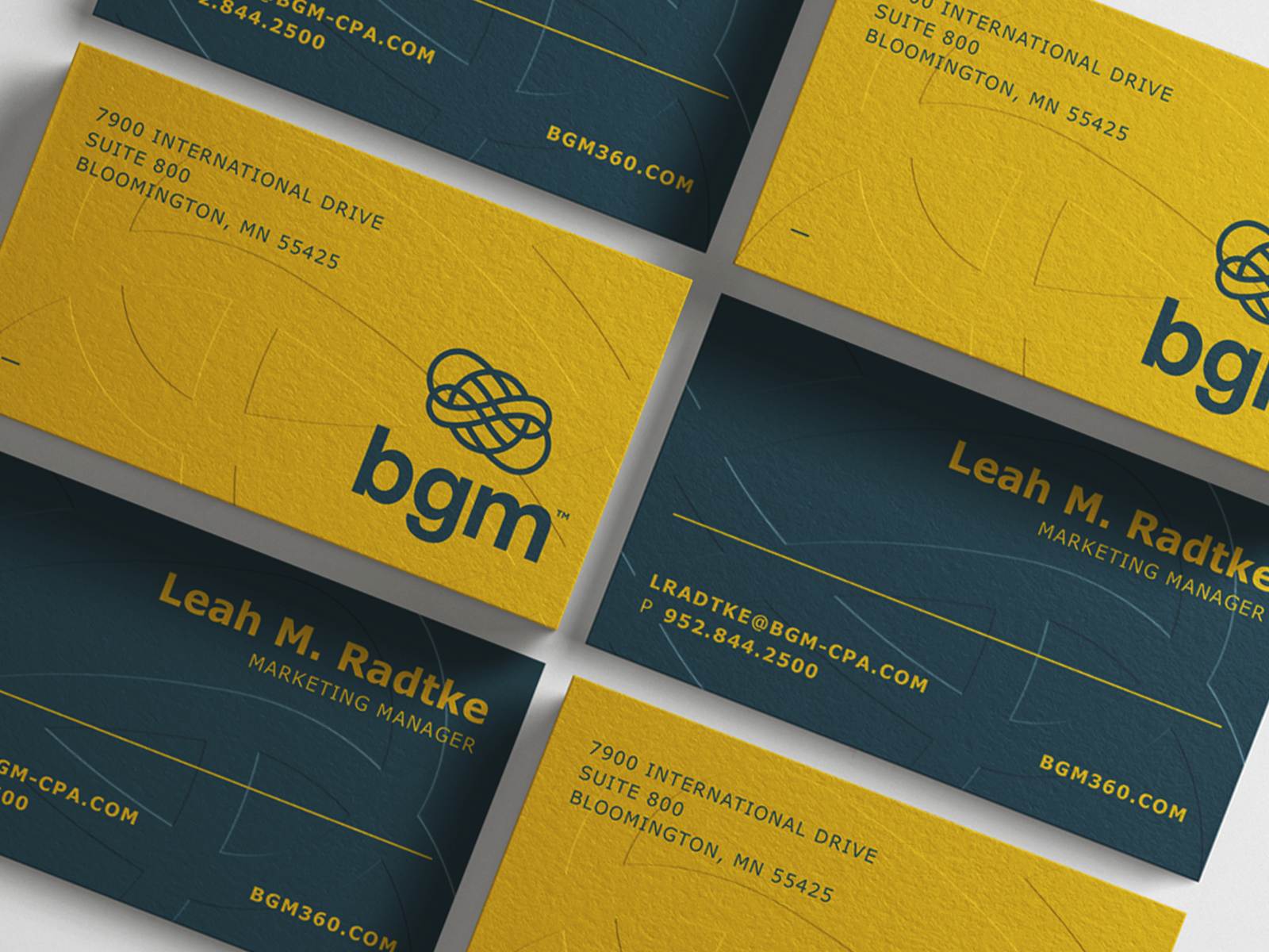
Visual Identity
The energy and movement inherent to the mark flows directly into a fresh visual identity system update. A primary color palette of deep green and gold combines to generate a more premium look and feel, giving a strong nod to the idea of wealth without any attached feelings of arrogance or stuffiness. A lowercase Georgia headline typeface provides a clear and conversational connection to the new lowercase “bgm” word mark.
Custom iconography was crafted to represent various BGM focus areas and service lines, from legal, to business services, to cannabis specific financial advising. The new icon system serves as a distinct design element that both enhances navigational clarity as well as elevates the overall design aesthetic of the brand


Brand Messaging
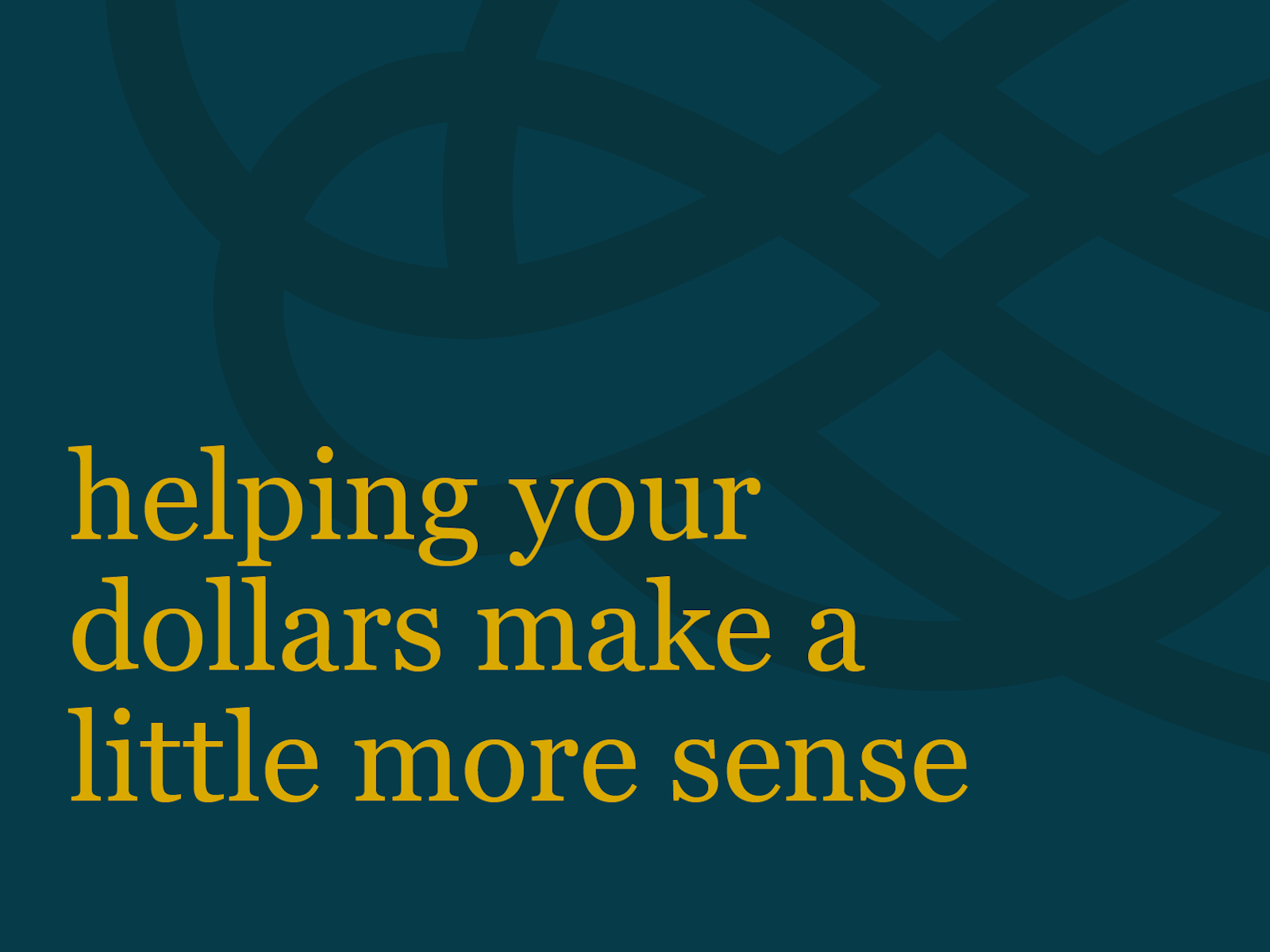
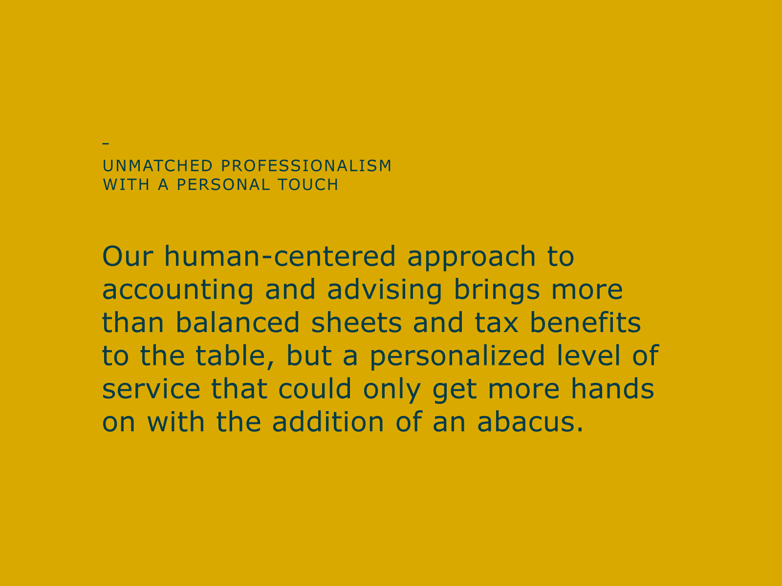
New brand messaging was developed to further unify the three distinct business entities under a shared vision that transcends transactional service, and rather, repositions the brand as an ongoing financial advisor for any and every client need. A future-focused mindset is a common theme throughout messaging, giving nod to the overall rebrand as well as further underscoring BGM’s commitment to providing the innovative solutions and well-established expertise needed to advise clients through any season they’re growing through.


Website
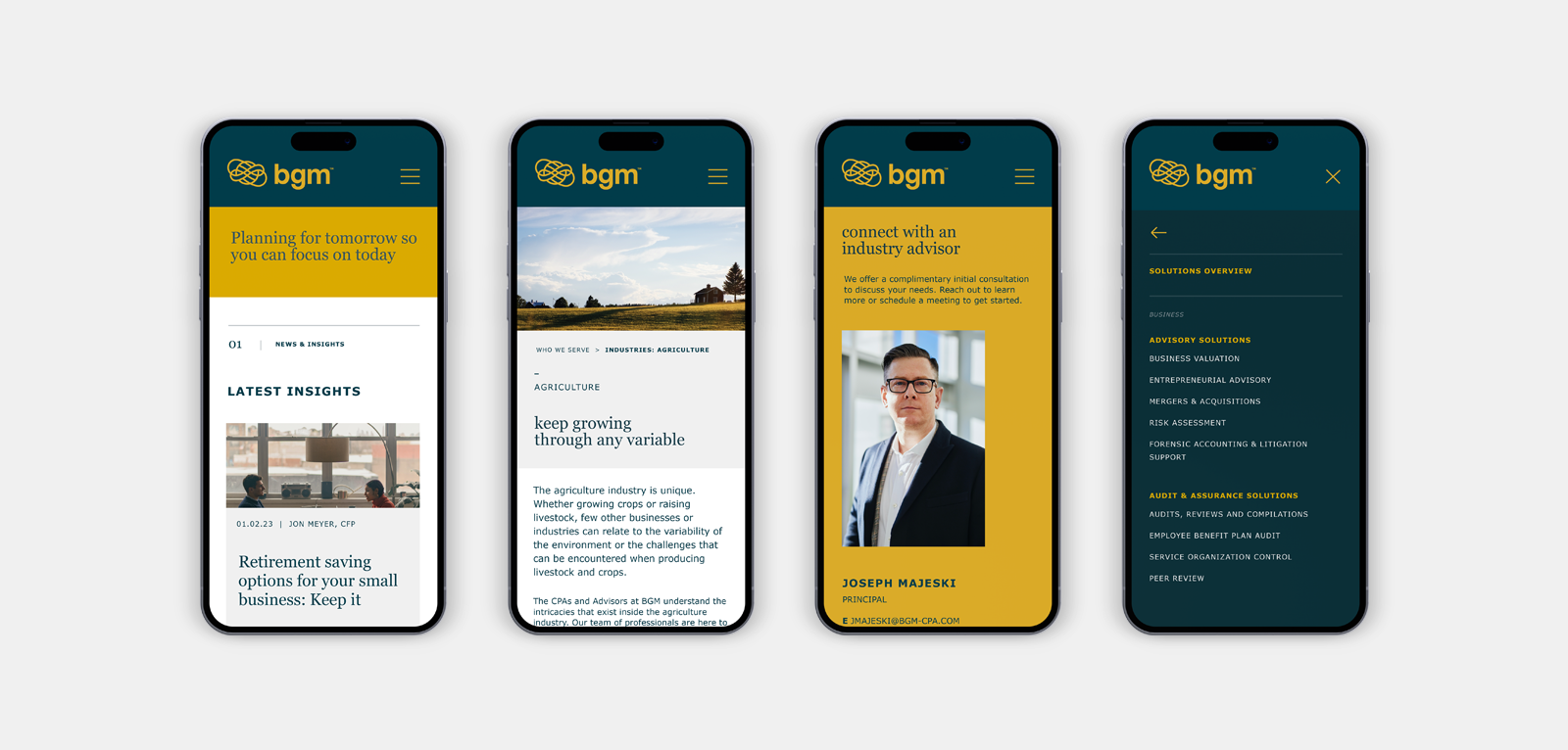
All efforts culminated to execute the most essential external touchpoint of the rebrand, a new website. With an objective to clearly articulate the wealth of information found across three distinct websites into one new site unified by BGM’s updated brand and mission, saying the endeavor required a little up front calculation would be a mild understatement at best.
A deeply thorough site-mapping and content outlining process were conducted to ensure every essential piece was accounted for, any extraneous detail was dropped, and any gaps in content or design were filled.
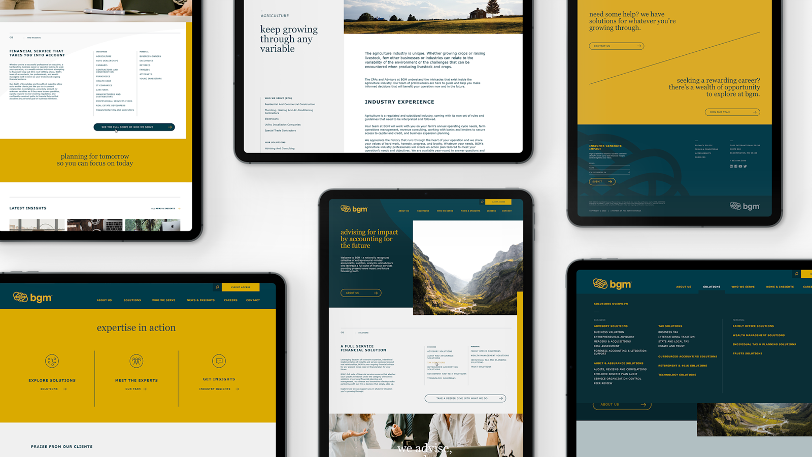
The result? A streamlined information architecture, content strategy and user experience that better highlights BGM’s dynamic content and robust solutions.
Menus were organized and optimized for enhanced site navigation. Accordions were implemented to provide BGM’s prolific content a place to live while also making page layouts more digestible. A comprehensive web of intersite links was woven to give visitors easy exploration access between BGM’s distinct business lines and served industries.
The results
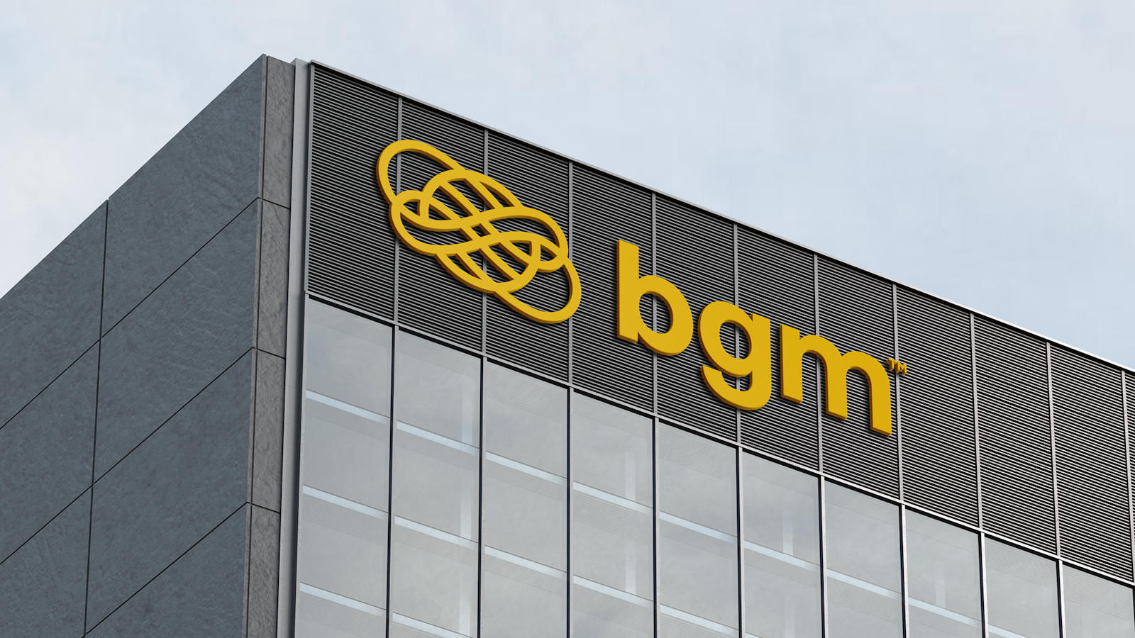
The brands have successfully come together under one united purpose - to guide and deliver all-encompassing solutions that enable clients to achieve any financial goal. The newly launched BGM will allow the brand to grow forward with one strengthened message and marketing strategy with hardworking tools promoting brand consistency, from brand guidelines, to collateral, to signage, and a wholly reinvented web experience.
Testimonial
“I am thrilled with the outcome of our rebrand and website project. Right from the outset, I knew we were in the hands of a talented team that could guide us through the challenges of such an endeavor. The team’s attentiveness and proactiveness are a testament to their commitment to excellence. They encouraged us to think differently, allowing us to achieve a standout finished product. Throughout the project, Capsule seamlessly integrated and collaborated with our existing partners, while also introducing us to other valuable resources that are helping us achieve success post-launch. Working with Capsule has been both professionally satisfying and a lot of fun!"
Leah Radtke Marketing Manager, BGM