Hydro Flask
The Challenge
Hydro Flask, the go-to container for all beverage types and temperatures is known for both its vibrant colors and sleek designs. Seeking a packaging system that was not only sleek and functional, but also suitably met the stringent sustainability standards of important retail partners like REI, Hydro Flask came to Capsule seeking a packaging refresh that would build upon the previous standout system we had crafted for them.

The Solution
Utilizing previous in-depth qualitative research we conducted with Hydro Flask for their original packaging system design, Capsule built on the insights already gathered from in-aisle interviews as a starting point to shape a similar system with added sustainability in mind.
Capsule conducted an additional in-store audit to assess how Hydro Flask stacked up against competitors in store navigation, packaging and brand and information hierarchy, taking our findings into design with a holistic view of the landscape and areas for improvement in Hydro Flask's display and experience, material choices and overall brand positioning on shelf.


Less is more
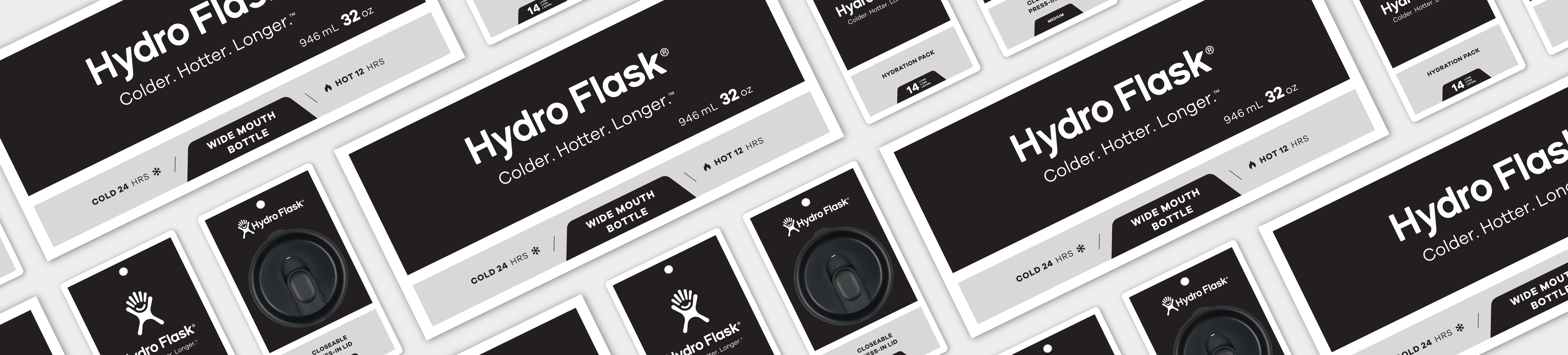
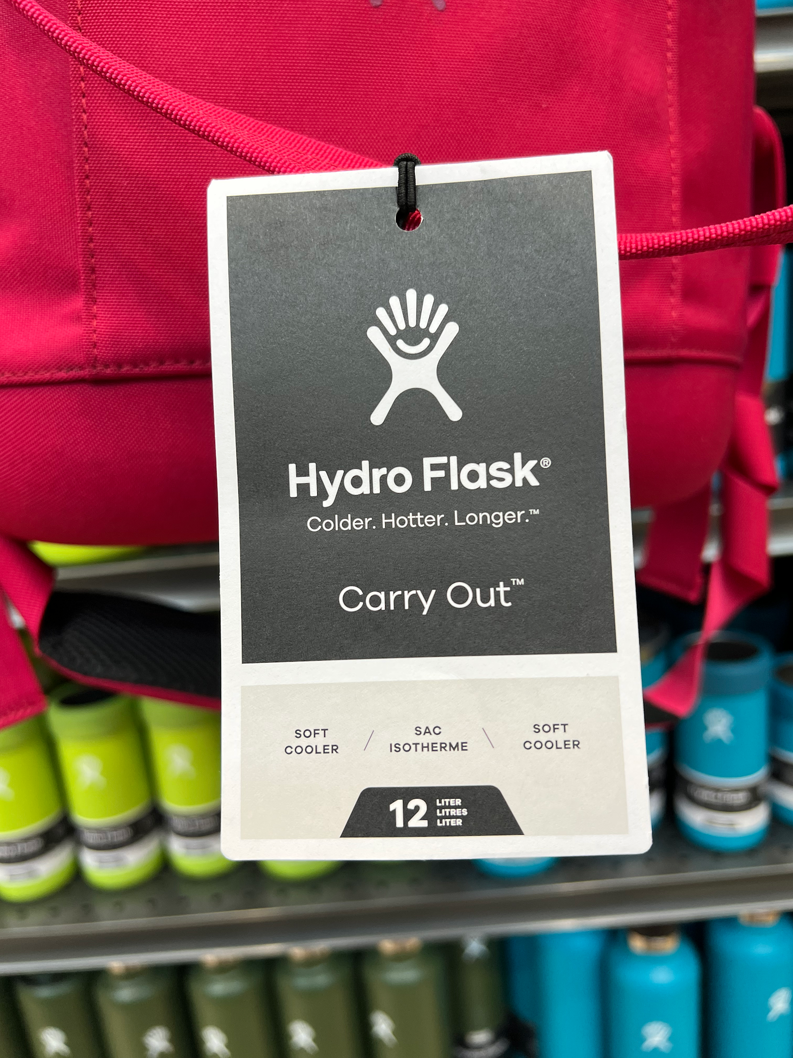
Capsule added to the successful packaging design effort we'd already accomplished by reducing the materials used in the system. Recyclable friendly print processes were utilized, biodegradable adhesives were explored and any trace of plastics, foils or varnishes were eliminated to produce an update that featured a simple, yet premium look that allows the energizing colors of the actual products to vividly pop.
The updated system not only builds on efforts to clearly communicate product positioning and benefits, but brings a consistent look and sustainability level to packaging across multiple product lines such as soft goods, water bottles, accessories and, most recently, Outdoor Kitchen cookware and utensils.


Naming Strategy
The original brand and product research also guided names in three different categories: color, product and series. The subsequent names born out of our unique naming process were chosen to further establish brand resonance, match Hydro Flask’s personality and align with the particular use of each product.


The Impact
Inspiration and insight from the our previous work flowed seamlessly into the newly designed system, pulling together language, icons and a playful naming convention already developed while reducing materials for greater compliance and success with sustainably-minded retail partners.
Testimonial
"Capsule was a great partner for our packaging refresh. Their work was thorough, timely and exactly what we needed. Considerable thought was put into strategy and execution, resulting in an excellent finished product."
Eric Molletta Senior Creative Services Manager