Minneapolis Downtown Council
The Challenge
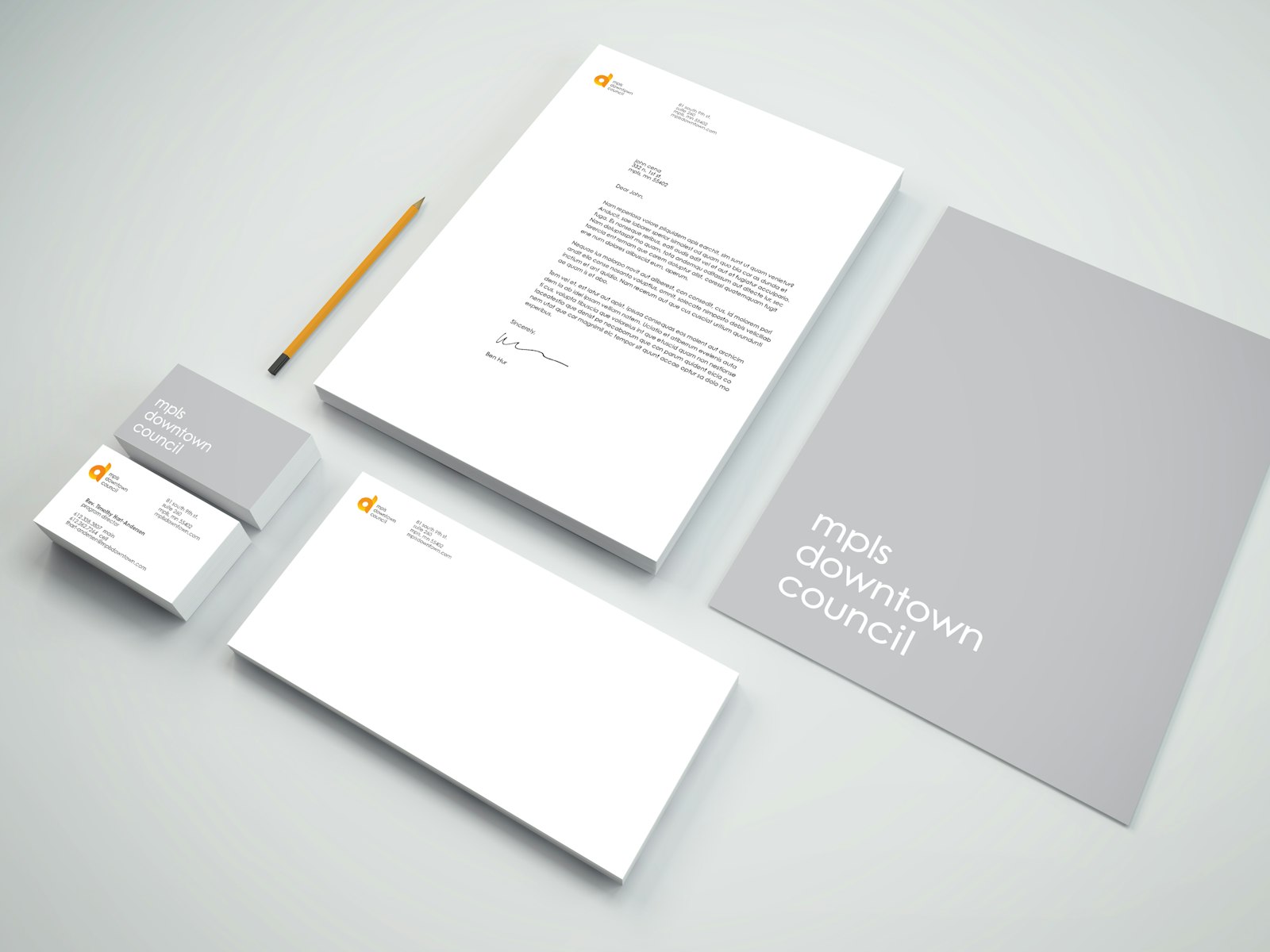
A collection of the city’s brightest leaders and businesses small and large, mpls downtown council is a historic central business district association skilled in collaborating to solve issues and shepherd community initiatives that fuel the vibrant city of Minneapolis. Working alongside partners for over 70 years, MDC embarked on a new collaboration with Capsule to rebrand and redefine what MDC means to its community today.
THE SOLUTION
It was only natural that the vision was fueled by a diverse and skilled MDC member task force made up of prominent business leaders and strategists. Capsule conducted stakeholder focus groups with MDC board members, Minneapolis businesses and employees and partner organizations to understand current brand perceptions and dream up the next chapter of the brand. This research was core to the new brand strategy and visual identity development.
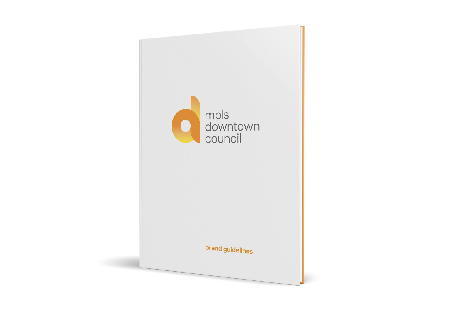
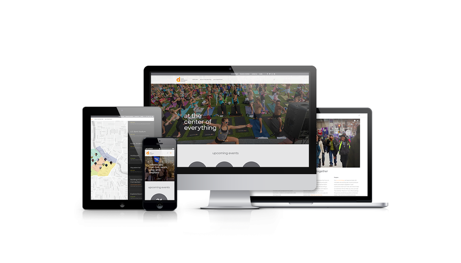
The impact
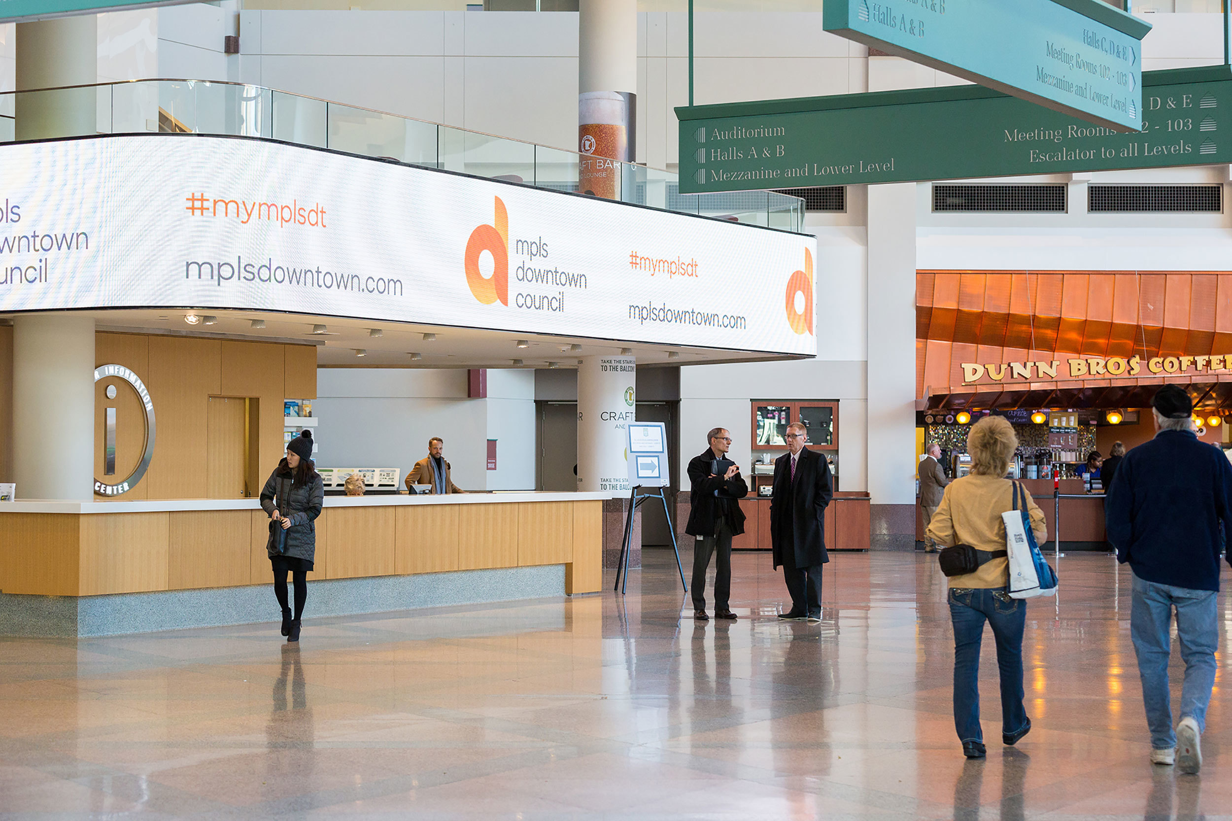
The brand launch reverberated across downtown Minneapolis, with printed and digital signage, a promotional video and launch event to celebrate the evolution. The MDC logo was also recognized in the 2017 LogoLounge Trend Report.
Testimonial
“Our rebranding task force and Capsule helped to land us in a strong spot with a visual identity that is reflective of our organization's role in our 21st century downtown where people, ideas, and experiences converge to create a place people are drawn.”
Leah Wong, Vice President mpls downtown council

