Double Cross Vodka
The Challenge
After stirring expansive brand appeal and recognition for over a decade through an iconic rectangular bottle designed by Capsule, our friends at Slovakian-inspired Double Cross Vodka were looking for a refined evolution of their premium bottle with an added emphasis on functionality and helping bartenders everywhere achieve “the perfect pour.” Double Cross turned to Capsule to provide a splash of fresh inspiration into a customized bottle structure and design that would increase user utility while maintaining the elegant and luxurious personality of the brand.
The Solution
This design initiative began with in-depth research in which we not only examined dozens of competitor bottles both on the shelf and in the office (don’t tell the boss), but visited a few of our favorite local watering holes to ask bartenders and mixologists what shape of bottles they grabbed first for a preferred pouring experience.
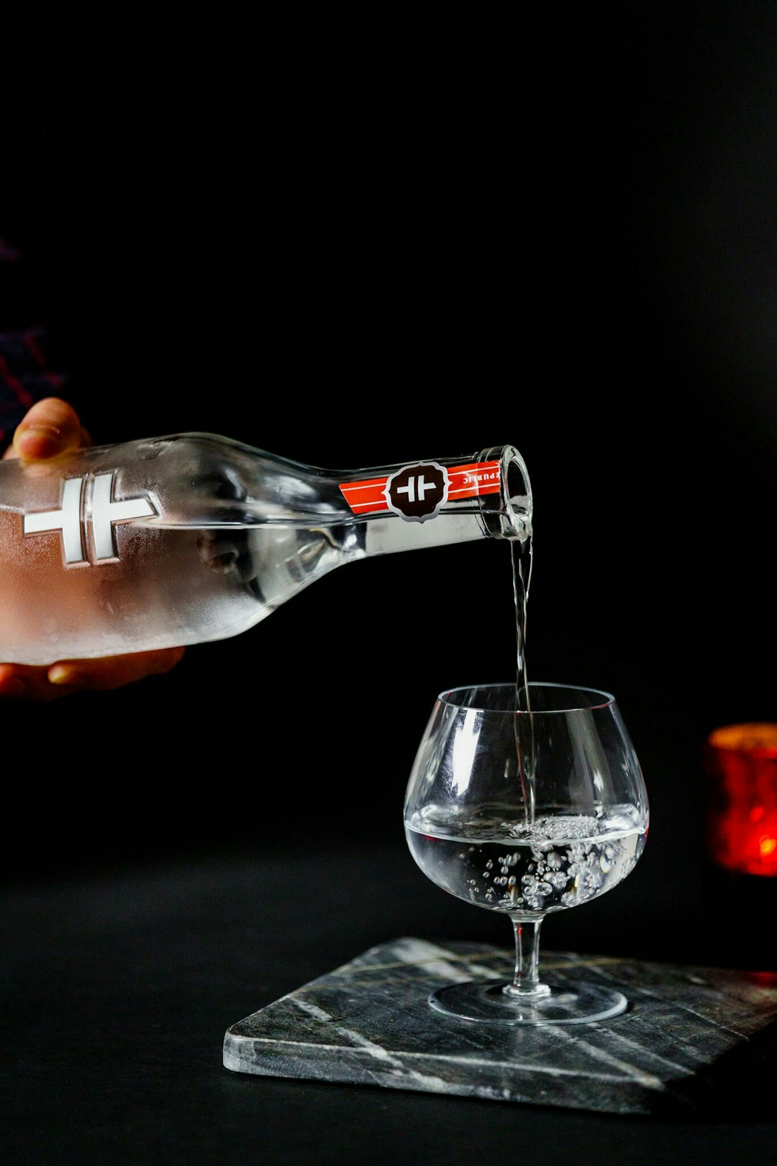
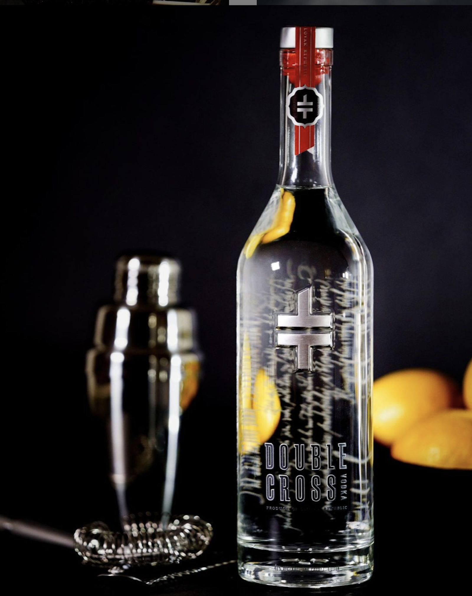
Filled with the insights of industry experts, we began designing a custom bottle structure in-house. We translated our ideas into 3D printed prototypes and consulted our bartenders and mixologists yet again so they could tactilely test our in-progress ideation. From these trials, three sizes of the bottle were eventually developed, all with thoughtfully crafted and bartender-tested bottle necks and shoulders that were purposefully shaped for better hand grip and a perfected pour.
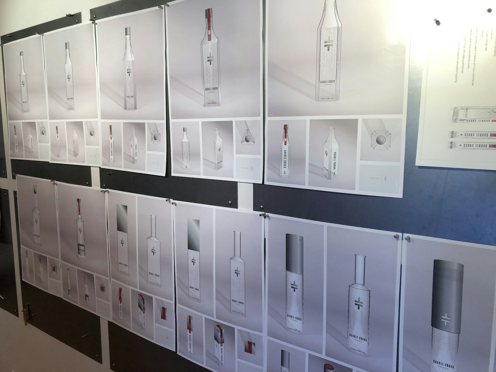
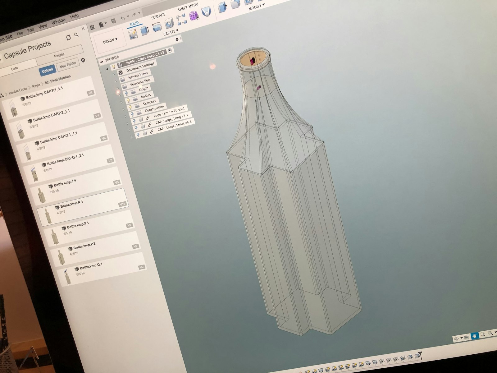
Seeking to fulfill the client’s ask to reduce packaging costs, we tested a variety of materials and weights to design a customized metal cap that would reduce the price of packaging production without sacrificing the brand’s premium look and feel. CAD-designed custom stoppers in Double Cross red were also produced, along with a newly designed tamper seal that would work on a rounded bottle rather than the original, rectangular cap design.
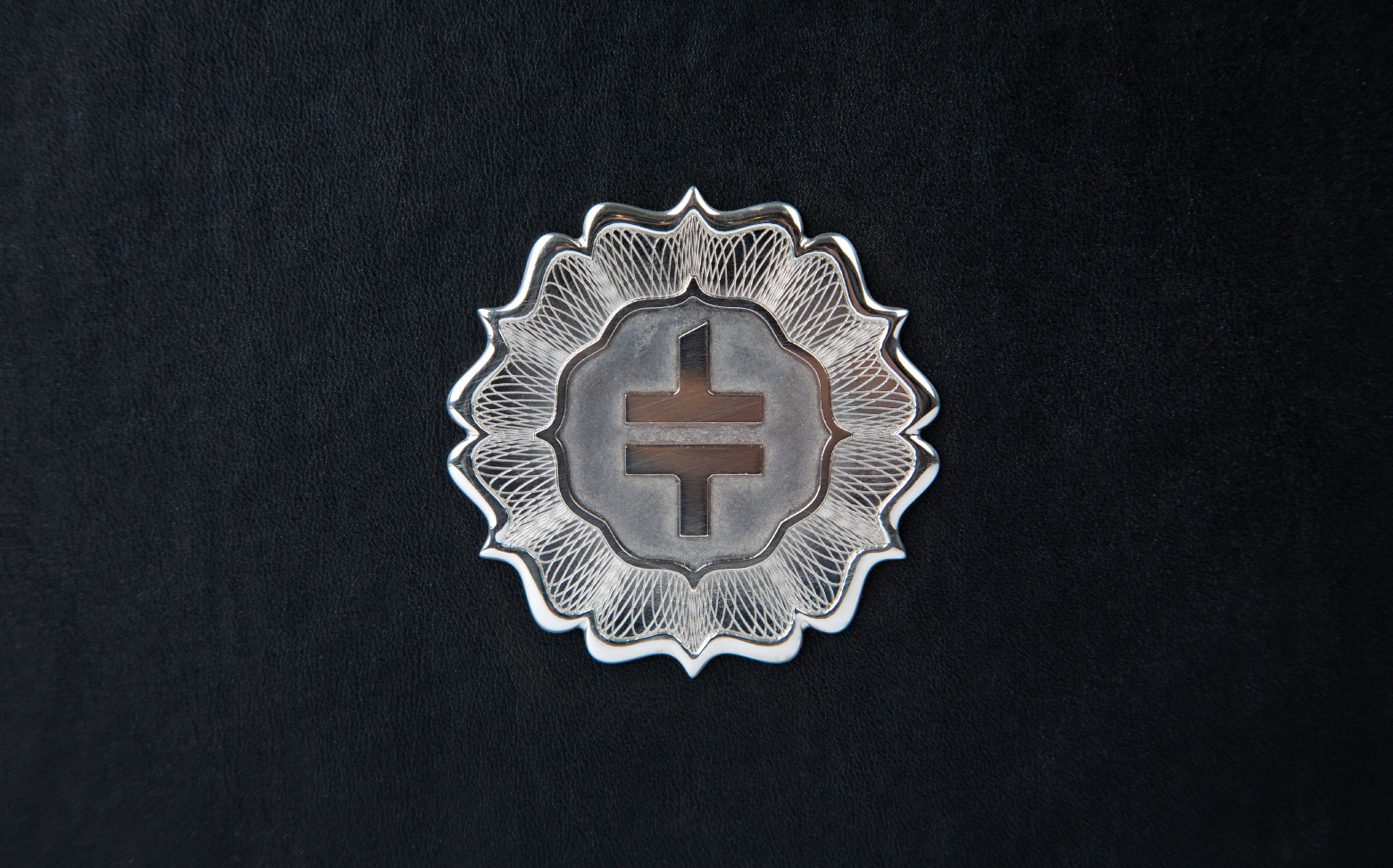
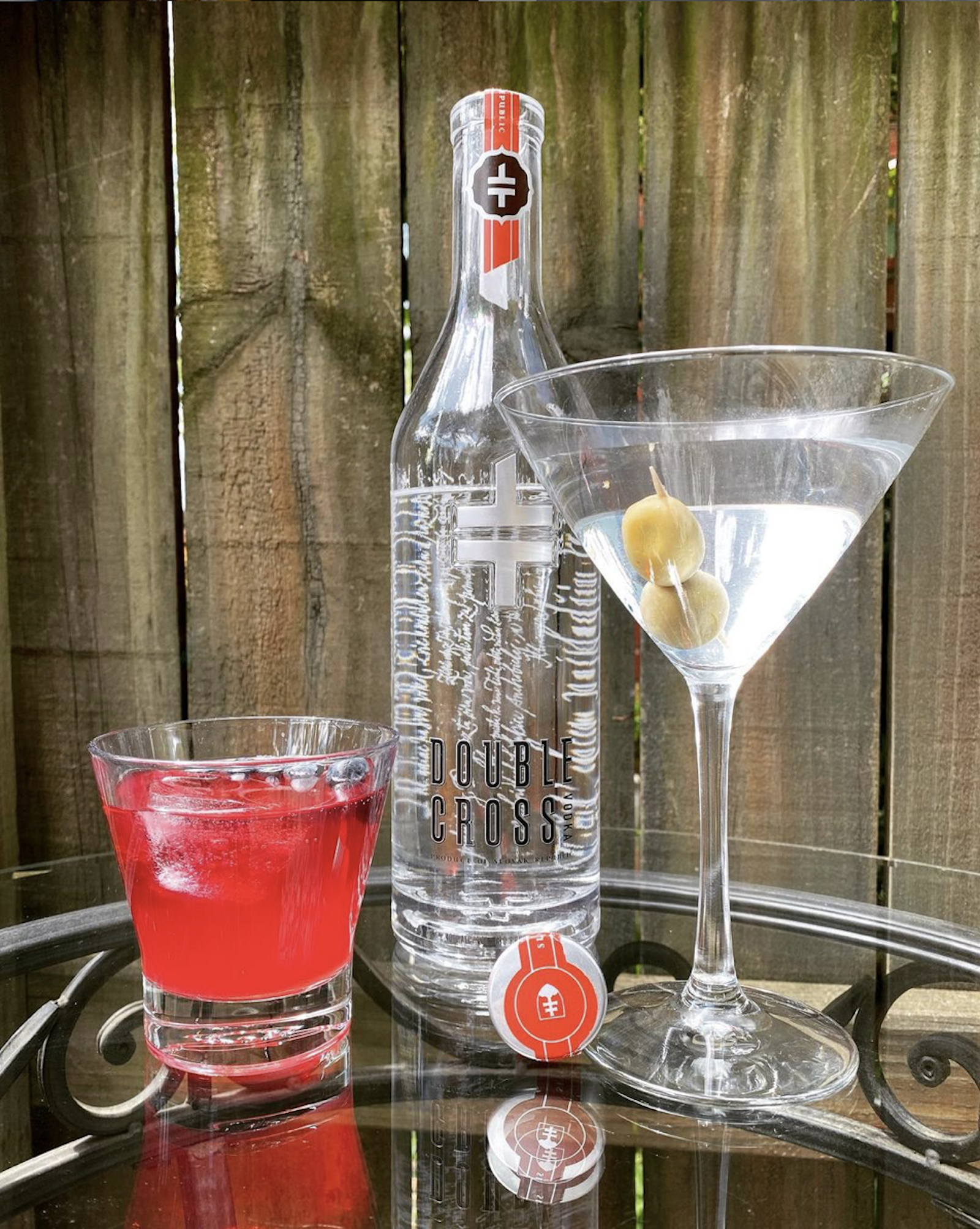
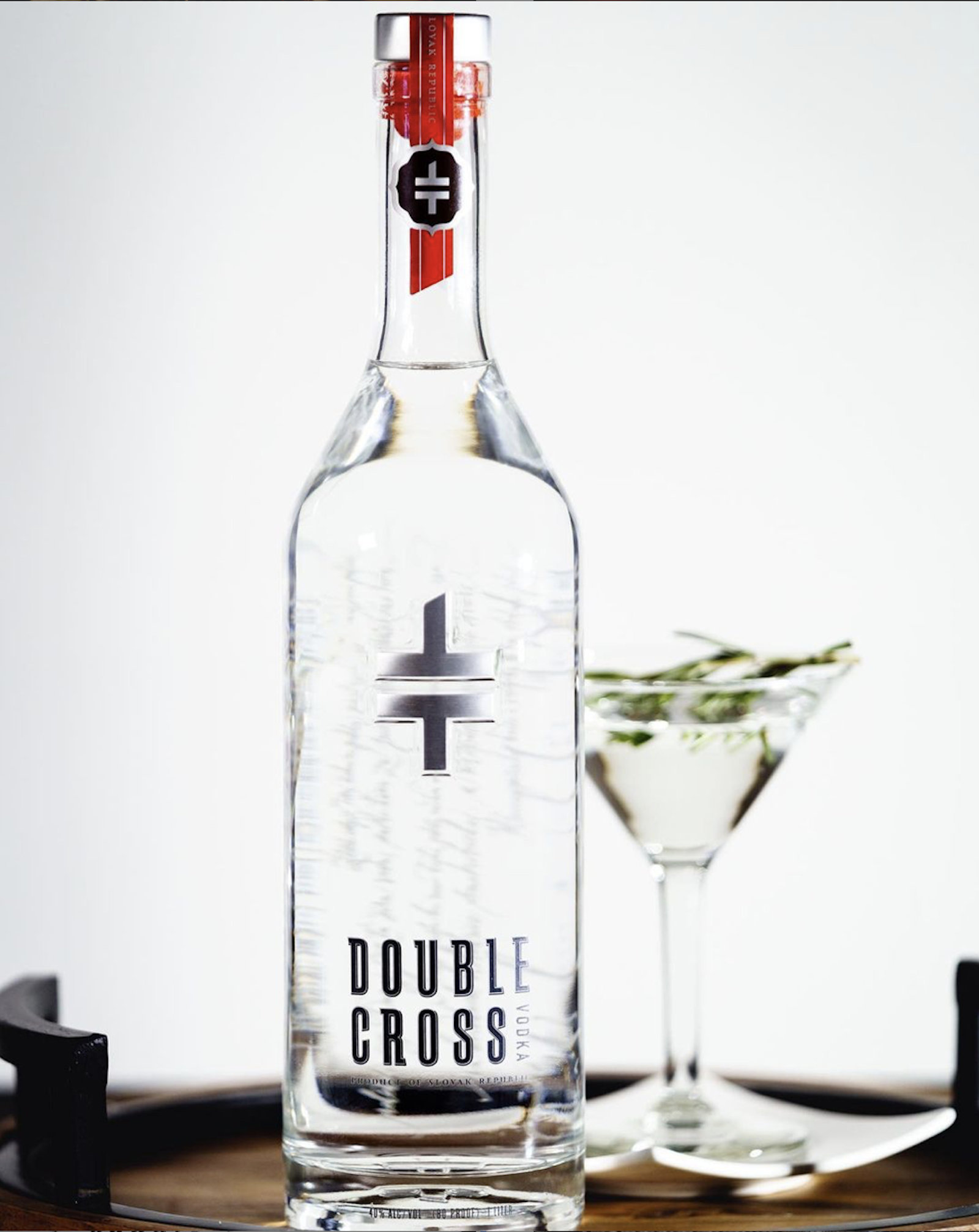
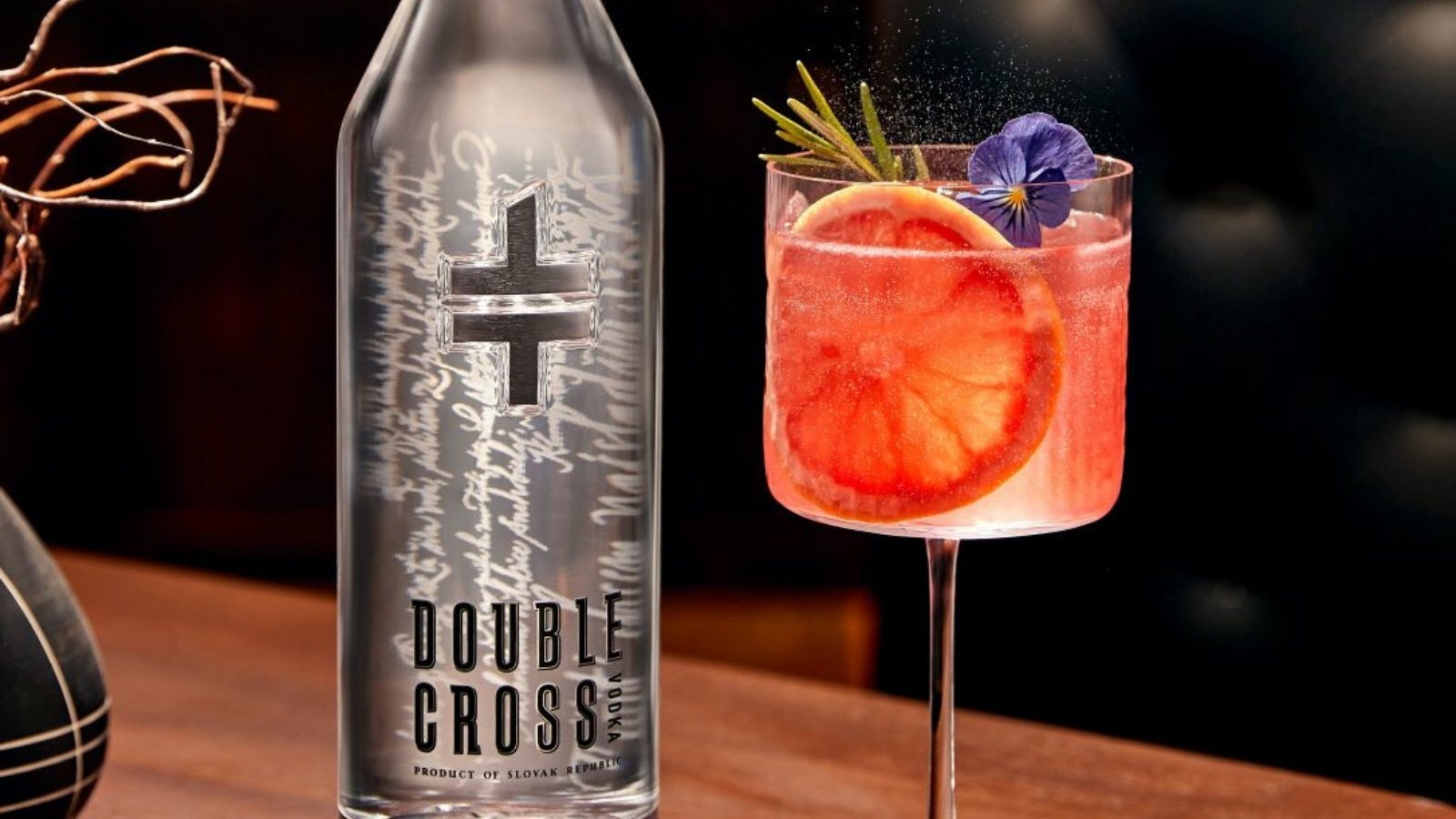
In addition to embedding a metal Double Cross mark front and center of the bottle, the mark was molded into the glass at the bottom of the bottle as well. While the original typeface was maintained, typography evolved to stack on itself to fill more bottle space and generate greater brand presence. Many successful elements of the original design were translated into the new bottle, including a horizontally cascading Slovakian poem etched into the back of the bottle.
The Impact
Reproducing the original consumer enthusiasm and brand distinction when updating an iconically successful design is never an easy feat, but the new bottle delivers just that and then some with an elegant look and feel, cherished and readily recognizable brand elements, and increased utility purposefully designed into the shape of the bottle for those who interact with it most.
Testimonial
We’re very happy with the new Double Cross Vodka bottle. Capsule took the award-winning, iconic bottle they originally designed ten years ago and, collaborating with the Double Cross team for over a year, designed a functional bottle with exceptional pourability while matching the brand and high-level aesthetic of the original rectangular bottle.
Linda Gawne Chairman at Double Cross Spirits, LLC
