Bright Blue Health Center
The Challenge
Tyson Foods was developing a brand new health and wellness initiative custom built to serve a growingly diverse workforce and their families. Through the planting of world-class health centers directly located within the communities that their team members lived and worked, Tyson was seeking to pack both primary and preventative care into a single, world-class healthcare experience. One that would not only treat symptoms or conditions, but intervene early on to help individuals form healthier habits and more fulfilling lifestyles.

Before they could open the doors to these health centers, however, Tyson needed a brand that could represent the revolutionary benefit this care system could bring to its visitors’ work and wellbeing. Capsule was engaged to deliver a full brand build that could communicate the total, holistic health resource of this new offering and neatly fit within the Tyson Foods brand hierarchy, while also being able to shine bright when standing on its own.

The Name
We began by prescribing Tyson a series of brand discovery exercises through our patented Foundations process to uncover core pieces of brand identity such as comfort, inclusivity and active guidance that would inform our ideation and eventually lead us to the name Bright Blue.
Bright Blue is an inviting oasis of care, alluding to a soft, warm light in the midst of dark situations. Providing a subtle nod to the Tyson Foods brand with it's blue hue reference, it calls to mind a clear sky or vast body of water, and inspires feelings of calm, serenity and endless possibility.

MEANING
A shining light in the dark, a guide and source of comfort in even the most uncertain of times.
Brand Hierarchy
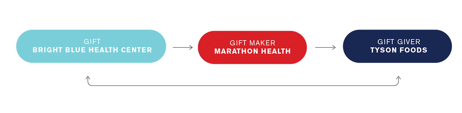
Careful to consider Tyson team members' desire for confidentiality with sensitive medical information, Capsule helped the Tyson Foods and Bright Blue brands define a clear brand hierarchy structure to highlight the fact that these health centers would be operated by independent healthcare systems and that Tyson would act as the "gift-giver" of Bright Blue's beneficial services to team members rather than the end provider of care.
Throughout subsequently created brand elements, from messaging and collateral to visual identity, Capsule helped maintain clear brand hierarchy order, emphasizing the Bright Blue brand over its Tyson roots to ensure greater trust and adoption from visitors.
The Mark
The mark visualizes the brand as a stylized burst of light, sitting nicely over the “i”. The beaming light highlights the positive energy resulting from holistically healthy living and nods to the sense of welcome and comfort one gets from a place that sheds light on exactly what you need.


While designed to stand on its own, the mark was also thoughtfully crafted to fit seamlessly within the the larger Tyson Foods brand hierarchy and visual style. Elements such as Tyson’s distinct and professional dark blue are incorporated into the logo, which, when contrasted with a more modern yellow, brings a comforting aesthetic balance to the mark. This new yellow also highlights the “Bright” aspect of Bright Blue without use of a literal “bright blue” color.
The Messaging
With an overarching goal of making the pursuit of wellness feel less overwhelming, Bright Blue was in need of a messaging strategy that highlighted its ability to provide care with lighter burdens on costs to visitors' time and energy, while also giving access to brighter futures for their health and wellness journeys.
Capsule continued to define Bright Blue’s core personality traits and tone of voice to develop a clear and engaging messaging strategy that could work across multiple communications channels, creating touch points among key audiences such as Tyson team members, their families, Tyson leadership and the local communities within which the health centers would be located.


Visual Identity & Collateral
Bright Blue’s visual identity is built upon a grid system that generates greater brand recognition and creates an underlying structure for all promotional communications. The grid allows a flexible, consistent design approach and supports a large variety of layouts and designs, all while maintaining maximum brand presence.


The grid system works in conjunction with the Golden Ratio’s “rule of thirds”, a mathematical relationship of proportion that can be found in our natural world. Providing a visual composition that appears more harmonious, balanced, and aesthetically pleasing.
The Bright Blue system is grounded in the Tyson Foods brand standards and features Tyson’s notable blue, while adding its own unique brand character through custom color elements such as the bright yellow. The photography style showcases authenticity with natural lighting and diversity in age, gender and race represented throughout the shots.
Customized iconography was developed to distinctly represent common health journey touch points like nutrition, exercise or primary care checkups, giving a simplified communication form for an audience with members speaking a variety of languages.
Outdoor signage was developed to fully display this vibrant system in each new location, along with initial brand launch collateral pieces including appointment cards, magnets for team members homes or work lockers and tee shirts to further promote the brand within local communities.

The Impact
With a full brand build in the books, Bright Blue was met with glowing internal reviews from Tyson leadership. This inspiring health and wellness effort has begun the process of radiating its effects outwards into Tyson Foods plant communities with the successful launch of 7 pilot locations throughout the nation.
Client Testimonial
"Aaron Keller and the Capsule team are tremendous partners. Their co-creation and brand-building abilities are exceptional. Together we built a brand through their empathetic and collaborative approach and partnership with my Design Leadership team and our broader Tyson team. From journey mapping and their proprietary naming methodology to brandmark design and brand strategy to an assortment of artifacts bringing the brand to life for team members, Capsule proved to be a valued partner."
Vinessa DePinto Director of Brand Design + Strategy, Tyson Foods