Take16 Brewing
The Challenge
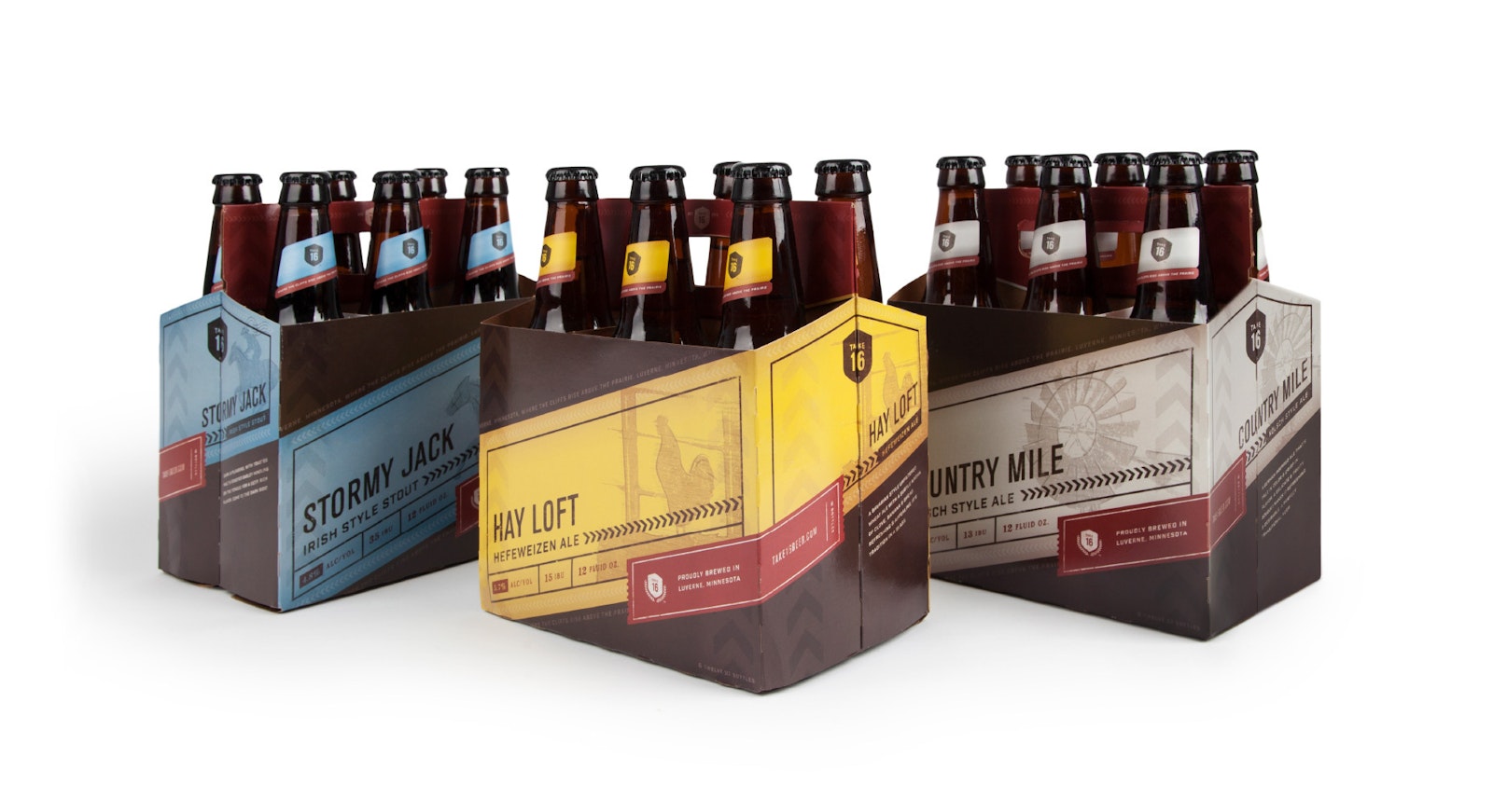
Take16 Brewery is a hometown, homegrown brewery proudly founded and established by the community of Luverne, MN. As the foundation of the brewery was laid, the foundation of the brand was also established. And as the brewery was constructed, so was the brand’s identity. Capsule moved through the entire brand development process with Take16 to establish a visual identity that didn’t stray far from Luverne’s main street.


the solution
It all starts with a name. Take16 Brewing Company is where small-town memories are made and small-town heritage is shared. The name pays homage to US Highway 16, a 1,600-mile thoroughfare that fostered many new towns along its borders, including Luverne. Certain elements in the identity were designed to specifically reflect this legacy; the tire tracks represent the journey taken and the shield shape resembles old highway signage.


The Impact
Just as a beer requires patience and careful attention to the ingredients used, a brand strategy requires thoughtful attention to brand personality, vision and values. Incorporating a mark and identity system that combines elements of a storied local history with the feelings of a bygone era, Take16 Brewing has firmly established itself as a fixture of its community.


