Soli
The Challenge
Our longstanding partners at Pacha Soap Co. approached Capsule to assist in the creation of a fresh new sister brand of essential oils. Tasked with formulating a brand that could independently stand on its own, while still connecting to Pacha’s global mission of “raising the bar” in creating transparent and transformative global trade, Capsule had the opportunity to put its nose to something a little more pleasant than the grindstone, developing a distinct name, brand identity and packaging system design that would encourage customers to stop and smell the aerosolized roses.
A Name that Stands on Its Own
Distilling the new brand’s unique values, differentiators and vision captured in our brand strategy process, Capsule ideated and authored the brand name, “Soli.”
A play on the word “solely” and "sun," this name highlights the brand's focus on single source scents, each derived from a unique plant origin and location, as well as harkening back to its 100% pure and natural ingredient makeup.

Meaning
As in 'exclusively' or 'only,' a singular and pure source, something that can stand on its own and flourish
A Mark that Brings it All Together
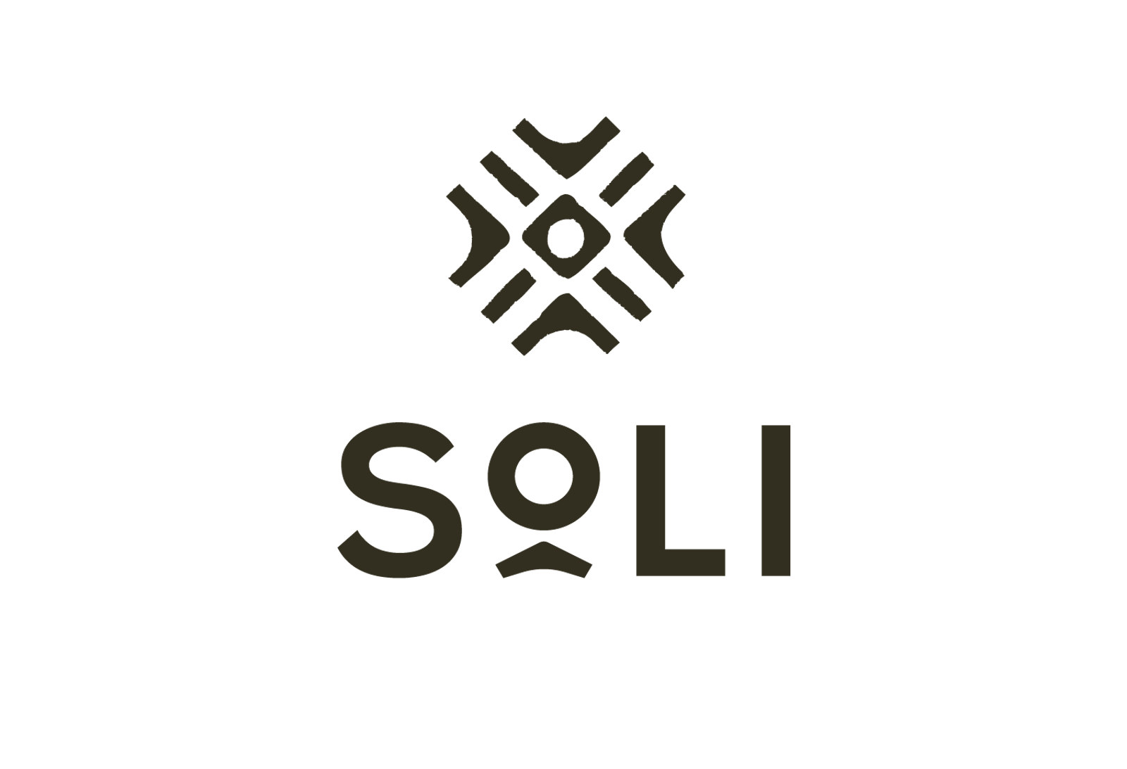
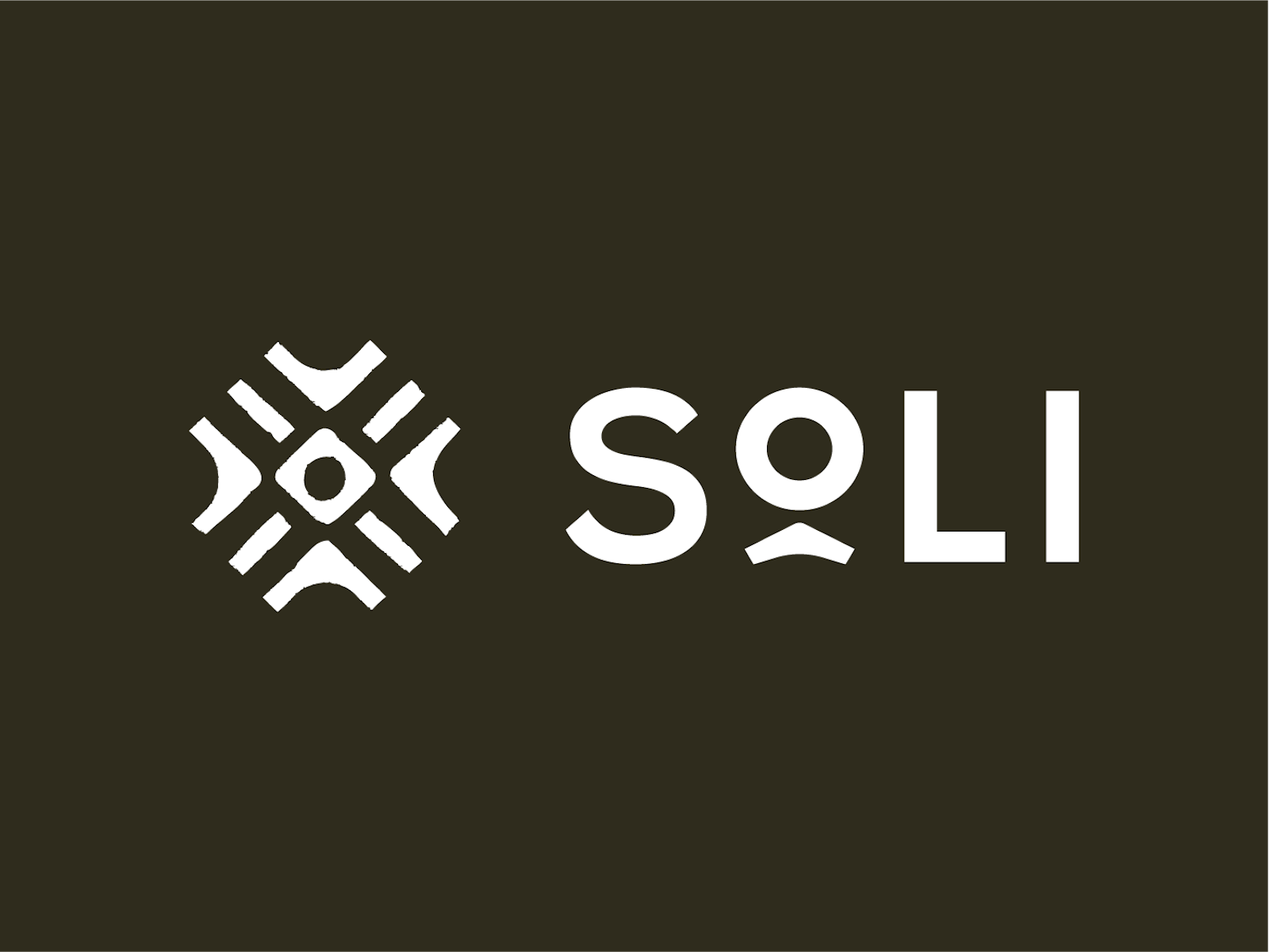
Utilizing distinct pieces that form a cohesive whole, the logo designed signifies the respective elements coming together, like the land, farmers, sourcers and the distributors that collectively work to bring this product into its perfected final form. Arranged in a circular pattern, this mark pays homage to the name through the use of an abstracted sunburst, communicating associations with both growth and intentional movement.
The distressed style of this logo alludes to something handmade, yet natural. This rooted feeling is underscored further, as the logo intentionally points inward, representing a singular, central source from which ingredients are derived.

Packaging that Engages the Senses
Endeavoring to craft a brand experience that engaged more than customers’ olfactory senses, but visual and tactile senses as well, we began concepting a three-fold packaging structure. The unfolding of the box offered an informative and interactive experience, while ensuring safety in shipping and handling of the glass bottle contained within.


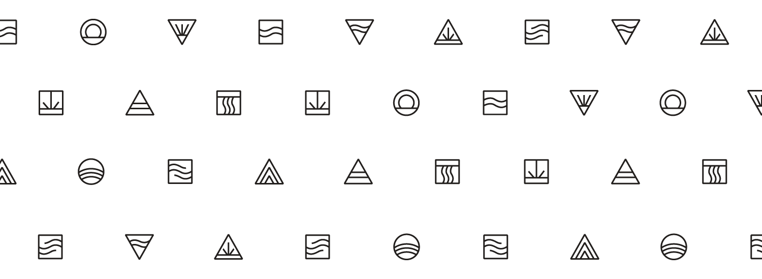
Diffuser designs, unique rips and diverse use interactions were all explored as we alchemized a compact packaging solution that reduced use of materials and enabled a more sustainable system. We carefully concocted a distinct color palette and full suite of iconography that could be seamlessly translated across unique product skus, including pure essential oils, roll-ons and flight boxes.


The Impact
The resulting brand work represents a momentous effort to source the best ingredients, design a natural product brand that reflects the essence of Soli and Pacha's purpose and deliver an engaging new sensory experience for the Whole Foods shopper.