Smartcon Solutions
The Challenge
Smartcon Solutions provides powerful software for multi-unit dwellings and commercial properties, integrating multiple building monitoring and management systems that boost energy and operational efficiency while maximizing comfort. These software solutions are deployed in hotels, apartment complexes and office buildings across the country, but the Smartcon brand wasn’t keeping pace with the expanding reach of its offering to serve new markets and buildings at a more holistic level.
Capsule signed on to help make Smartcon look and sound as integrated as their technology with a new value proposition. Beginning with a brand strategy process, our insights informed a new logomark, visual identity system and messaging platform that modernized the brand.
The Solution - Building an Integrated Vision
To begin, Capsule led Smartcon in a strategy process to unearth its brand challenges and future objectives for repositioning. Focused on defining its core purpose, key audiences and differentiators -- as a highly technical, customer-centered, vendor-agnostic full-systems integrator -- alongside key attributes of the identity, stakeholders were able to use this vision to strategically drive future brand decisions with cohesion and clarity.

Leveraging Smarter Symbolism
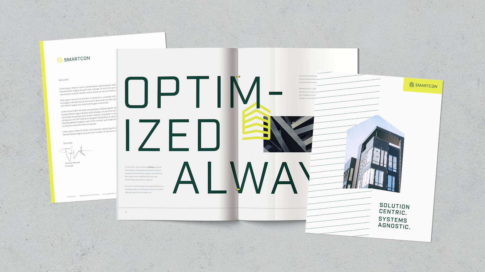
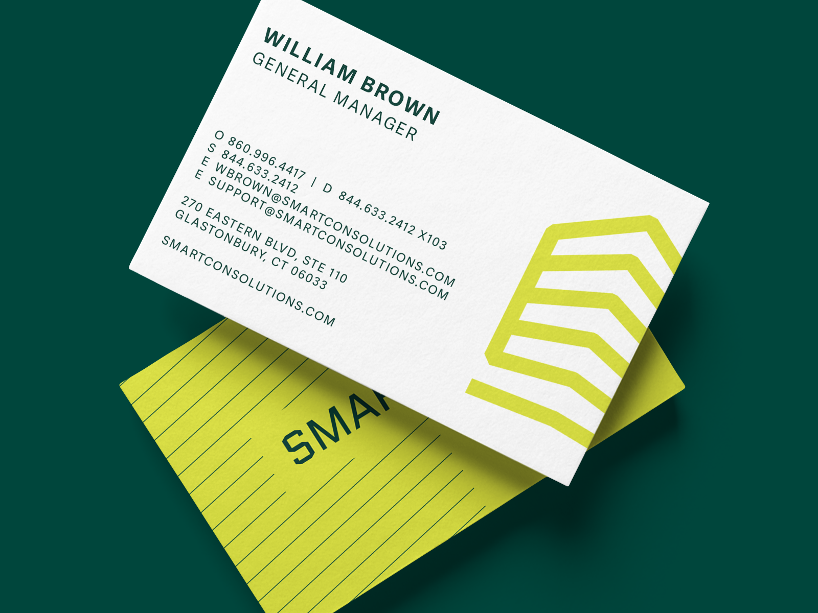
The new brand identity elevates Smartcon’s core combination: integrated buildings and software. Capsule designers found opportunity in imagery that tells both parts of the story at once, symbolizing an abstracted multi-story structure and server rack. Combined with energetic color and a bold, sturdy font, the mark communicates the future-forward reliability Smartcon’s audience demands.
A Technical, Clean System
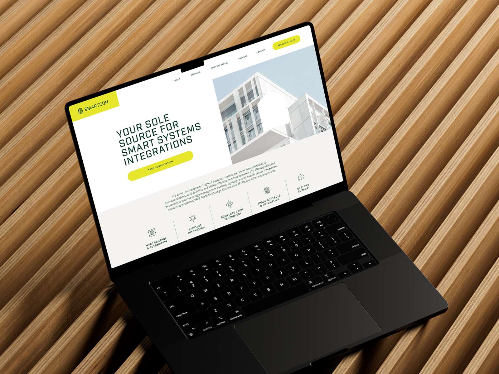
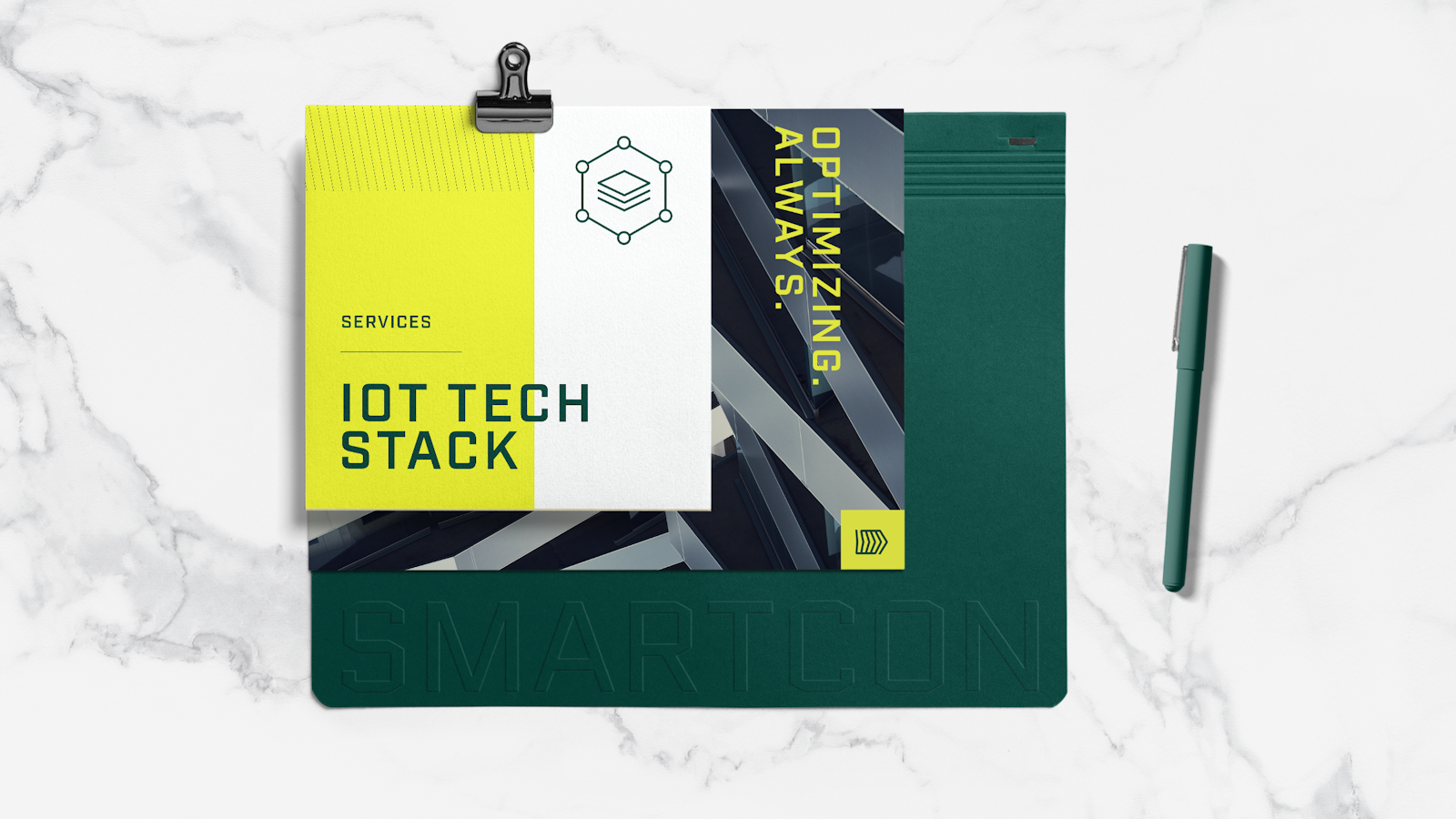
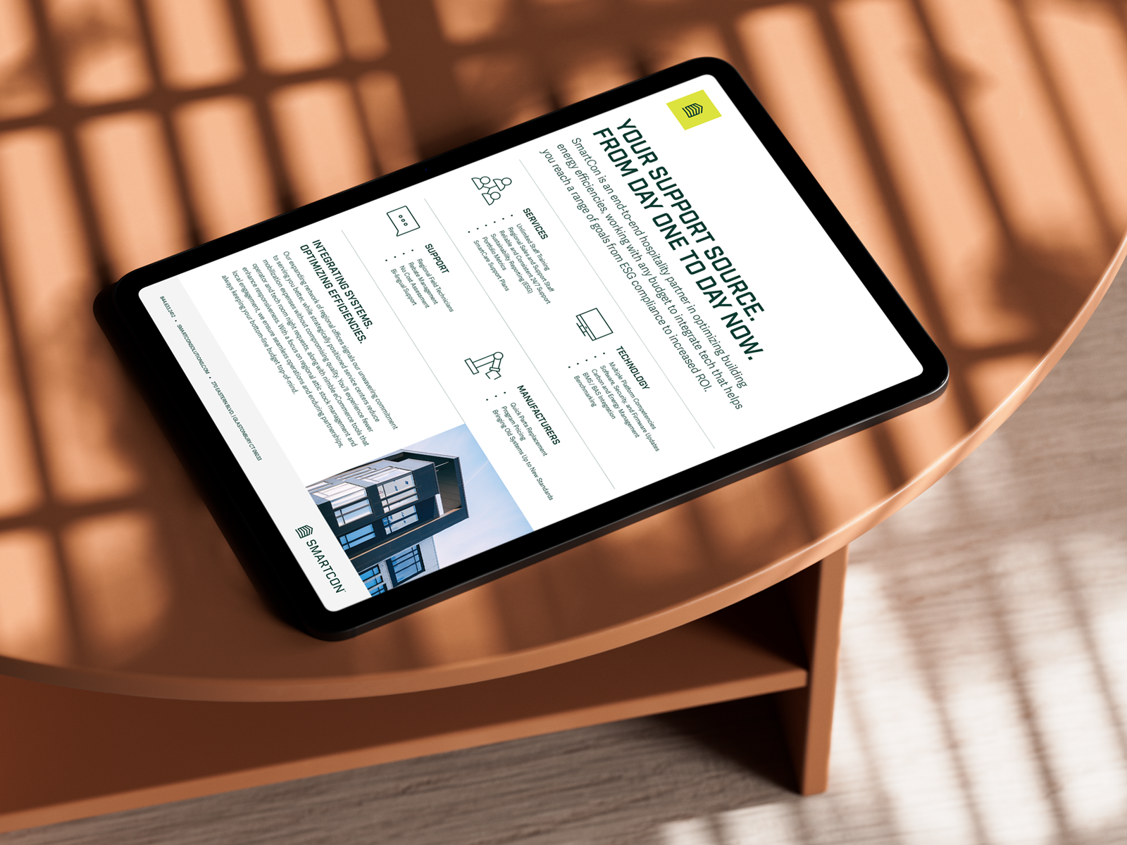
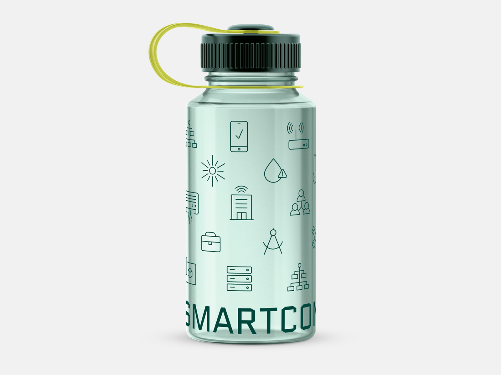
Smartcon specializes in spaces where comfort and efficiency matter most, so their visual identity system had to evoke crisp clarity and reliability amid highly technical functionality. The confident use of white and off-white combines with clean line work to further convey their professional, innovative personality, while a system of visual icons for each Smartcon service adds both aesthetic appeal and a sense of coherence to the diverse capabilities. Together, the visual identity system imparts simplicity amid complexity to build assurance and trust.

Optimal Communication
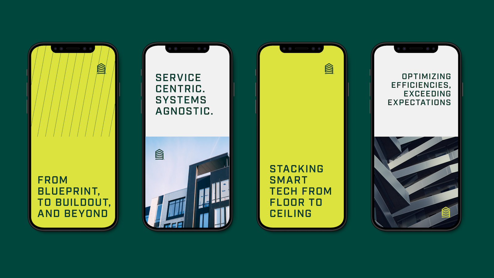
Smartcon’s new messaging platform communicates the uplifting reliability Smartcon customers feel with a sense of inspirational boldness. The new tone and narrative focuses on the benefits of an integrated system partner without overwhelming people with jargon and delivers ideas efficiently without losing warmth or meaning. Headlines and audience-tailored key messages linked seamlessly with the revamped visual style to fully optimize Smartcon’s brand for their markets of emphasis, bringing dynamism to a service sector not traditionally known for strong branding.

THE IMPACT
Containing highly-specific and technical solutions in a compelling, accessible brand without losing a sense of rigor is a challenge for many companies. But Smartcon leaned into a future-forward approach that we were delighted to bring to life. With the right visuals and the right language, Smartcon doesn’t feel like just another management services company — it shows up as a modern, efficient, innovative and necessary partner that simply makes operations easier.
With Capsule’s help, Smartcon created a brand as powerful and connected as their services. And with a new brand in hand, Smartcon projects confidence that customers can immediately feel.


