Minnesota Orchestra
Summary
Tuning up an orchestra’s look and feel for a fresh season
The Challenge
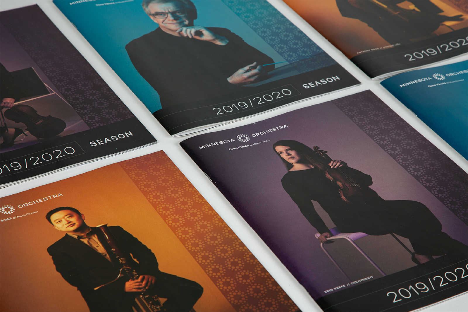
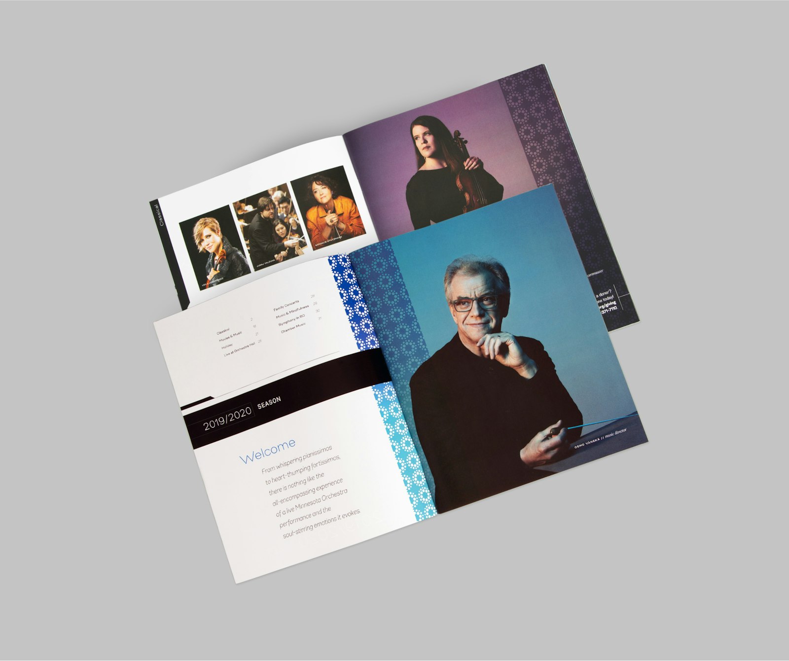
The locally rooted, world-renowned Minnesota Orchestra approached Capsule with a desire to update their look and feel for the 2019/20 orchestral season. The new system had to be flexible enough to account for all types of programming and communications including website, online ads, video content, in hall graphics, posters, brochures, social media and their full catalogue to be mailed out to season ticket holders.
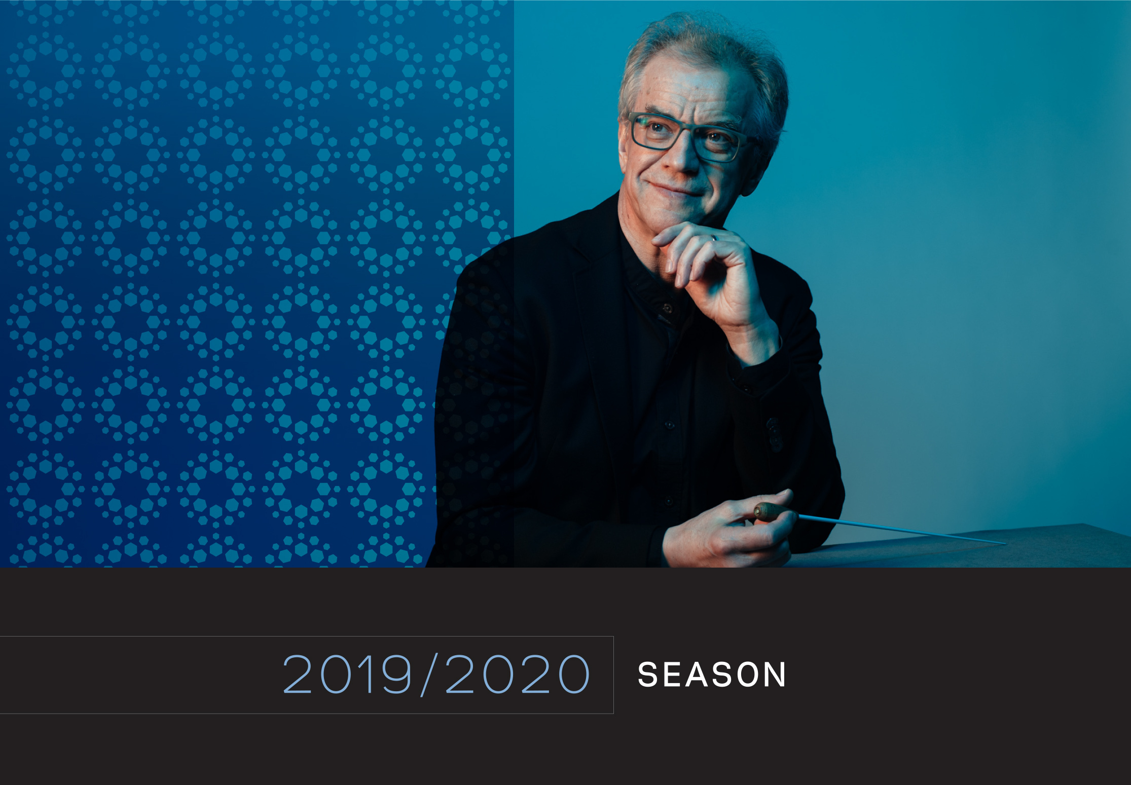
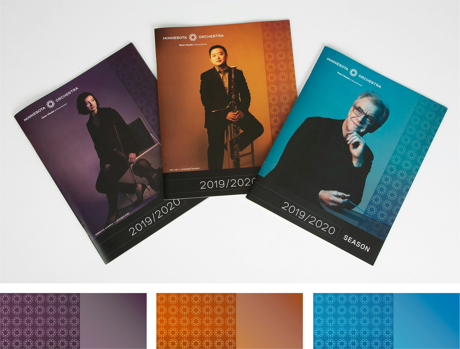
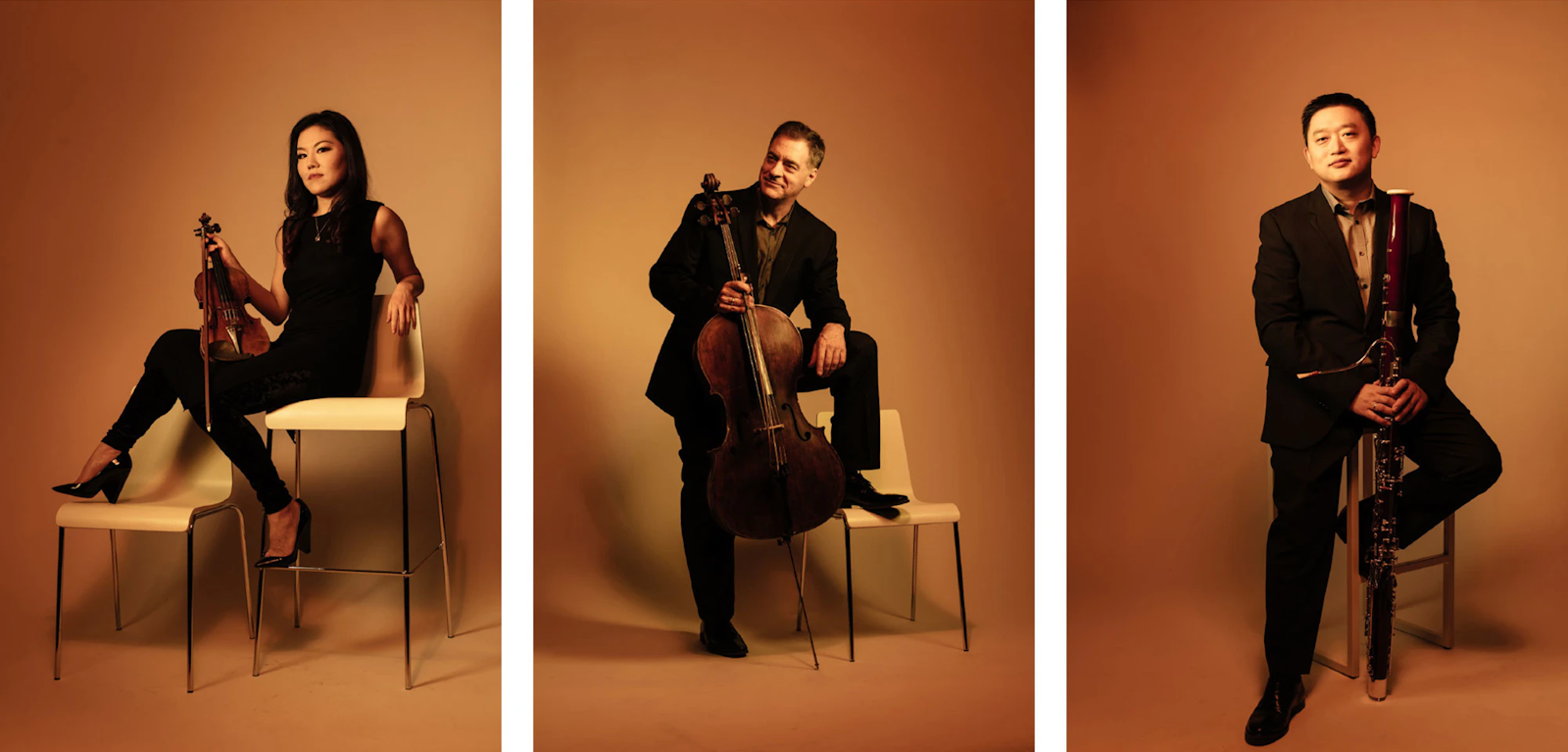
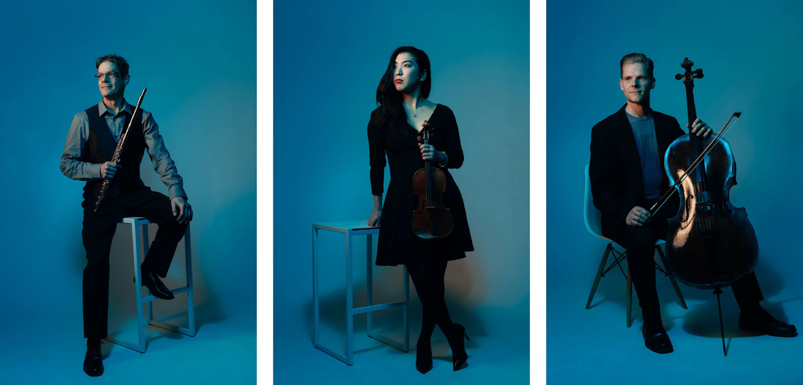
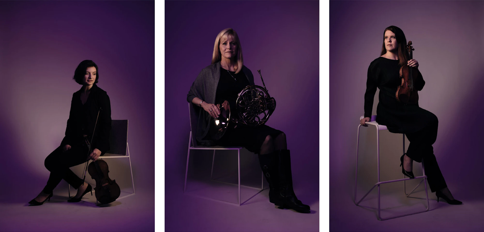
Capsule’s design team led the updated brand Visual Identity System by concepting, designing and art directing all visual elements, including photography style, color palette, typeface, layout and pattern. While reimagining several of these elements, it was also important that the look and feel made reference to the broader MN Orchestra brand, infused with new aspects for the season.
