AlpineAire Foods
The Challenge
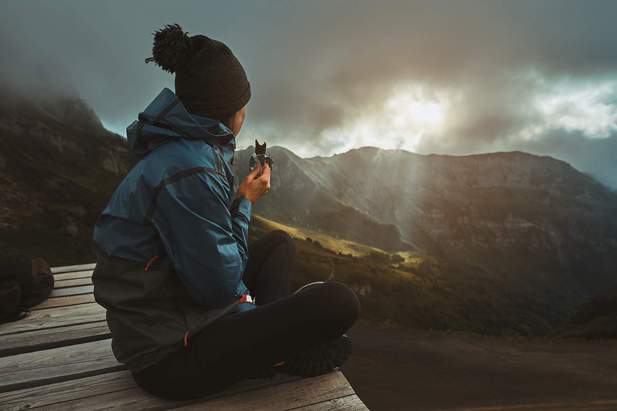
Amidst a myriad of dehydrated food brands, The Katadyn Group called upon Capsule for a holistic brand and package redesign for AlpineAire. Brand consolidation and fresh, new visual language were priorities.
The Solution
At the start of the project, findings from both the Foundations™ journals and extensive in-aisle research were analyzed and developed into a purposeful strategy. With these findings and strategy in hand, the team was fully prepared to design a new identity and packaging system.

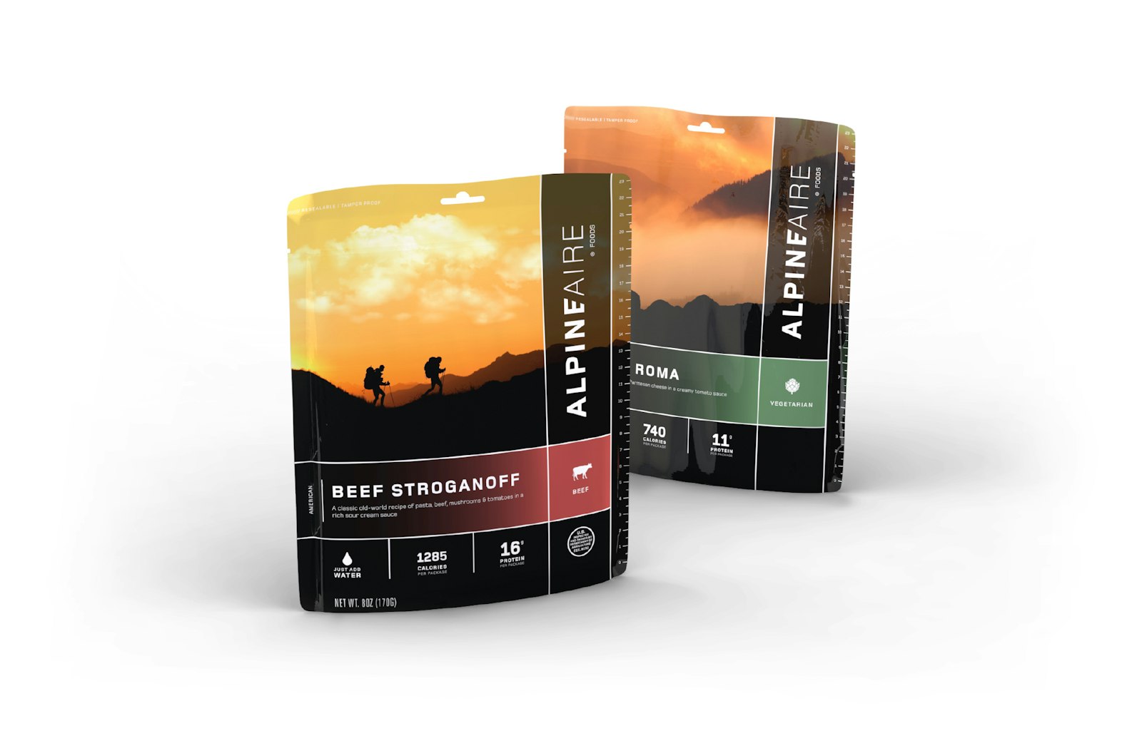
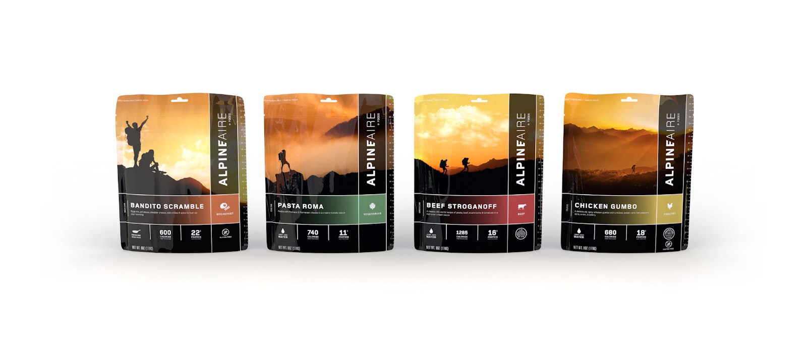
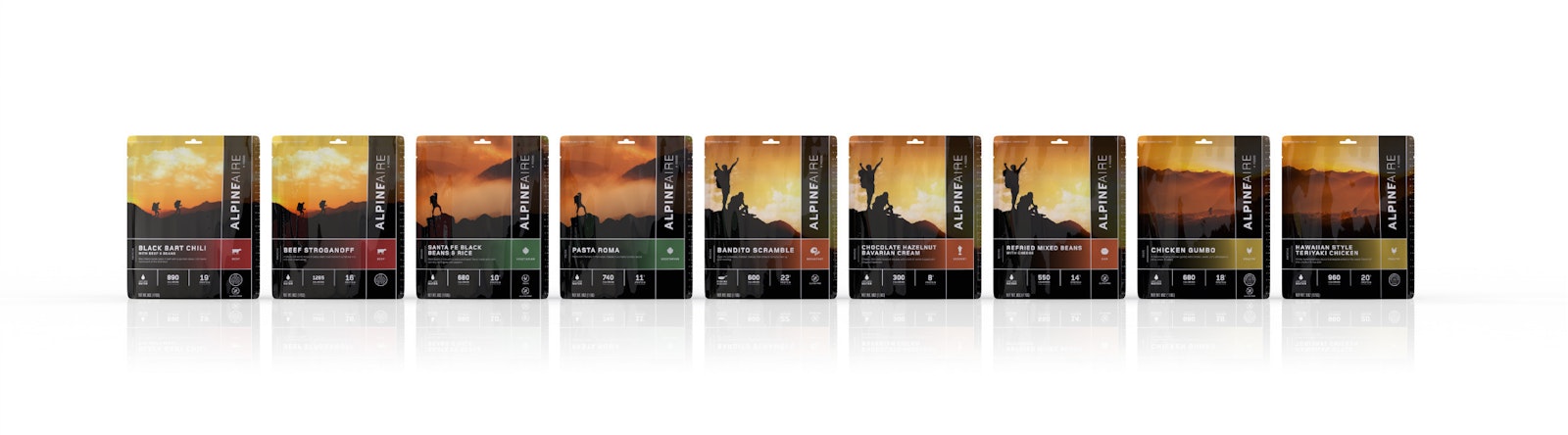
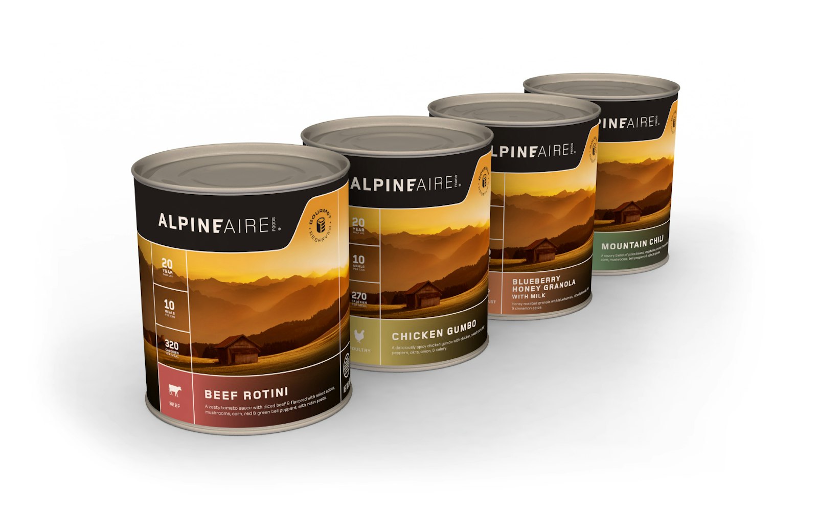
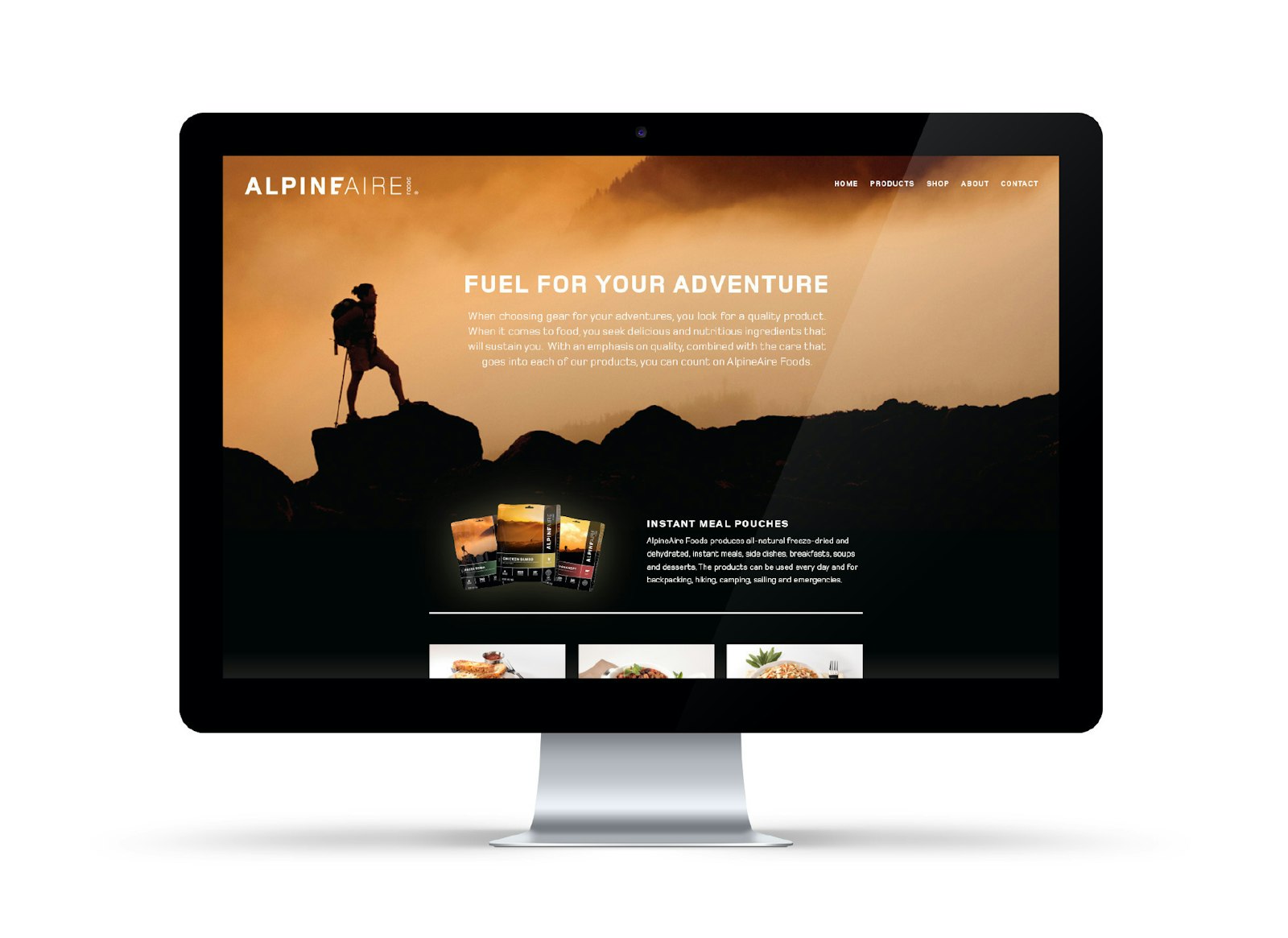
The result
The new AlpineAire visual language is fresh and sophisticated. Color palette, photography style and typeface capture the adventurous brand personality. Navigational cues for meal type and flavor were incorporated into the design to improve experience in the aisle and on the trail.
The final result generated a 44% growth within the first month on shelf.
