Endless Coast
The Challenge
Leading medical and wellness cannabis operator, Curaleaf, was cracking open yet another new product offering in the form of a low-calorie, low-sugar and low-carb cannabis-infused seltzer. Featuring four botanical and fruit extract flavors as well as innovative nanotechnology offering an easier on-ramp to relaxing effects, Curaleaf was reimagining cannabis consumption through an alcohol alternative that would help those who partake to hang looser without the next day hangover.
Seeking to initiate a test market launch in just a few short months, Curaleaf tasked Capsule with a full brand build and packaging design that would effectively showcase the endless enjoyment this refreshing new line of loosen up libations could bring to social affairs, everywhere.
The Name
Inspired by the mesmerizing dreaminess of the California coastline, the Endless Coast name represents enjoying life's journey at the easygoing pace of a never-ending summer.
Through refreshing flavors, accelerated calming effects and good vibes, Endless Coast provides a new route to cannabis consumption that invites you to take your foot off the gas and coast awhile as you soak in your surroundings and simply enjoy the ride.


Visual Identity System
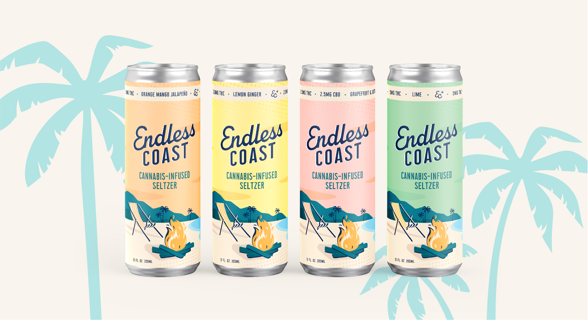
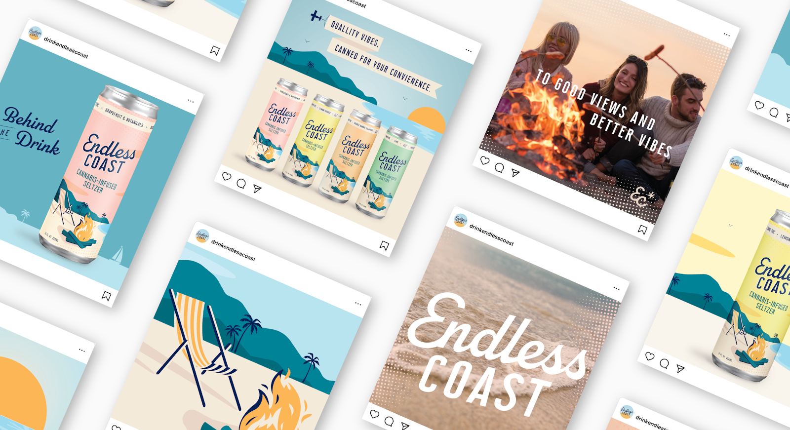
The visual identity system further explores and expands Endless Coast’s approachable, retro-Americana spirit with a light and dreamy pastel palette utilized for easy flavor navigation. Lively carbonated patterns and custom coastal illustrations were incorporated into the identity system to create a distinct and dynamic visual toolkit.

Messaging
With a brand personality and tone of voice balancing the adventure of exploring new horizons with the approachability of a "trip-dad" in Birkenstocks and fanny pack, the messaging strategy invites seasoned cannabis-customers and the "canna-curious" alike to experience a new wave in cannabis consumption.
Headlines are equal parts informative and playful, fitting cohesively within the vibrant visual system to offer compelling pieces of brand storytelling that are fit to flex across a range of promotional materials, website content and social campaigns.
Packaging & Collateral
With the completion of a picturesque visual identity system in our wake, Capsule's fresh design was applied to the can wraps and a 4 pack tote box.
The oceanic scene never ceases as you rotate the packaging, giving a nod to the former half of the Endless Coast name by sprinkling in moments of discovery and delight such as the “EC” monogram shining within the ocean waves, or the cannabis leaf icon used to to top the palms.
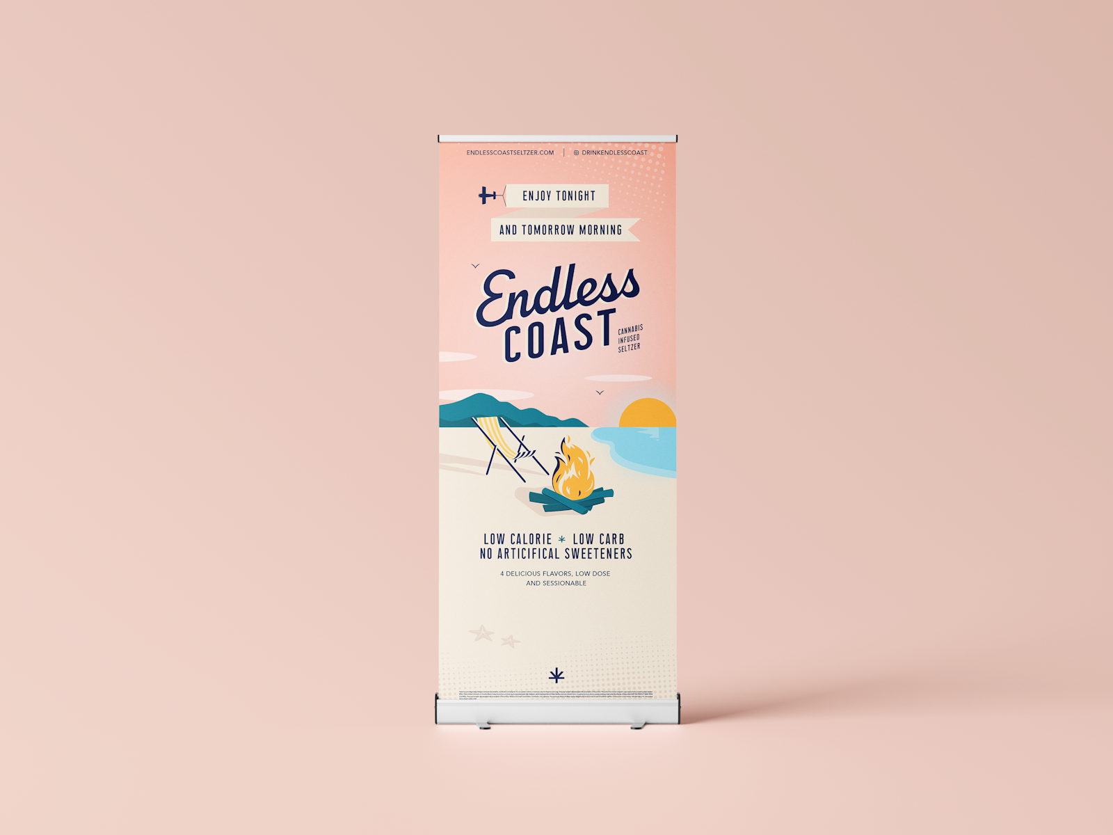
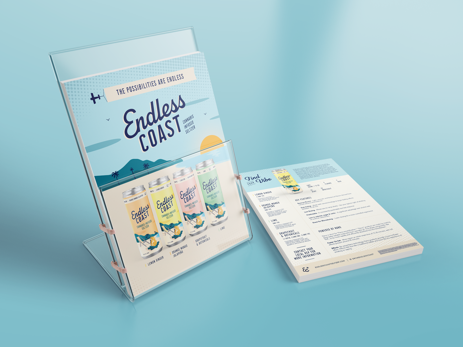


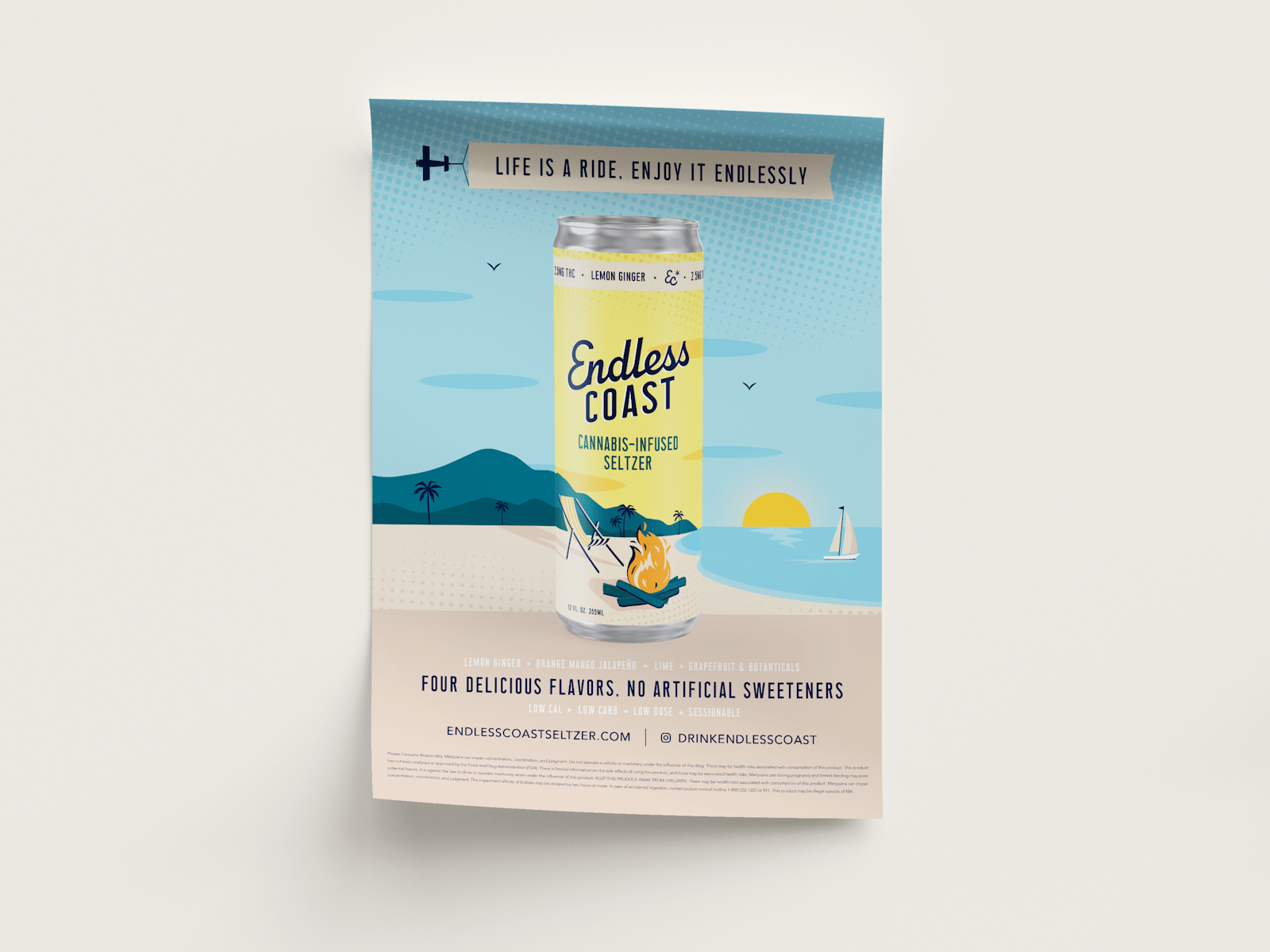
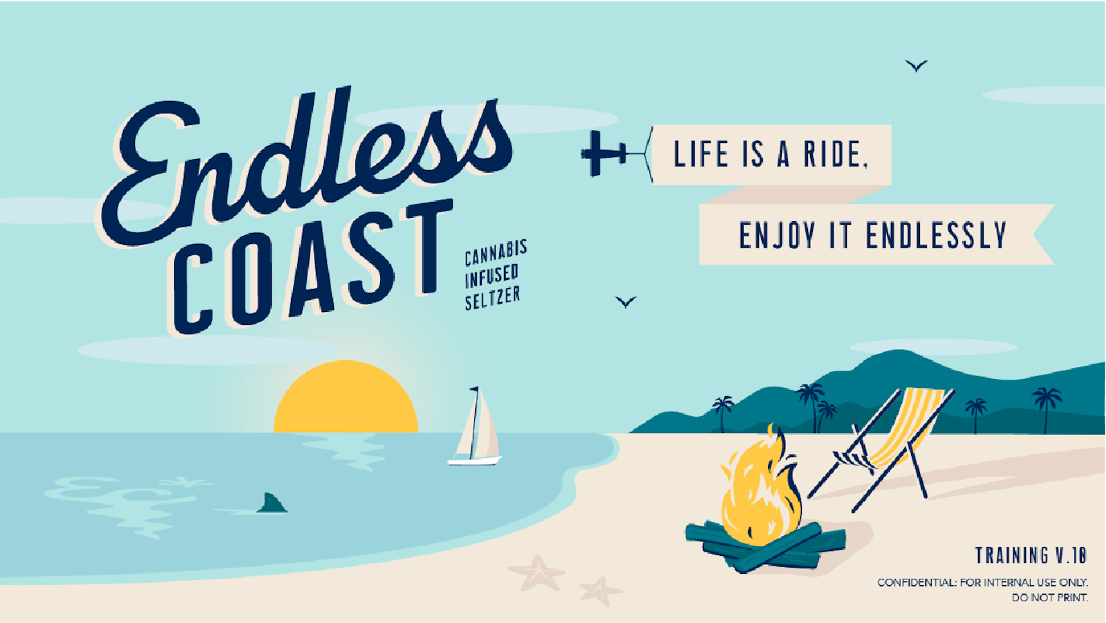
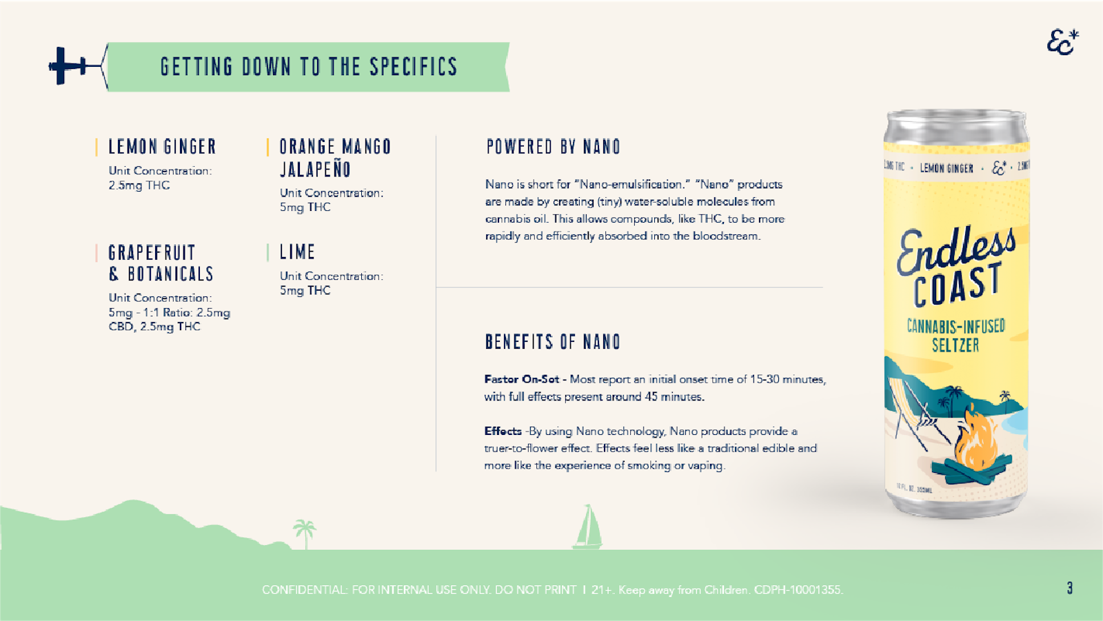
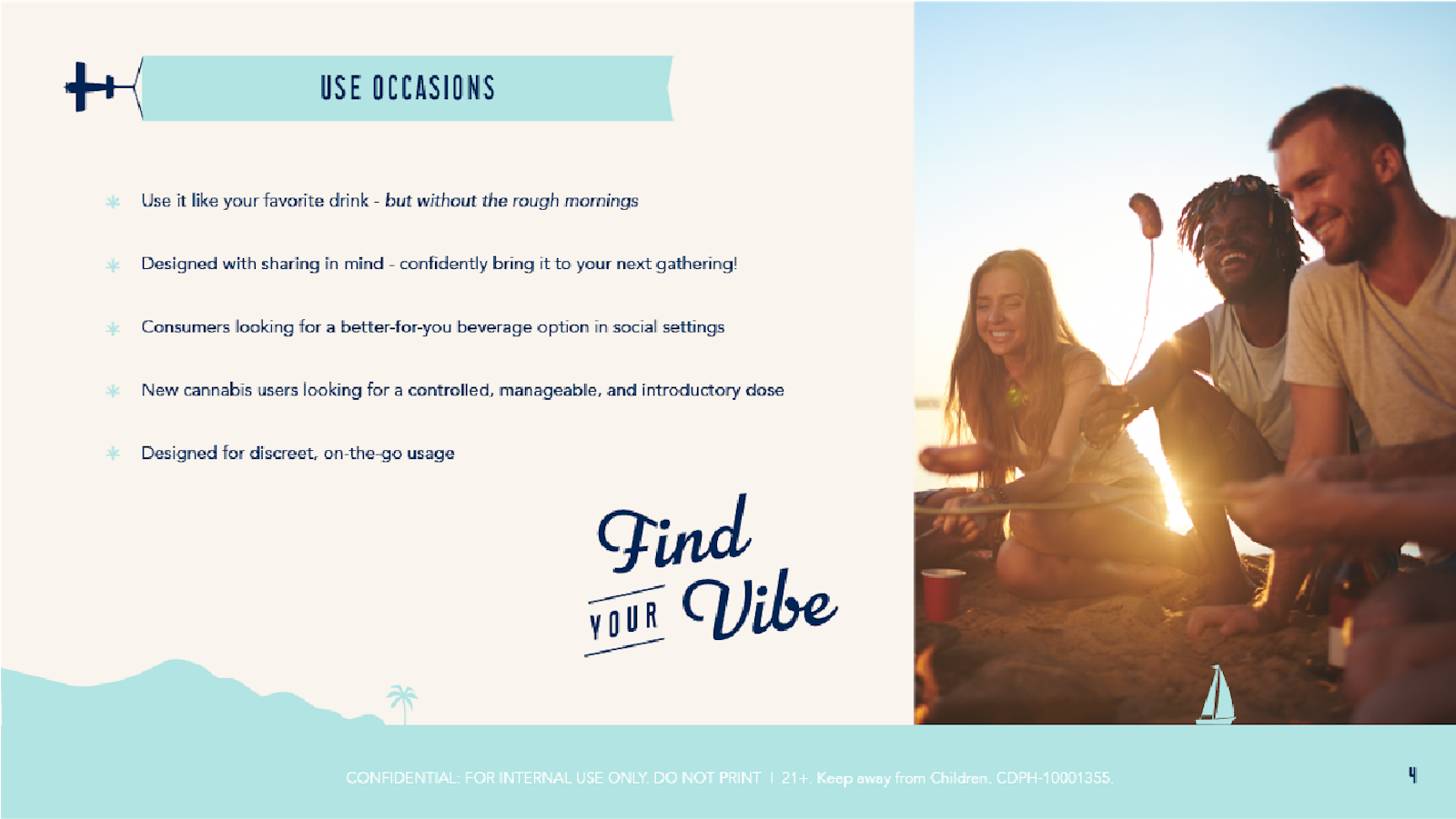
Application of the visual system didn’t stop at product packaging, it soaked into a plethora of additional brand assets and collateral needed for an effective test launch. A wide range of size ratios were troubleshooted to ensure illustrated elements could scale easily up or down on everything from print and social ads, posters, postcards, shelf talkers, email templates, TV displays, training decks and digital banners.
The Impact
This cohesive brand build was completed just in time for the summer beverage season. Endless Coast has been successfully launched in trial markets, generating a tidal wave of enthusiasm not only from the Curaleaf team, but retailers and cannabis consumers as well.

