Lake One Digital
The Challenge
Lake One Digital was seeking to re-explore their well-traveled brand identity and web experience. The digital marketing agency tasked Capsule with locating the “X” on the map that would better match with their voyaging brand personality, while also authentically articulating their core purpose: helping clients develop streamlined strategies for sales and marketing growth in simple, yet strategic strokes.
Mark & Visual Identity
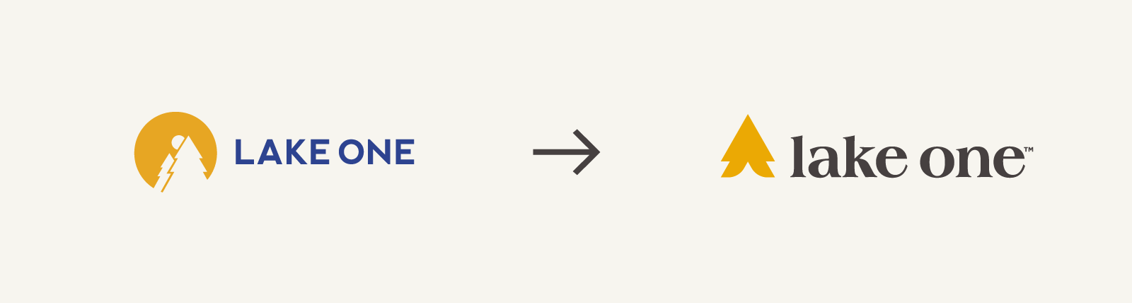
The mark pays homage to the Arrowhead Region of Minnesota, a geographic setting shaped by the wilderness of the Boundary Waters and in which the brand’s namesake lake is located.
Purposeful ambiguity is employed in the mark to allude to the arrowhead, as well as associations with other voyager adjacent themes, such as a northern pine, a compass point or a pitched tent. Ambiguity in the mark gives a purposeful nod to the varied tools and paths Lake One has to offer its clients on their journeys towards future growth.


As the corporeal "Lake One" is an entry point into Minnesota's greater Boundary Waters region, the north woods inspired mark design further broadcasts an adventurous approachability in actively spearheading meaningful exploration.
The original “Lake One gold” was maintained and augmented with the addition of a signature blue hue that energizes the overall brand look and feel with an active and modern tone.
Messaging
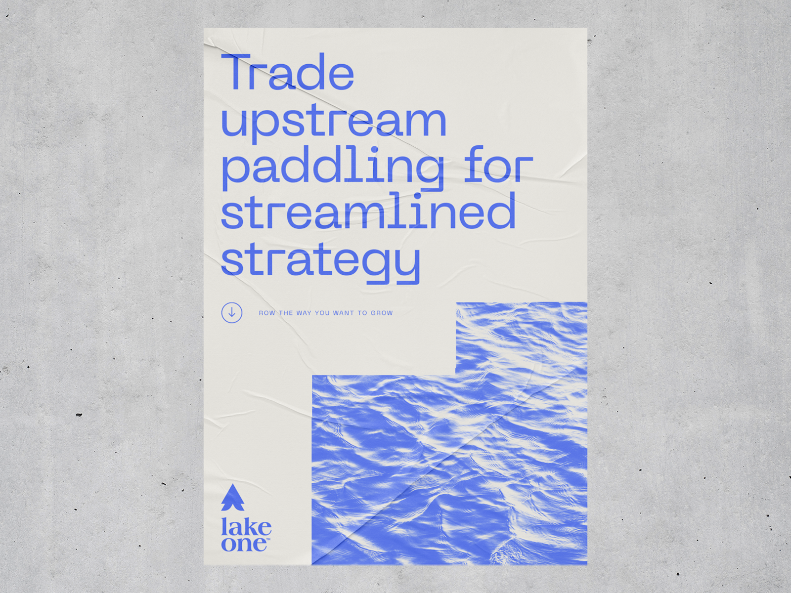
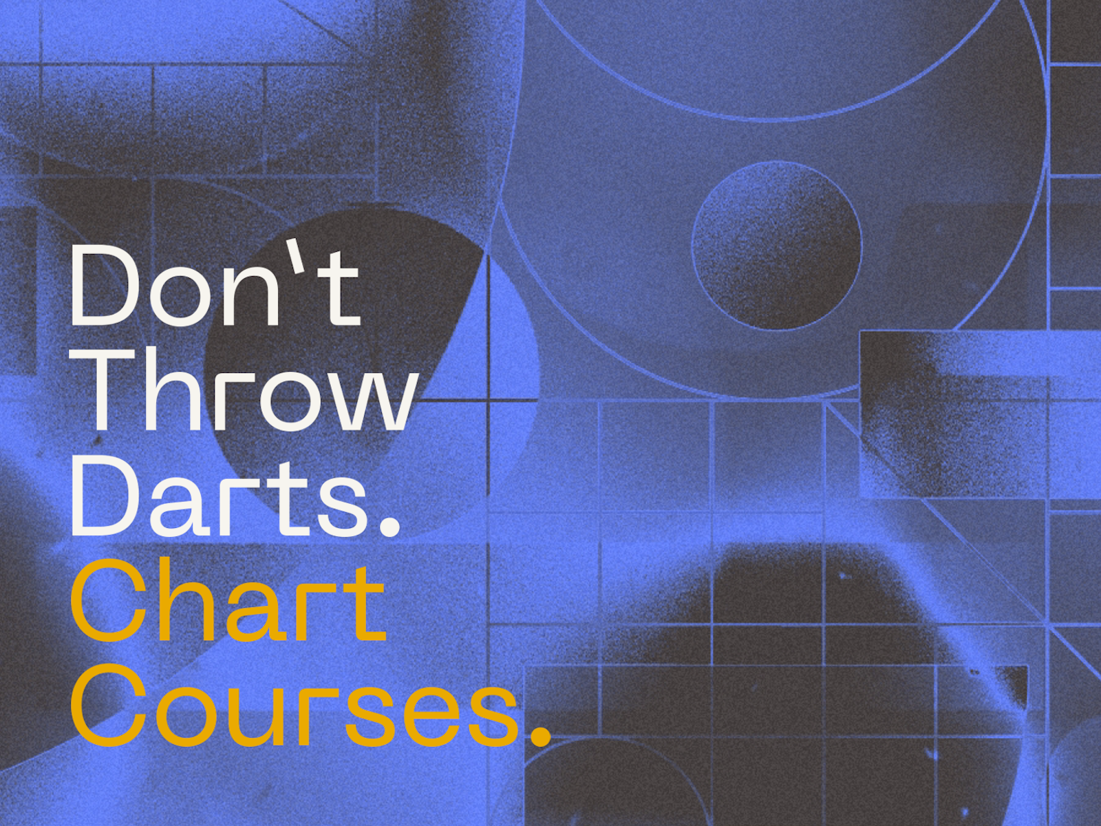
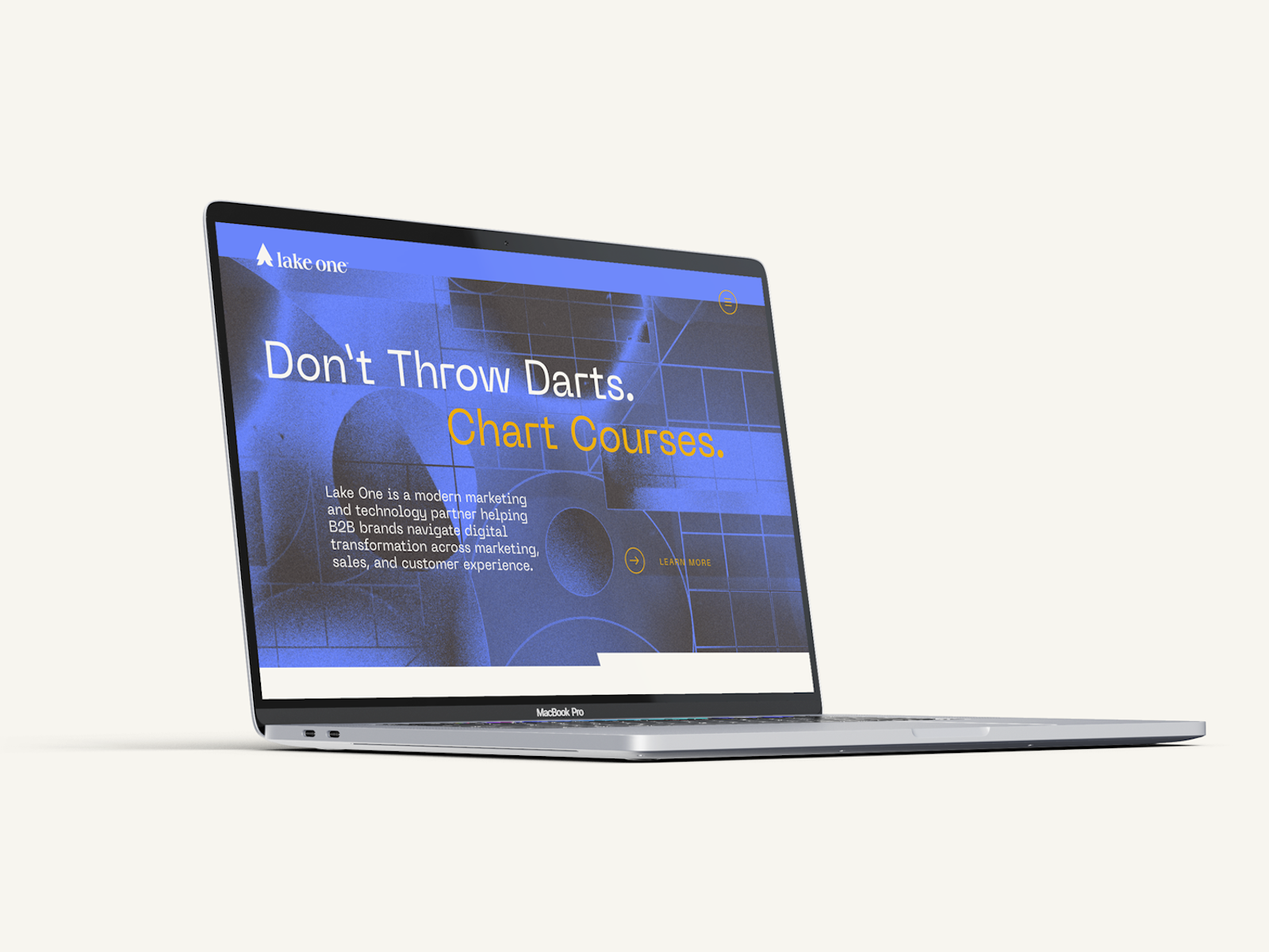
Heady strategy and technical terminology were given an approachable new spin with messaging that assumes the tone of a seasoned backwoods explorer. New messaging offers a playful nod to the Lake One name and its hands-on approach in helping clients navigate the trailheads of digital transformation and sales growth.
Website
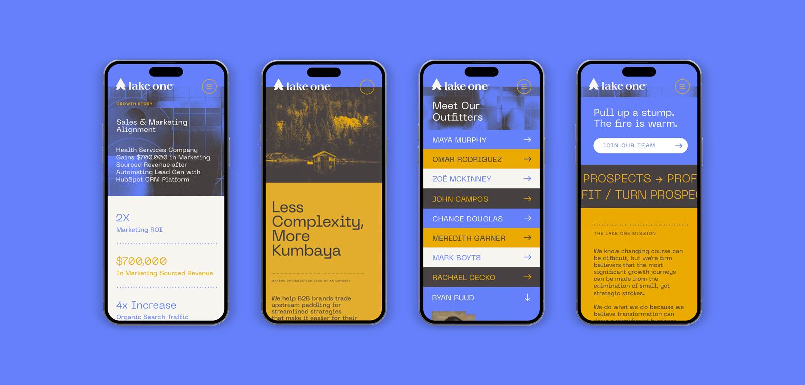
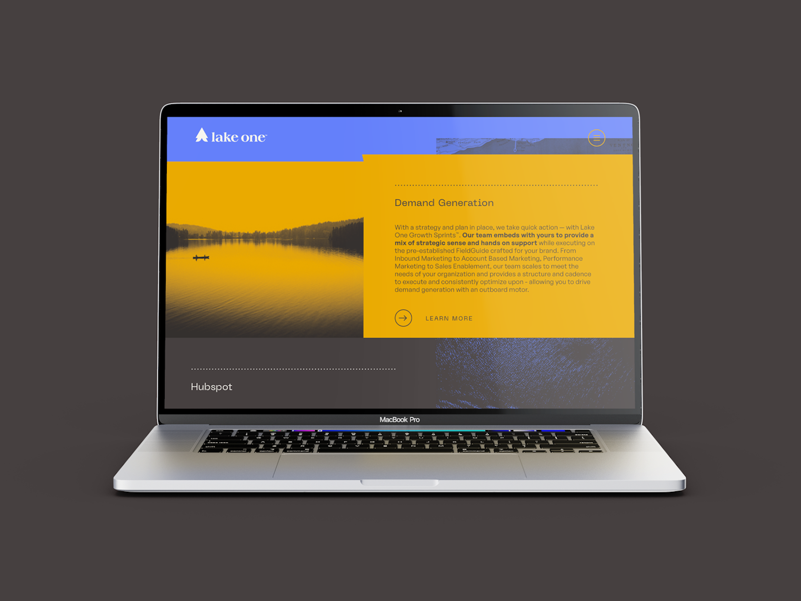
The trailblazing brand messaging and identity were further applied to a completely refreshed web experience. The woodsy look and feel was charged with modern and technical graphic treatments to communicate the idea of simplicity in the face of complexity. Name inspired imagery such as canoes, cabins, or maps were heavily stylized and given a hit of color to perfectly balance an overall experience that celebrates future-focused exploration without losing sight of the brand’s digital roots.
Futuristic fonts were utilized in large scrolling headlines and motion-heavy modules to add a sense of dynamism and forward progress throughout the site. Graphic elements throughout the site feature shapes born from the unique letterforms of the typeface for a more cohesive visual language.

The Impact
The rebrand and refreshed web experience have been successfully launched and stand as a bold, yet approachable invitation to Lake One's audiences to get off the shoreline, grab an oar, and begin paddling towards fresh tributaries of transformation and growth.
Client Testimonial
As a founder your brand becomes personal. I've struggled to find success evolving our identity in a way that felt authentic and captured the spirit of Lake One as it grew from a me to a we. Capsule was the only team able to bring it home. From the mark to the language it all just landed and we couldn't have gotten there without their thoughtful guidance. — Ryan Ruud
Ryan Ruud Founder & CEO, Lake One Digital