Blue Zones
The Challenge
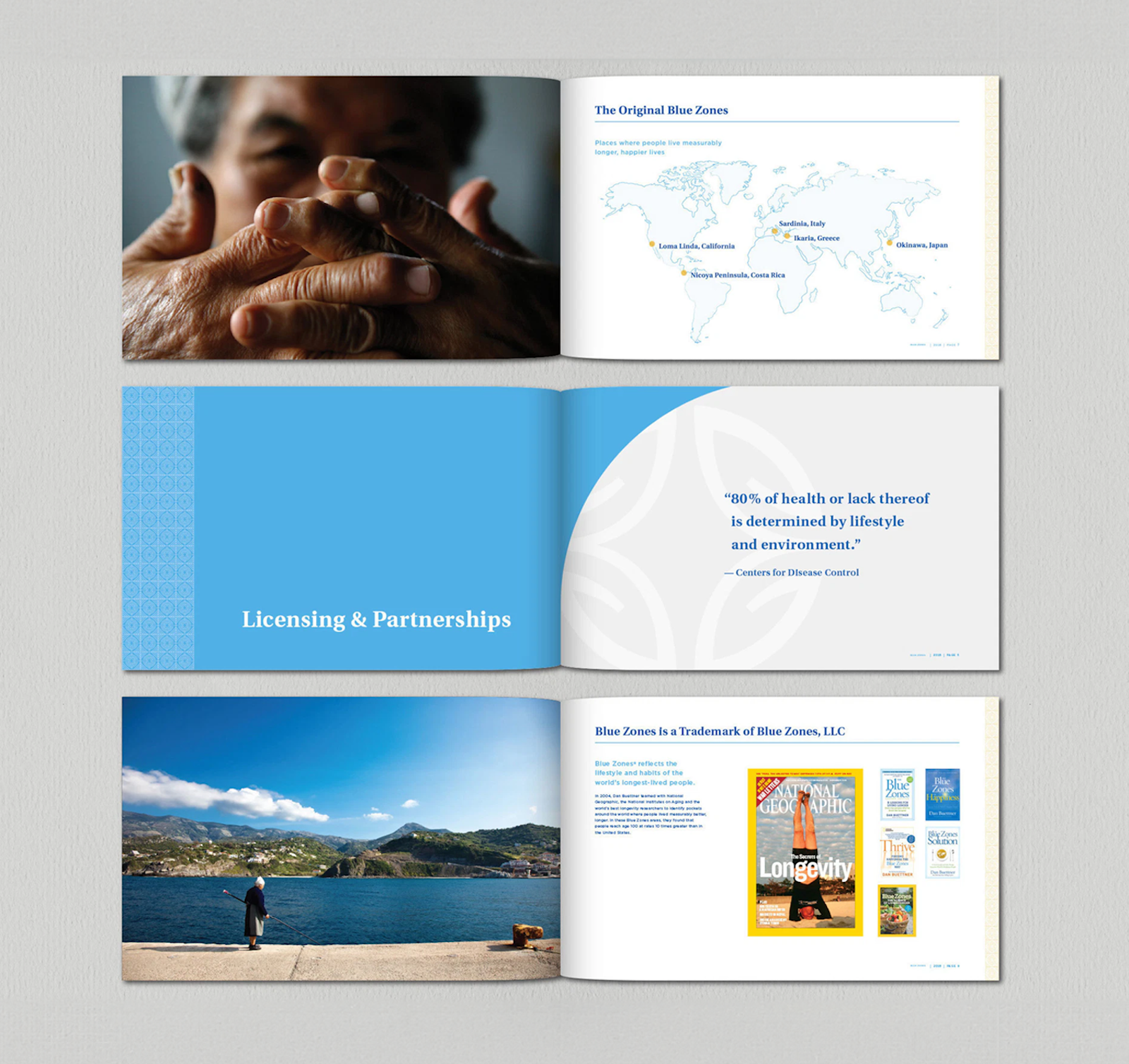
Blue Zones began as a National Geographic-sponsored area of research on longevity and well-being practices led by Dan Buettner, expanded into a New York Times bestselling book series and has most recently evolved into prominent health, lifestyle and well-being brand. Blue Zones turned to Capsule to fortify, organize and redesign their brand to better reflect who they are and allow for new expansions into industries, such as hospitality and community development, and impact initiatives.
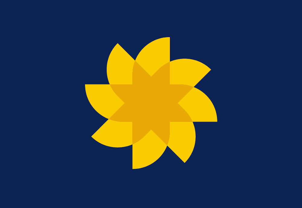
Capsule not only re-energized and freshened their look, but also created a strategic brand hierarchy that could accommodate their expanding business model. Using our brand Foundations process, Capsule defined key brand differentiators and overall brand strategy to inform an updated mark, messaging strategy and visual identity system. With audiences in varying sectors and roles, identifying a messaging strategy that could both speak to each individually as well as encompass an underlying essence of the brand was essential. This was accomplished through developing a brand narrative, personality and voice, headlines and key messages of importance. The new brand identity also included a new mark that better reflects the natural, authentic and approachable nature of the brand.
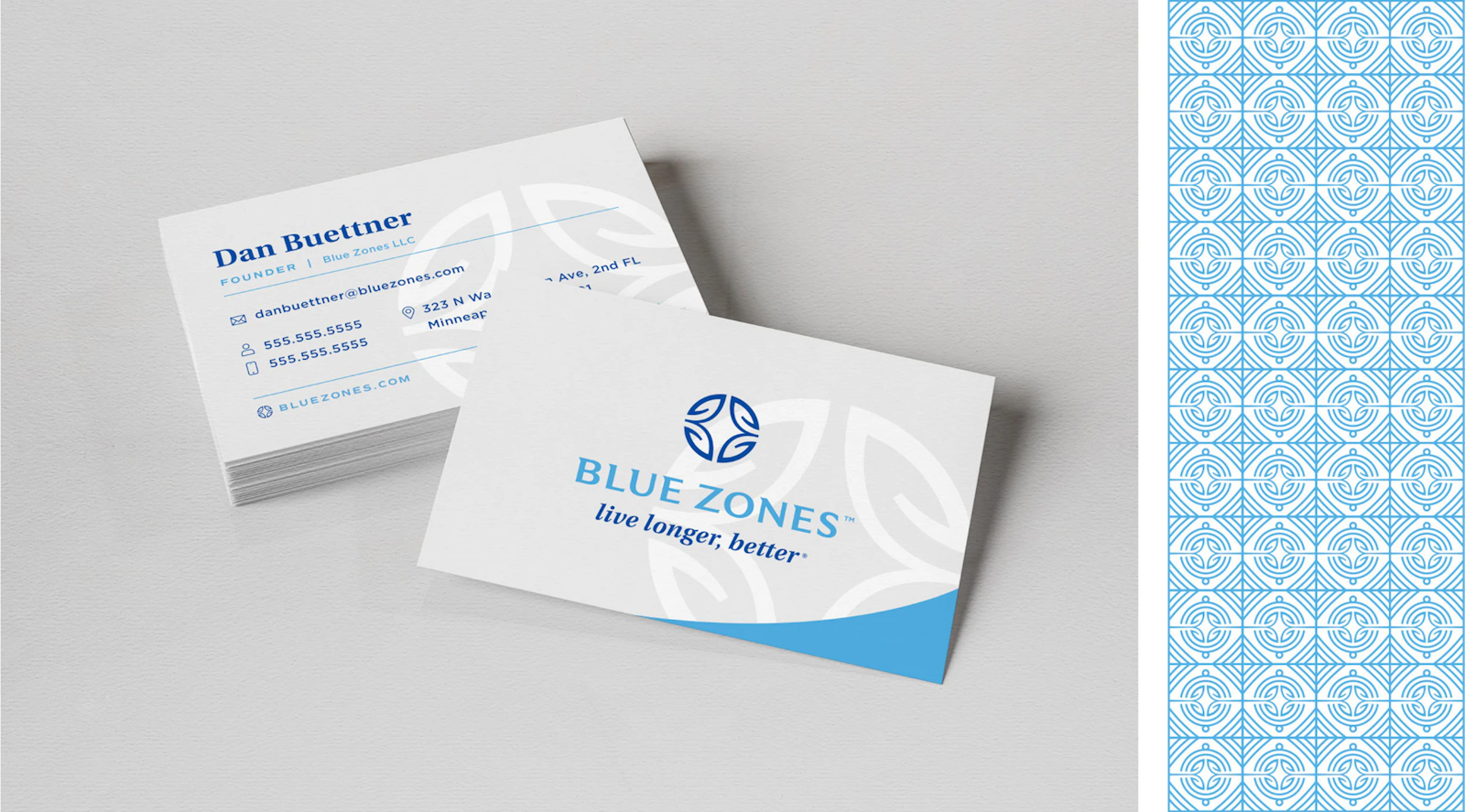

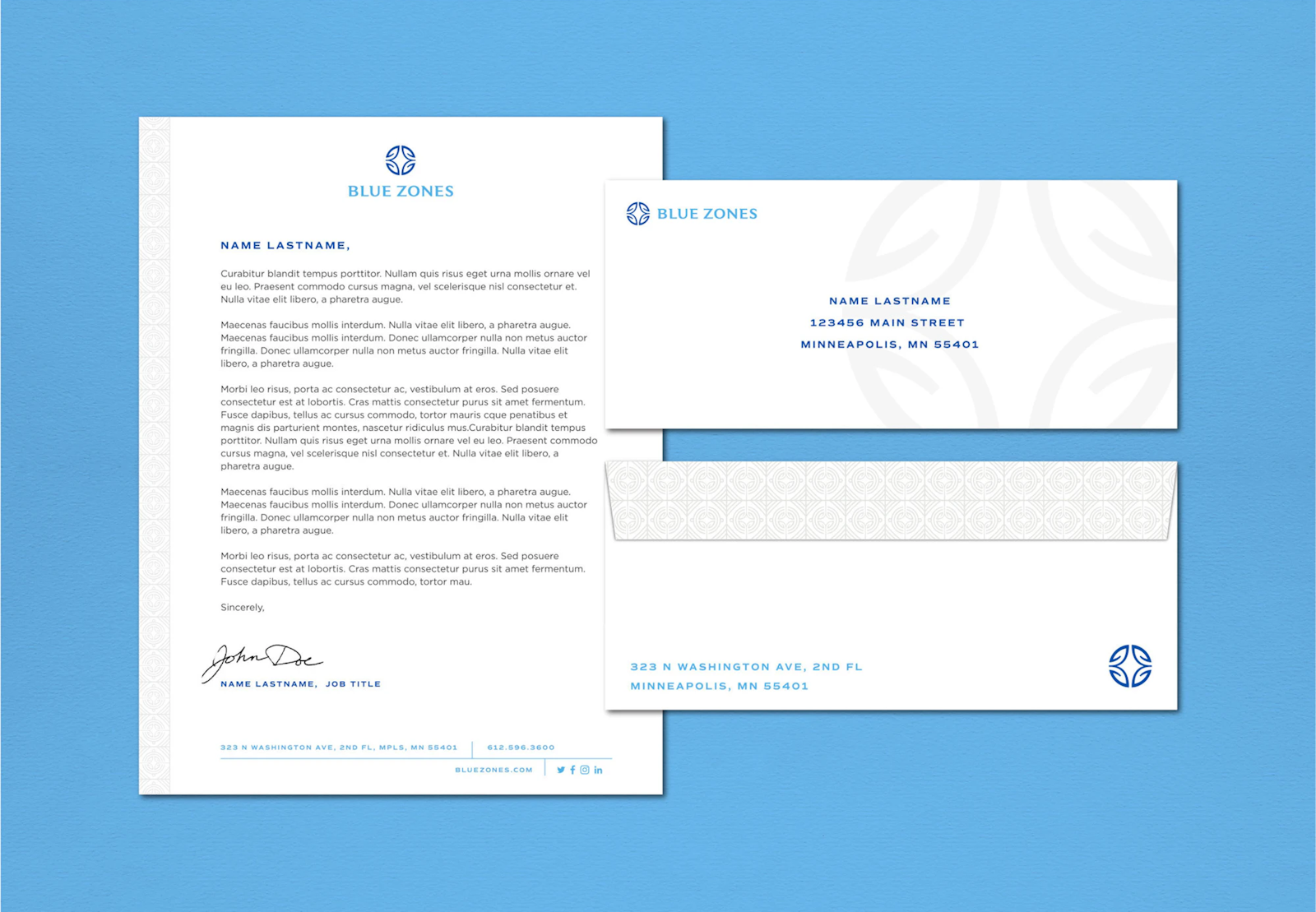
Capsule then created a comprehensive hierarchy strategy with visual solutions for the primary brand mark, along with brand categories, sub-brands and partnership programs. The Visual Identity System follows suit with a light and airy color palette, custom patterns and sophisticated typography. The new brand was applied to an array of communication tools, including business cards, presentation templates, stationery and a comprehensive brand book.

Client testimonial
"Working with Capsule turned the daunting process of changing our identity into a refreshing new start. Their patience and perseverance helped us push through difficult decisions and we ended up with a logo and identity that represented our past and prepared us for the future. The new system design provides us with valuable graphic direction for the brand and has been complimented by many of our clients.”
Dan Buettner Blue Zones, LLC