Structis
The Challenge
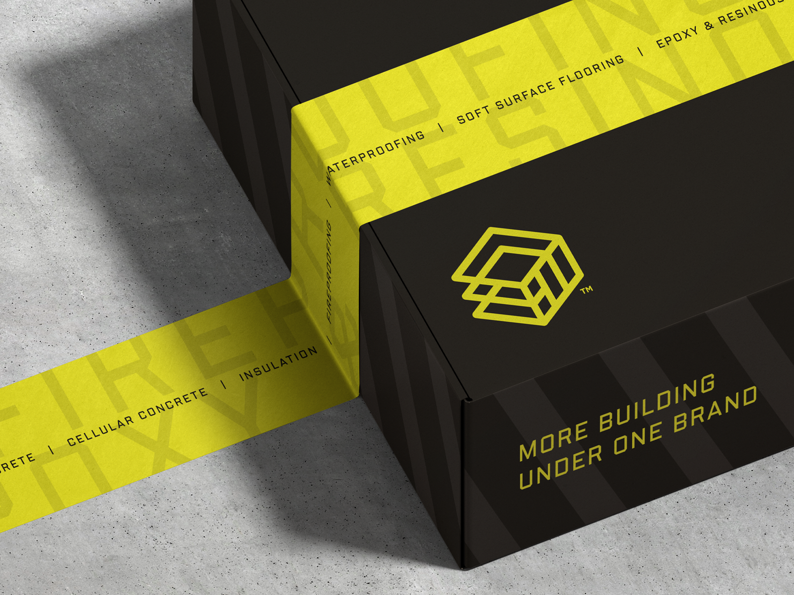
MaxTech Inc. was looking to consolidate it’s numerous non-union businesses into a single multi-trade subcontracting brand that could streamline client project success from floor to ceiling, and every touchpoint in between. Needing to highlight a full suite of services from insulation, to flooring, to water and fireproofing, the new brand, Structis, was in need of thoughtful construction to effectively convey its convenient offering of “more building under one brand.”
The Mark
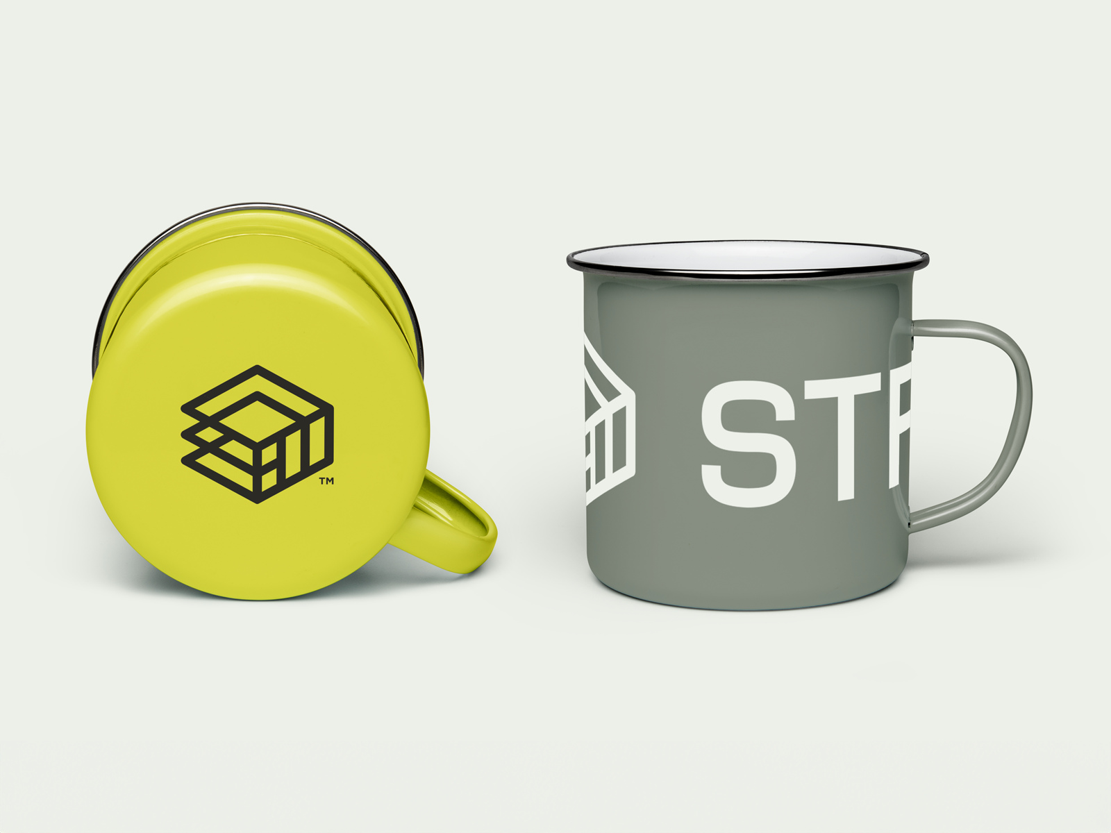
The mark design highlights the many layers and sublayers of skilled craftsmanship, exceptional materials and expansive services needed in order to construct an end product you can confidently stand on. The neat stack of interlocking lines and shapes inspires feelings of balance and thoughtful precision. When examining the logo’s varying elements, distinct visual cues to Structis’s core offerings like wall insulation or floor underlayment can be discovered.
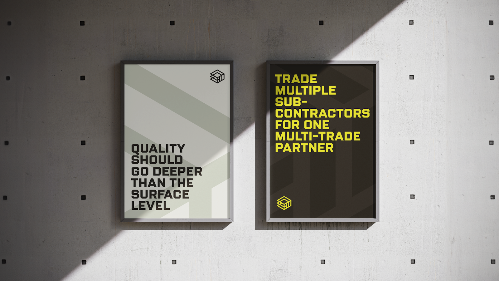
A modern, sans serif type shares a similar weight to the mark itself to produce a unified look, nodding to the story of a holistic brand that helps clients trade multiple sub-contractors for one multi-trade partner.

Messaging
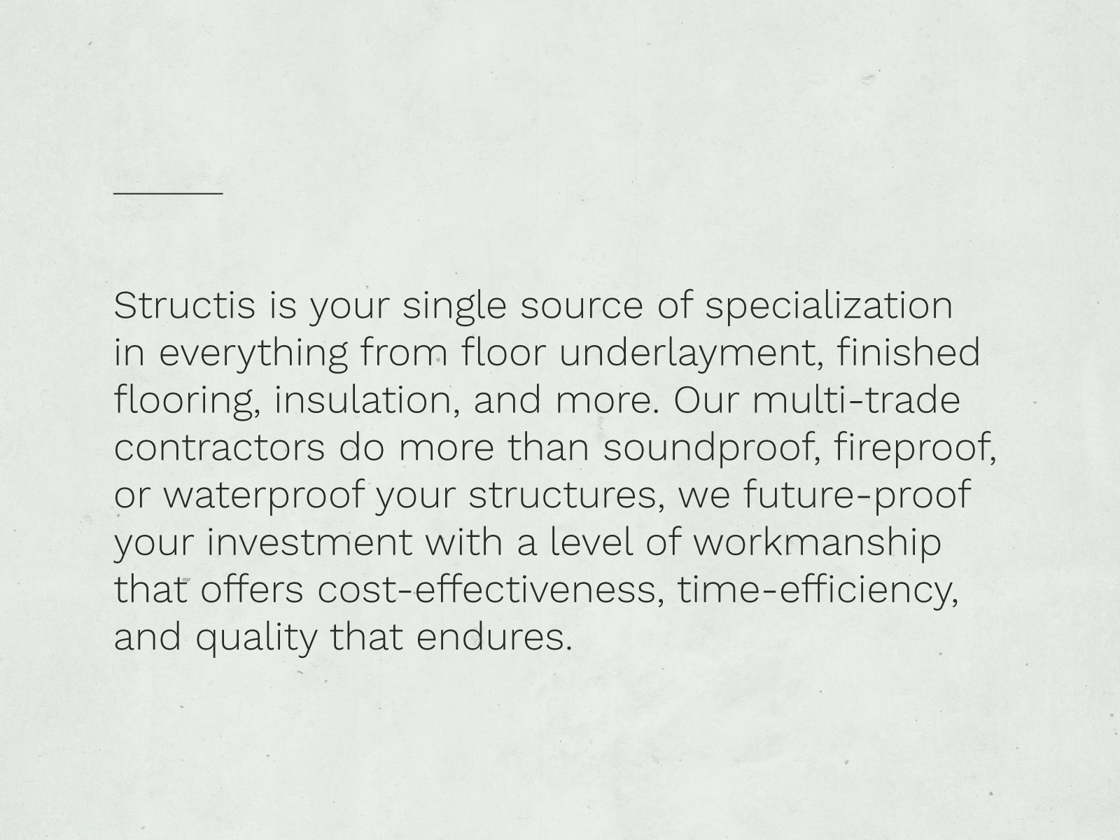
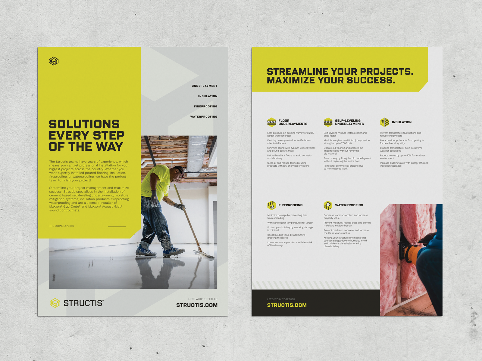
The Structis brand mission, vision and values were blueprinted and built from the ground up. Key selling points of time-efficiency, cost-effectiveness and elevated end quality were translated into a messaging strategy that champions the benefits of having one subcontracting partner for a multitude of project needs.
Visual Identity
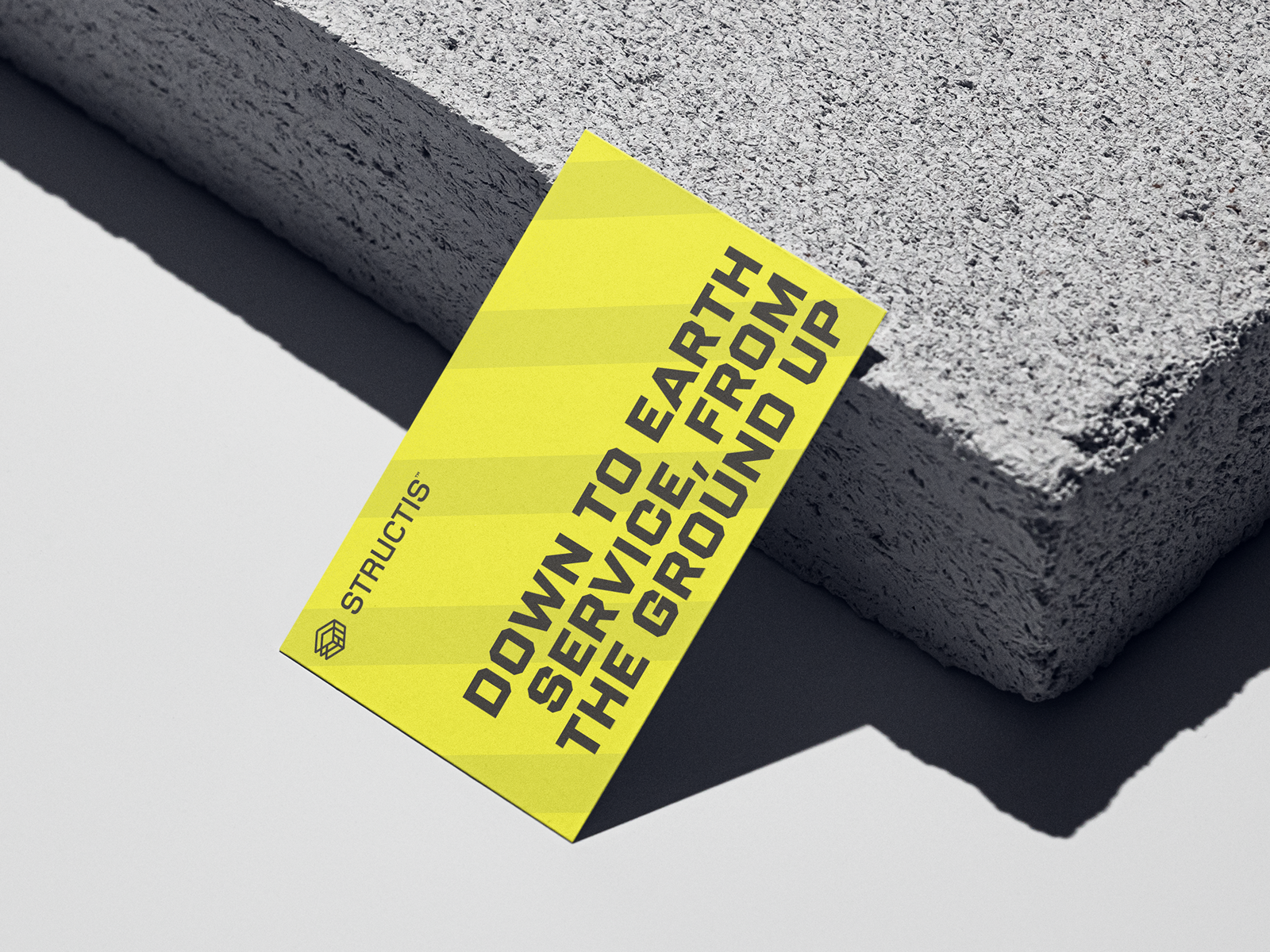
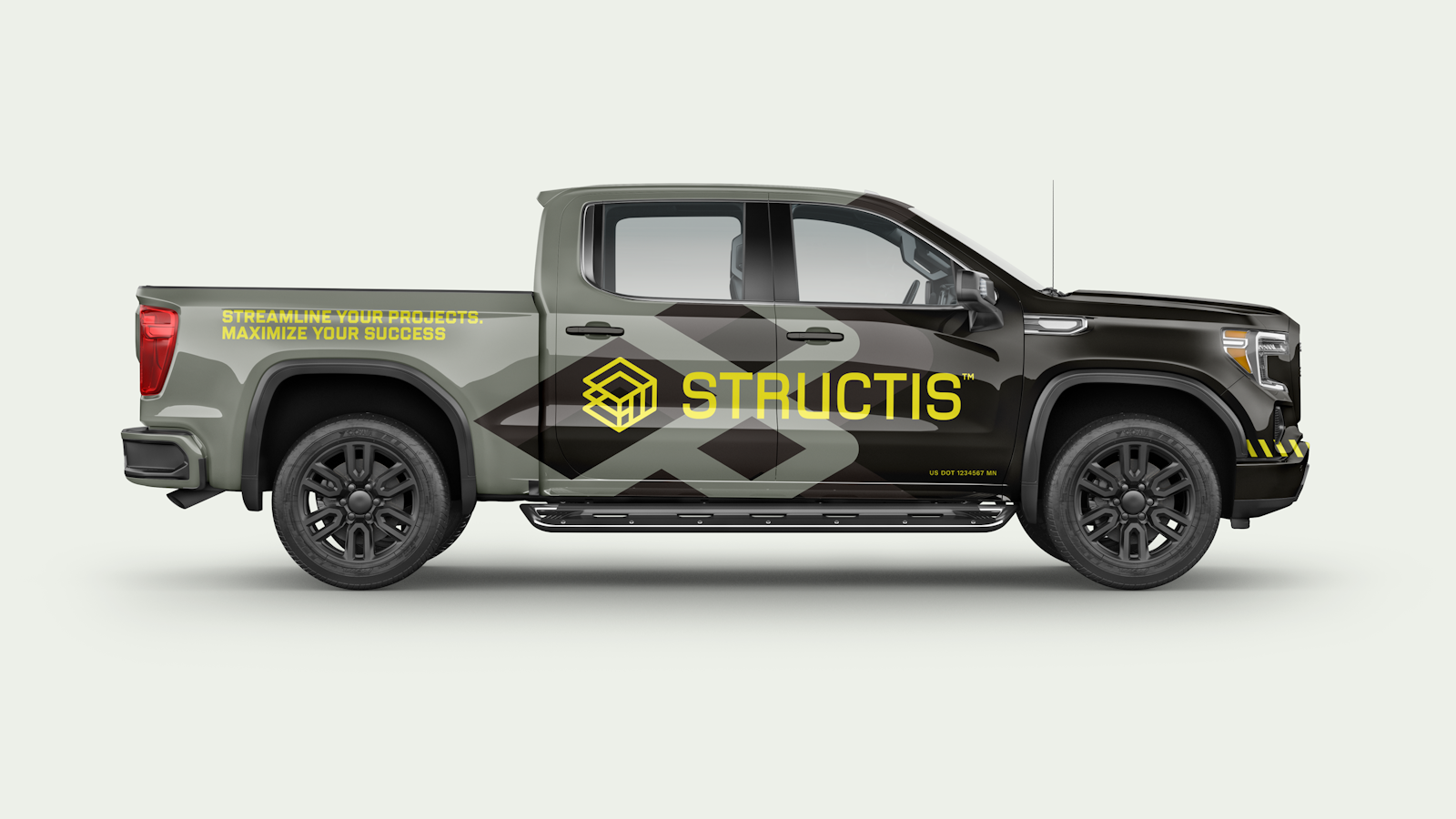
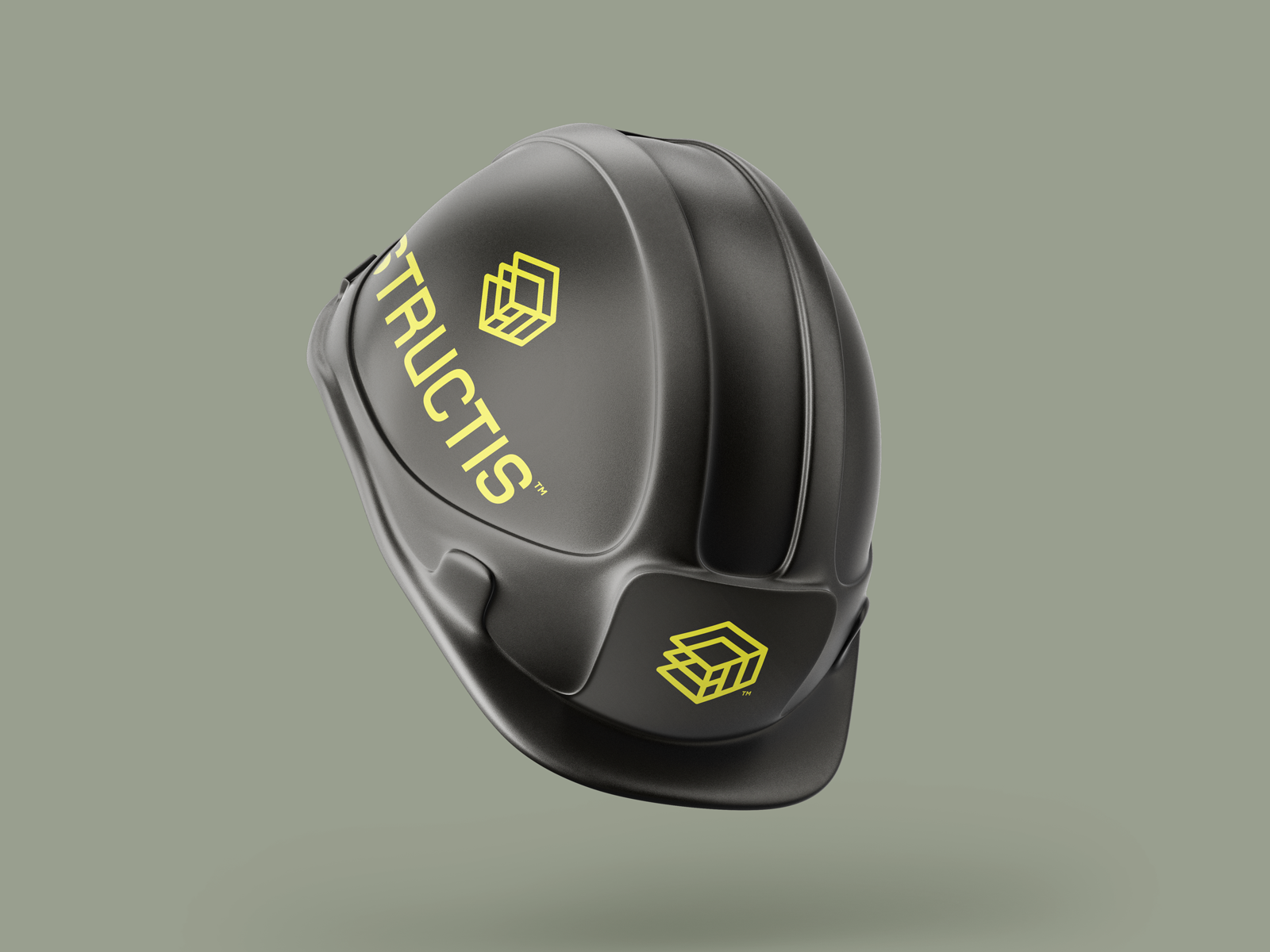
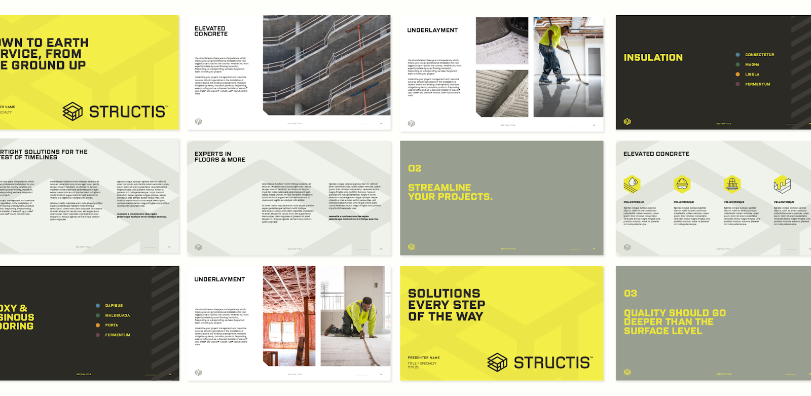
An emphasis on layered elements is intentionally mixed into a strict grid system to convey feelings of the utmost precision. A dark charcoal is paired with a highly active yellow to boldly lead the system, balanced with supporting grey-green tones that reference raw construction materials. A blocky headline style with beveled corners channels a strong and sturdy personality into brand messaging.
Whether through macro usage of the mark, stylized patterns, fields of color or iconography, shared angles and similar geometry are leveraged throughout the system to add cohesion and visual depth to every application of the visual identity system, from print collateral, to digital, to a customized truck wrap.

The Impact
The Structis brand has been successfully launched and serves as hardworking asset that unifies a once disconnected set of acquired brands, while also allowing room for continued portfolio expansion.