Stansport
The Challenge
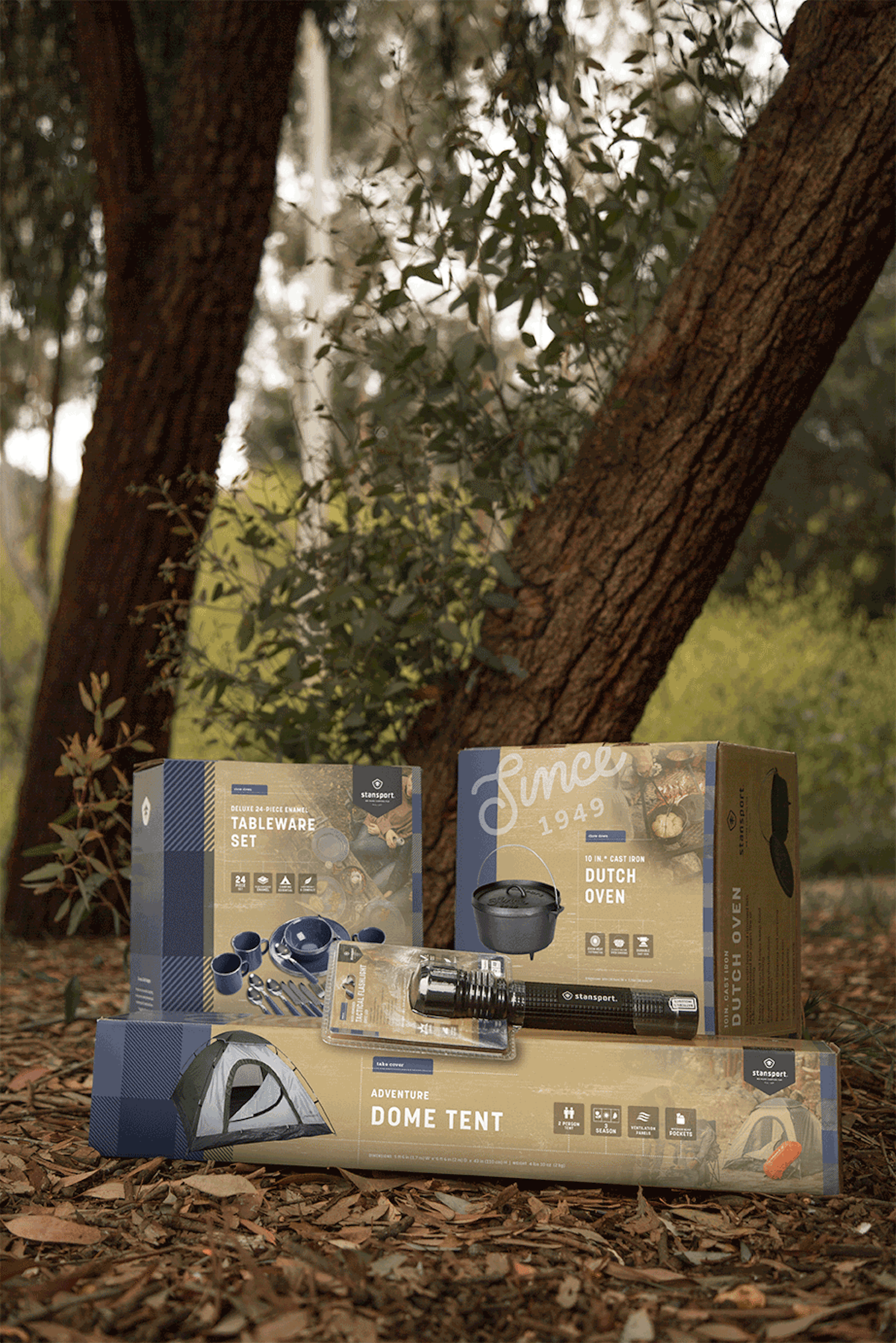
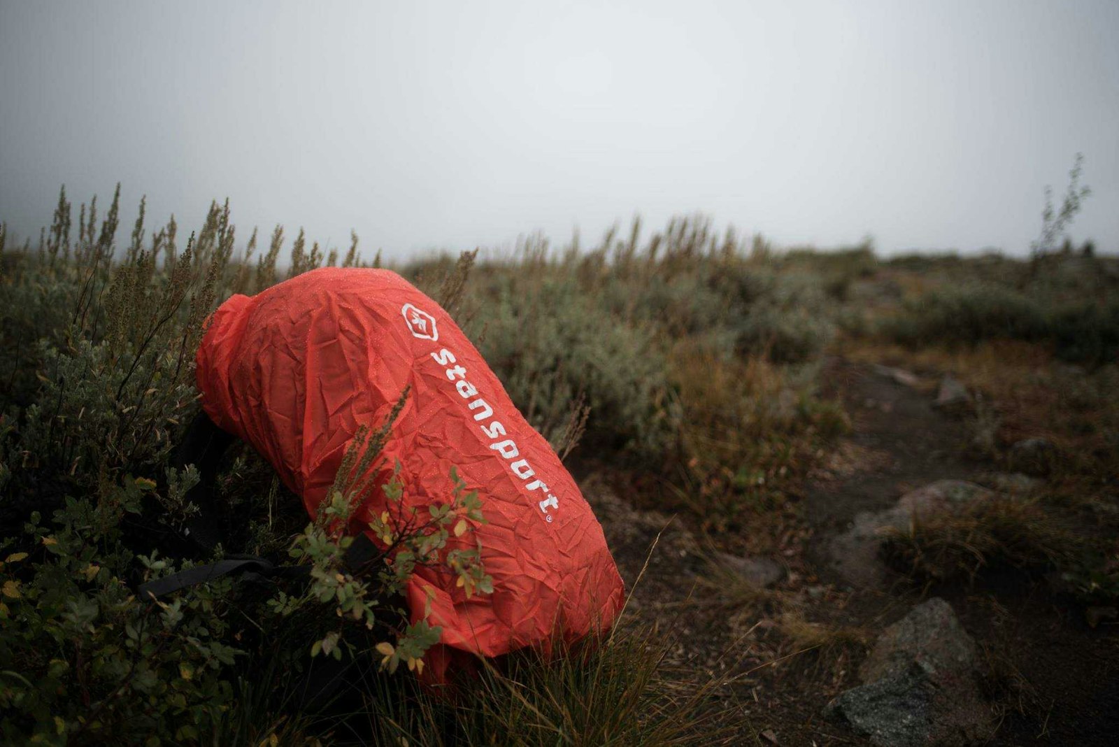
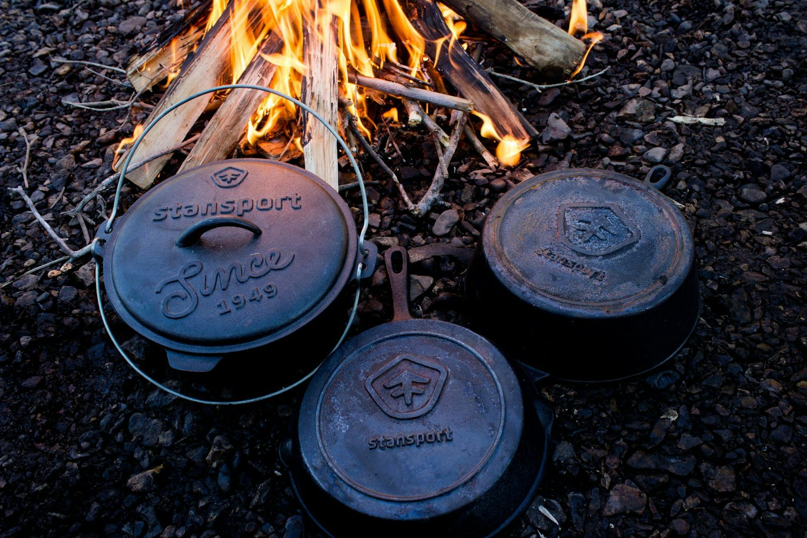
Stansport, a 68 year-old company with a history of supplying high-value camping gear, sought to refresh and modernize their brand with a new mark and packaging. Their goal was to grab attention and drive brand awareness in retail outlets like REI, Gander, Sportsman’s Guide and Walmart. In order to accomplish this, they required a mark and packaging that was simple and clear, would stand out in retail settings, could be easily viewable from twenty feet and provide clear product navigation.
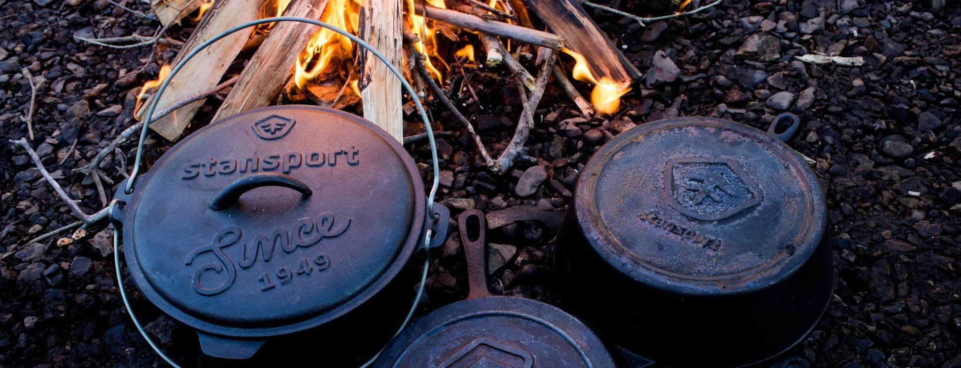

Making it last
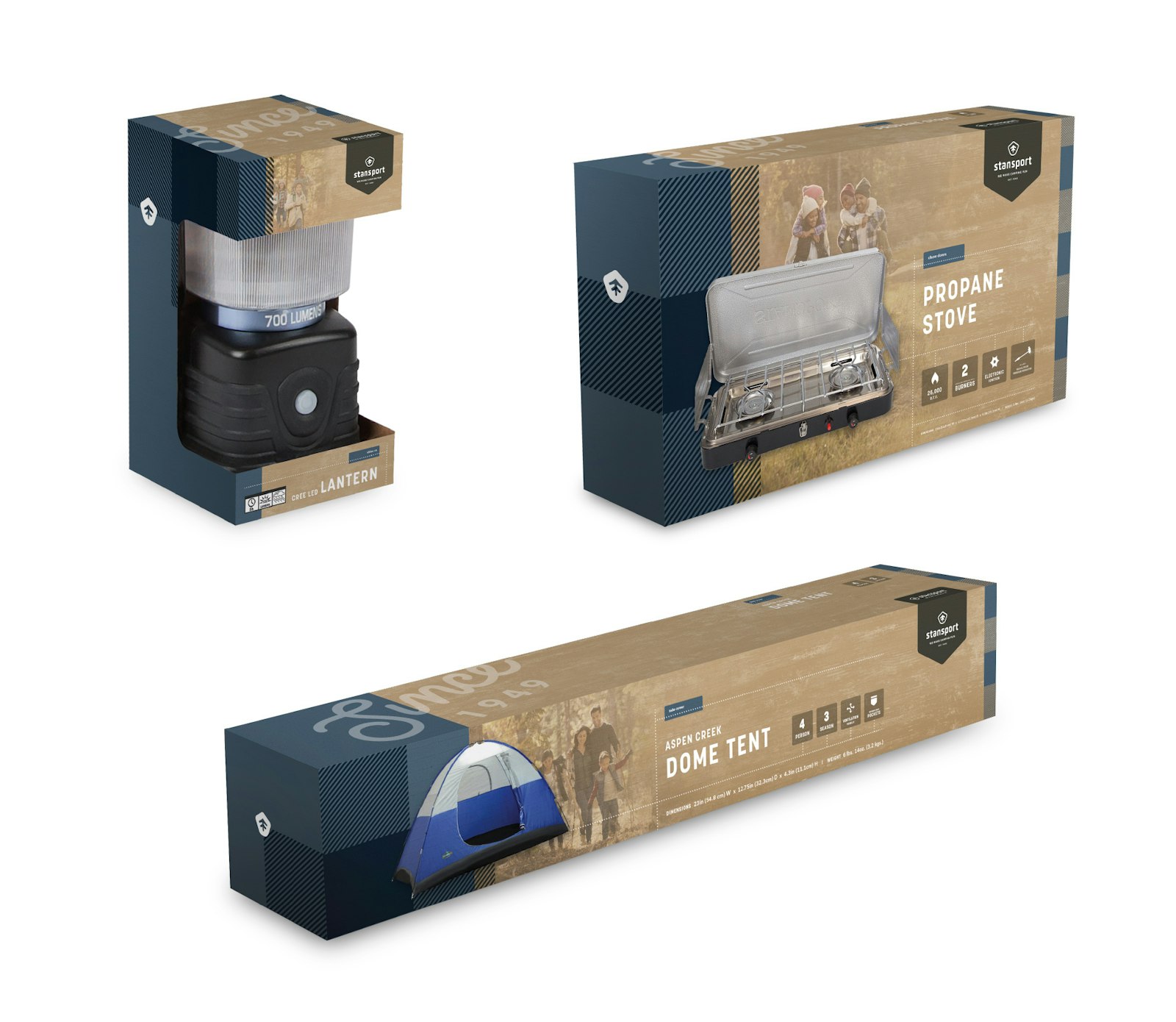
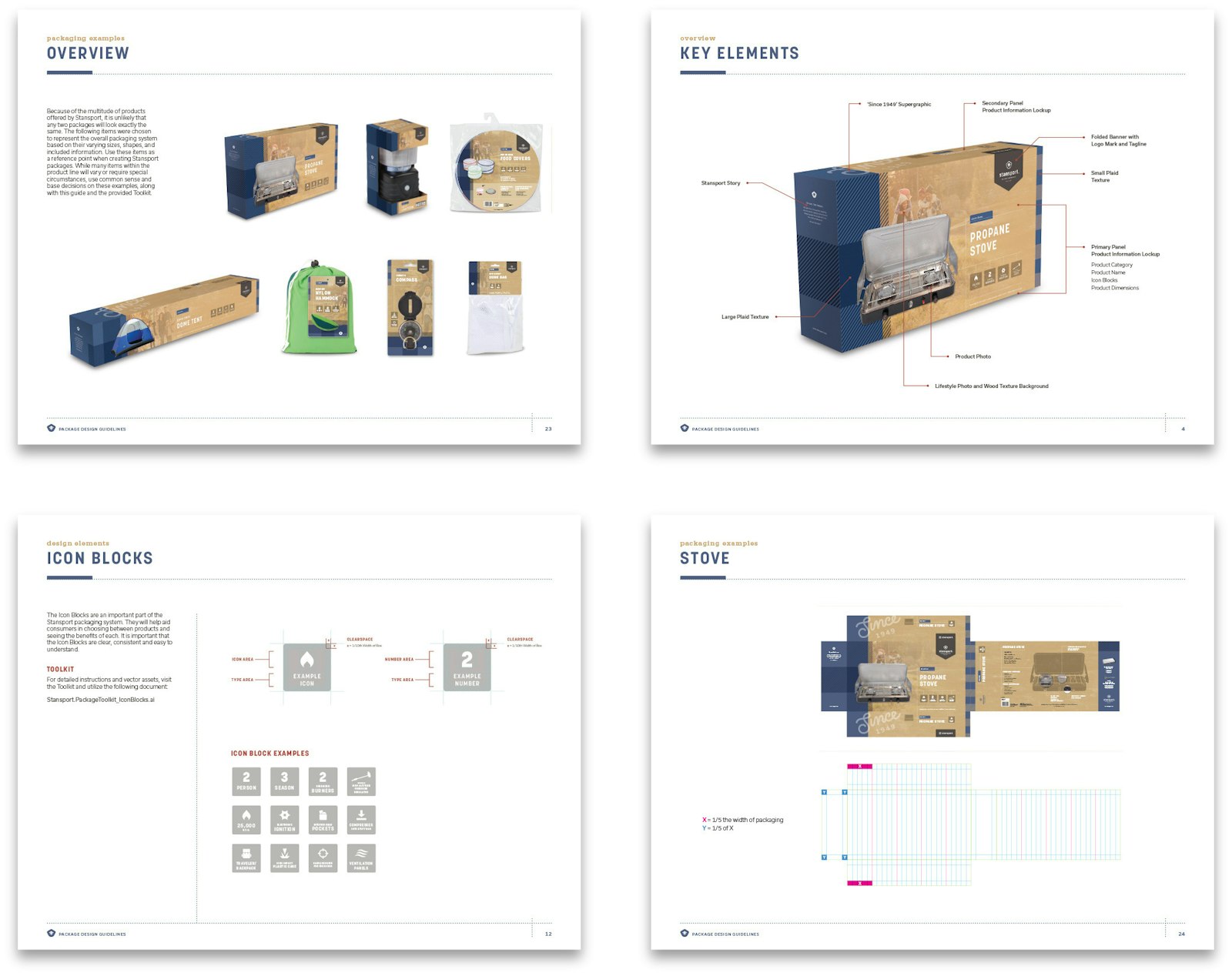
Designed with the purchaser in mind, the packaging is simple, easy to use and includes a simplified and intuitive flow of information specifically tailored to the eye of the consumer.
Outdoors for all
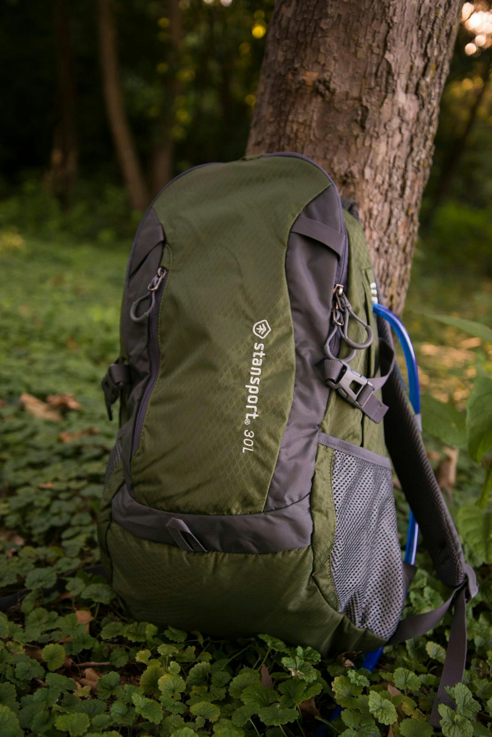
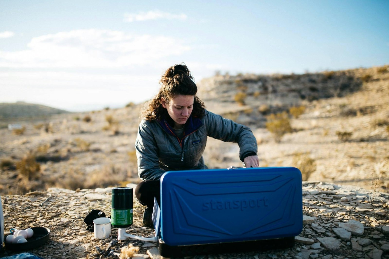
Stansport needed to appeal to the full spectrum of outdoor activity shoppers, from millennials buying gear for a weekend trip to the beach, to parents purchasing equipment for their kids to sleep out in the backyard or take a family hiking trip in a state park.
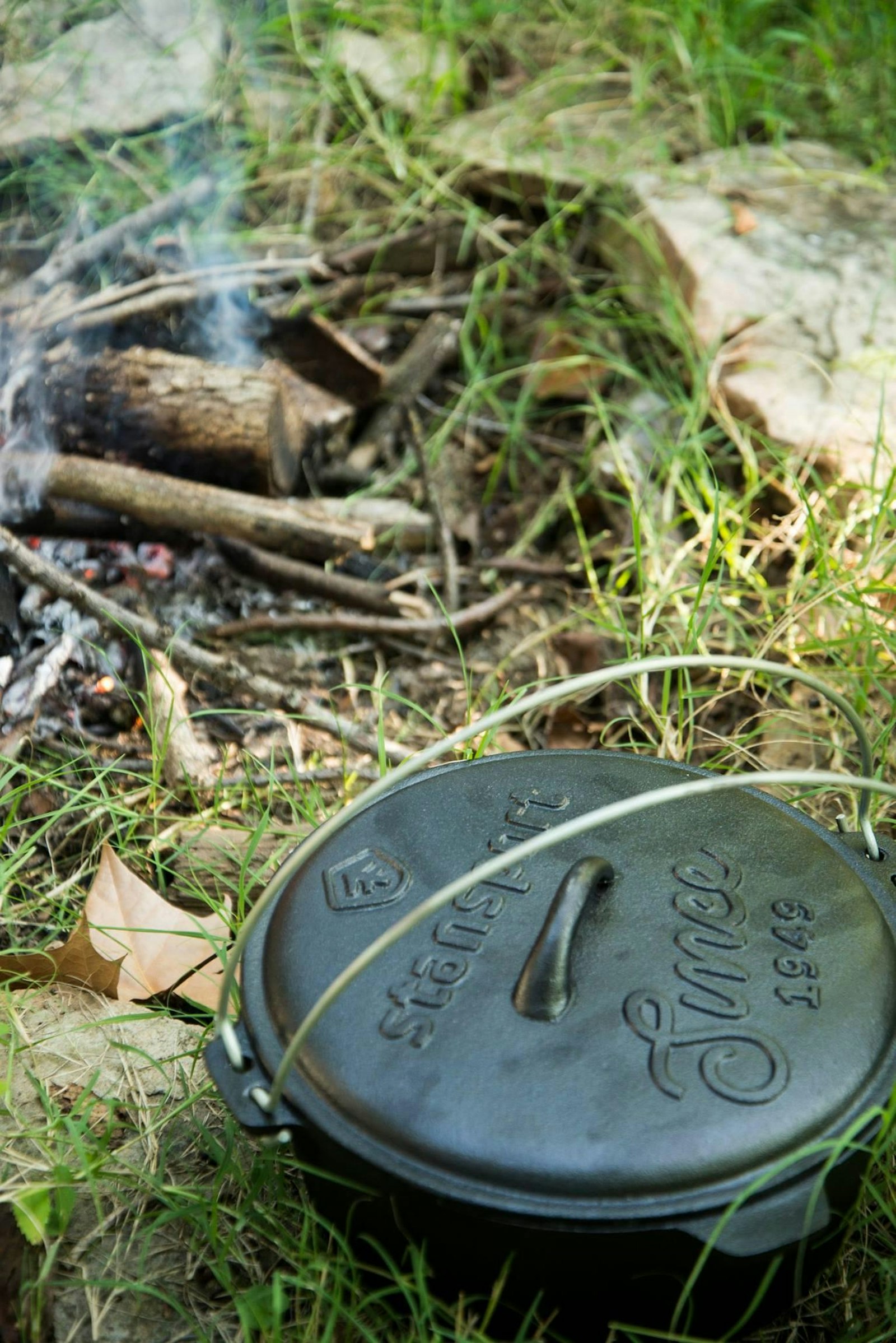
Capsule’s updated mark and packaging layout clearly transmitted the approachable nature that Stansport has carefully fostered over the brand’s history.
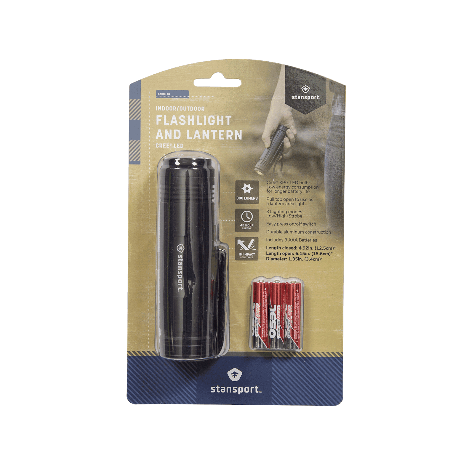
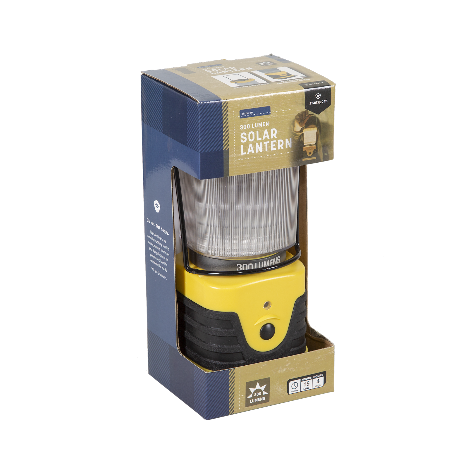
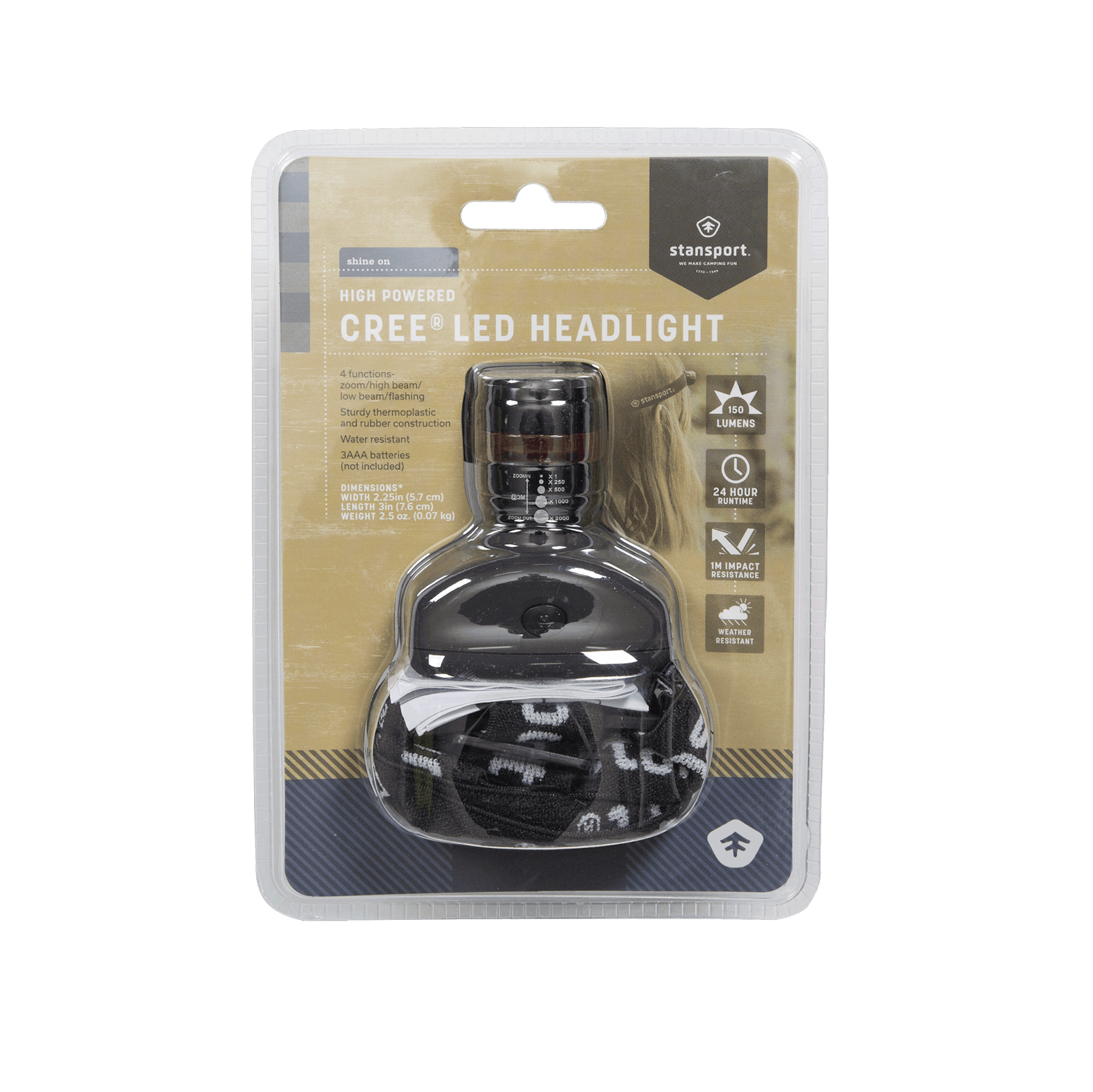
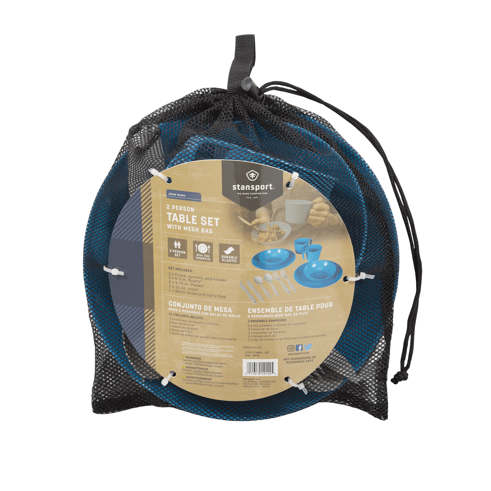
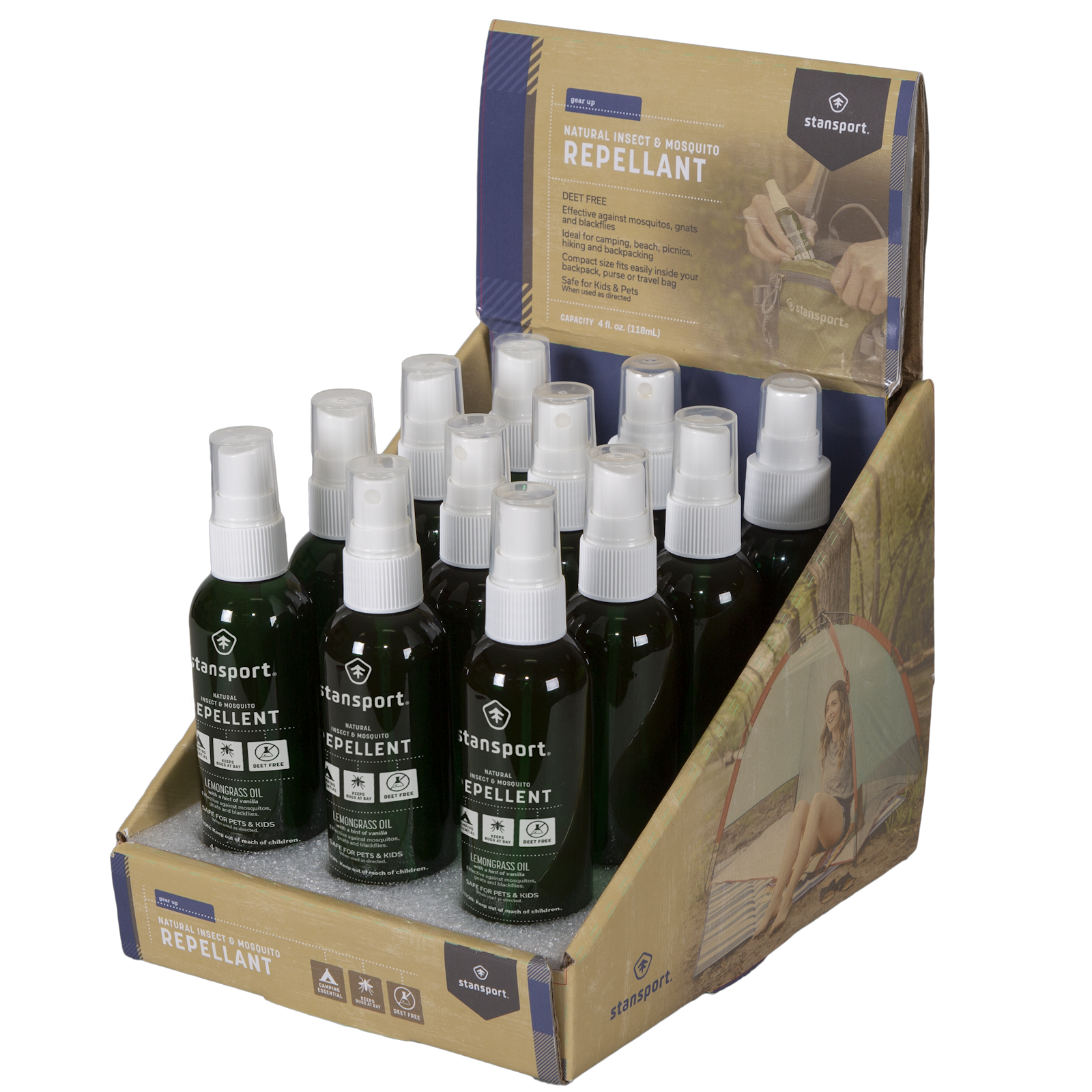
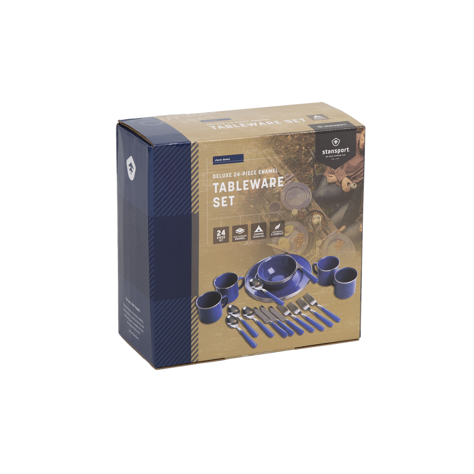
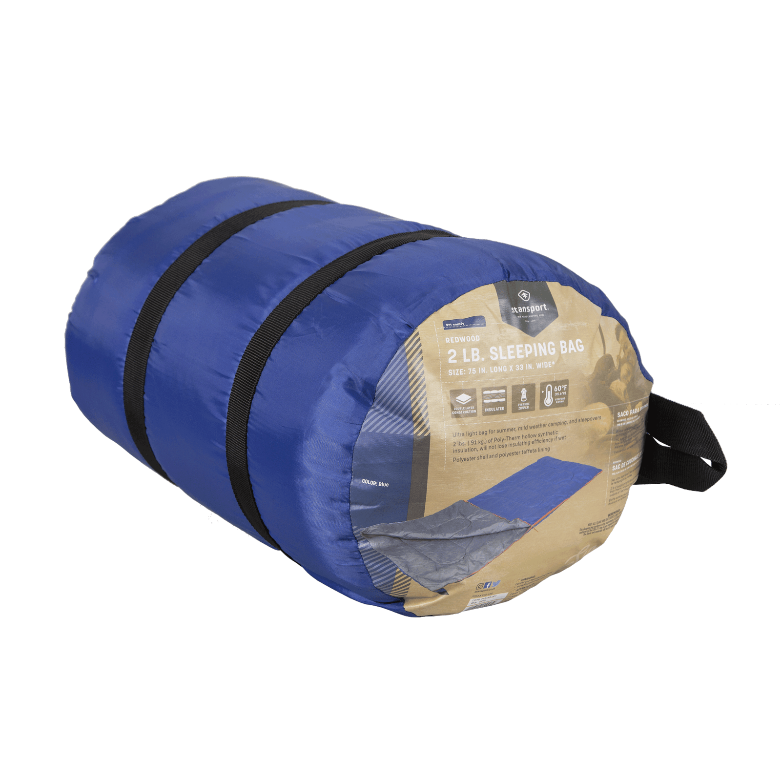
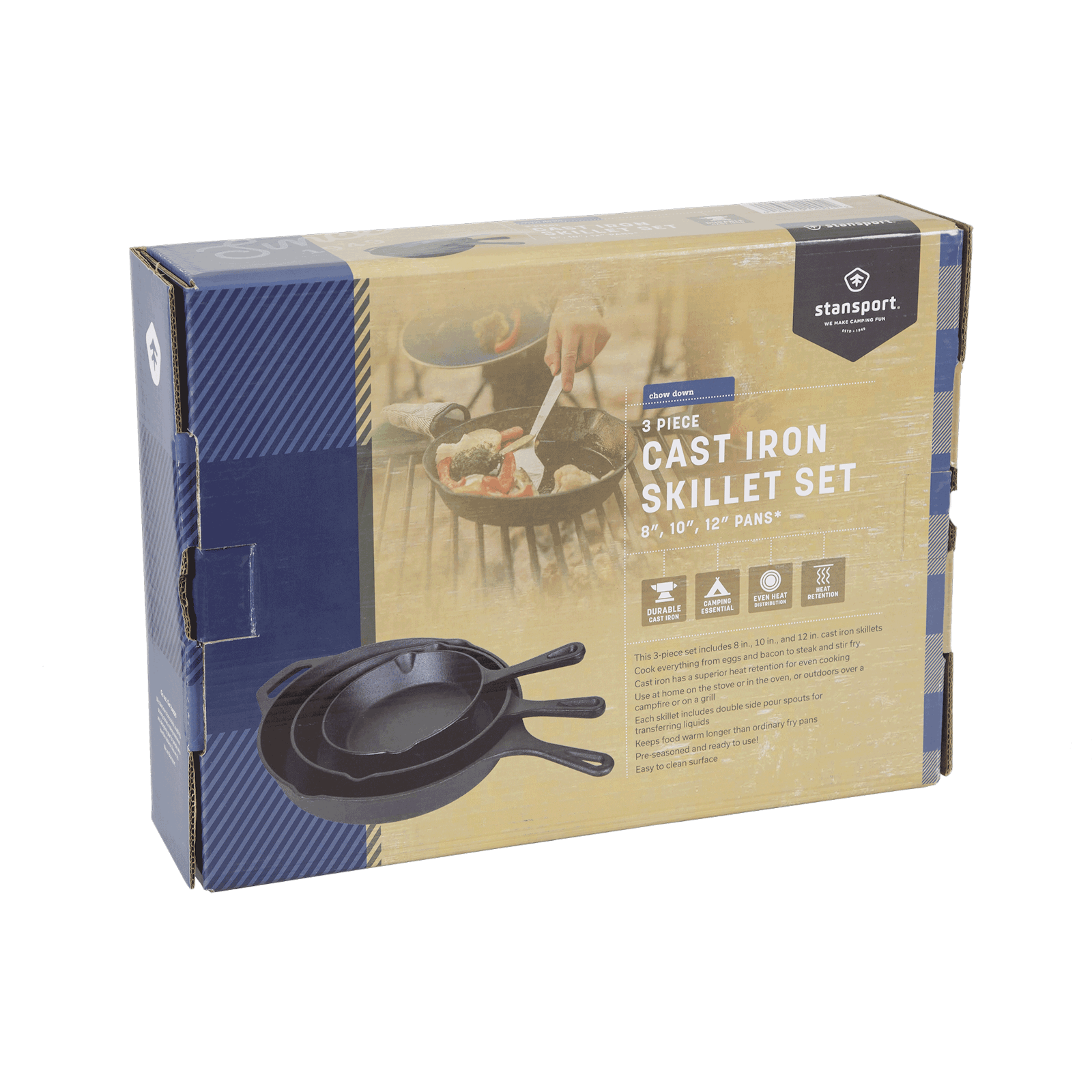
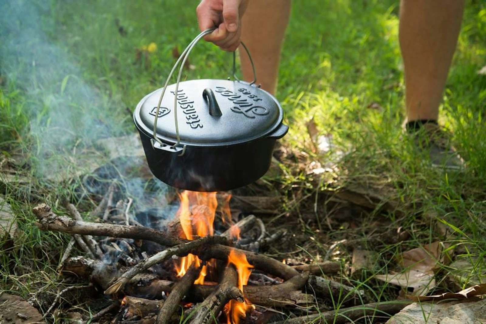
Choosing not to limit audiences to granola eaters or tree huggers, Stansport continues to define itself as a brand that meets consumers wherever they’re at to help get them into unforgettable outdoor experiences.
