Stansport: We Make Camping Fun
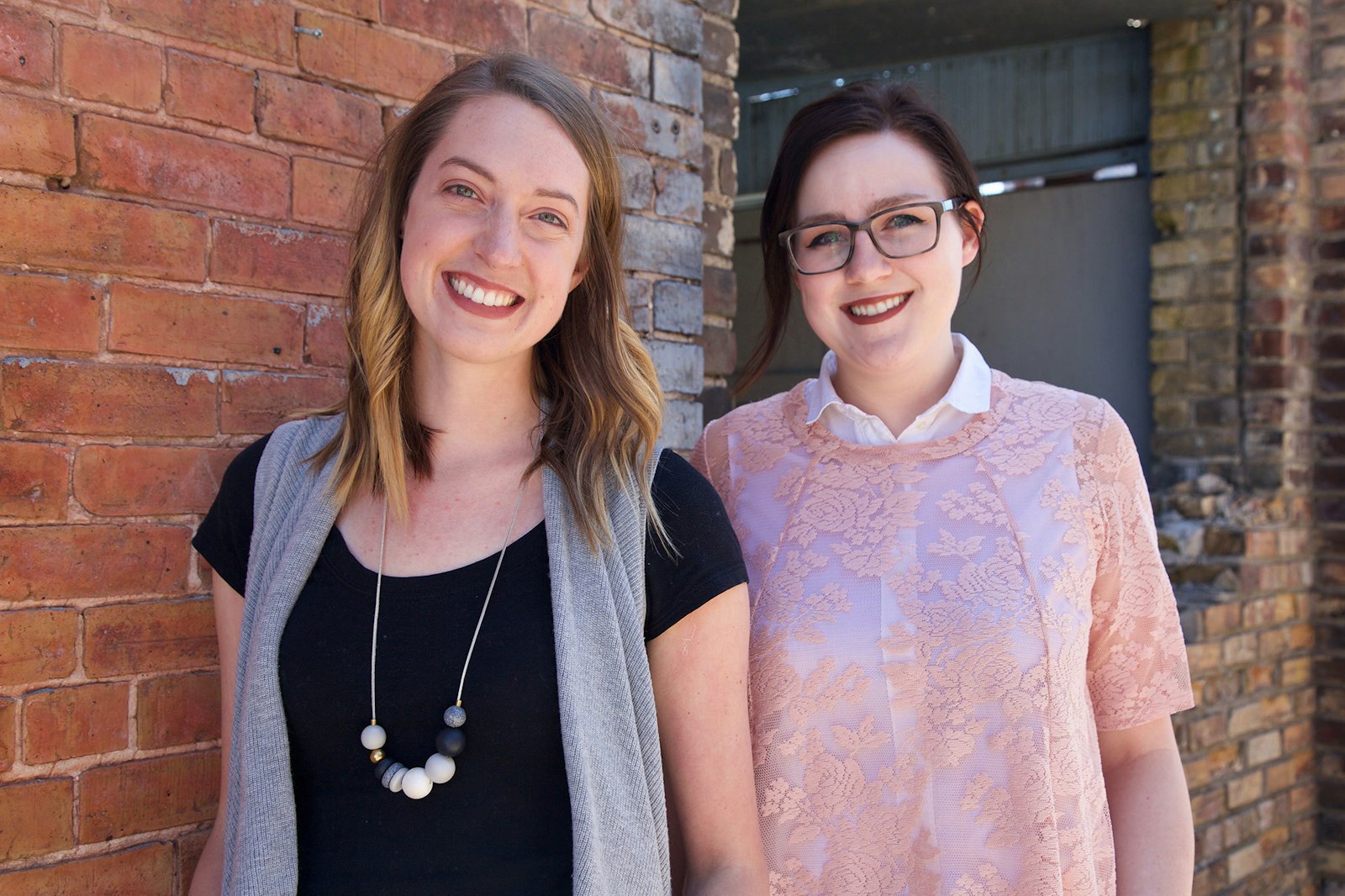
Gather around the campfire and learn about the rebranding of one of our favorite, fun-loving camping brands, Stansport. We sat down with designers, Beth Sicheneder and Kayla Petrich to get the low-down on the project.
Gather around the campfire and learn about the rebranding of one of our favorite, fun-loving camping brands, Stansport. We sat down with designers, Beth Sicheneder and Kayla Petrich to get the low-down on the project.

1. So Beth and Kayla, would you consider yourselves outdoorsy people?
BS: Yes! I grew up camping with my family all over the midwest, and get outside every weekend I can when the weather is nice. But you certainly don't need to be an outdoorsy designer to design for the outdoors. Although it certainly doesn’t hurt!
KP: I grew up going to the cabin and spending plenty of time playing outside, but I wouldn’t say I’m “outdoorsy”. I’ve only gone camping once or twice – but I’m definitely open to venturing out more, I’m actually hoping to visit the Boundary Waters this summer.
2. What problem was Stansport trying to solve when they originally came to Capsule, how did you resolve it?
KP: Stansport has a long history of providing quality, yet affordable camping gear for the everyday camper, but they were having trouble expanding into certain retailers. They believed their current brand was holding them back, and they came to Capsule looking to tell a more engaging story about who they are with a new mark and packaging system.
3. Walk us through the design process for this particular project. Where did you start?
KP: This project started with a shipment of camping gear from Stansport – we had a lot of fun digging through their huge assortment of products and getting a sense of how our work would have to hit so many touch points. From there our conversations with the Stansport team made it clear that they were all about making camping fun and catering to the casual camper, especially families.
BS: We also extensively researched the plethora of camping brands out there. A lot of outdoorsy brands push to look more premium and technical, but for Stansport this just wasn’t the right feel. It was clear from the start that they were focused on family, fun and getting everyone outside exploring, no matter their age, interest or fitness level.
4. Beth, what inspired you to create the mark?
BS: Stansport’s mark was inspired by the “everyday outdoors”. Instead of featuring mountain peaks or cliff faces, we wanted to tap into a symbol that everyone could relate to. A tree is not only a symbol of the outdoors, but also a metaphor of shelter and growth. A good fit for Stansport since they equip people with the shelter and supplies they need to get out and try new things! The finished mark also has the look of a badge or a patch much like the ones sewn on to scouts vests. We wanted the new logo to be worn like a badge of pride & accomplishment by those who used their products.
![]()
![]()
5. Kayla, you were the brainchild of Stansport's new packaging system design. What were your considerations and constraints while designing for this industry?
KP: There are a lot of companies in the outdoor space, with more being added all the time. By focusing on family, fun and the more casual nature of Stansport, we were able to create a brand that immediately told their story, while distancing them from a lot of the more technical or intense brands that tend to populate the outdoor industry.

6. What were the biggest challenges you encountered on this project?
KP: Stansport has over 150 products, which vary wildly in size and use. My biggest challenge was creating a packaging system that flexed to this range of needs; from simple products, like a small utensil set, to larger ones with a lot of technical information and unique benefits, such as a propane stove.
BS: Creating something original in an already crowded industry is always a challenge. In the end we just had to stay true to the spirit of who Stansport is and let that lend itself to authentic solutions.

7. What were you most proud of in this project?
KP: Not only did we create the mark and packaging, but we also produced a set of packaging guidelines so the internal team at Stansport could successfully step out all 150+ packages. The guideline was very in-depth and required us to think through how the design would apply to every possible package. The process took a lot of time and attention to detail, so sending the final guide over to the client was a rewarding moment.
BS I was proud to see our work applied in the real world and used by real campers and families. My favorite application and heaviest take away was a cast-iron dutch oven with the new logo cast onto the lid!


Want to learn more about this awesome brand and the work we've done with Stansport? Check out our case study here.


