Skio
Len Walter approached Capsule with an invention he was designing to help seniors pick and sort medication. His name for the product was "Pill Pick-up" and he needed a package fast. With some guidance, we helped Len and his team step back and start with a protectable name and then design the identity, package and experience of using the product.
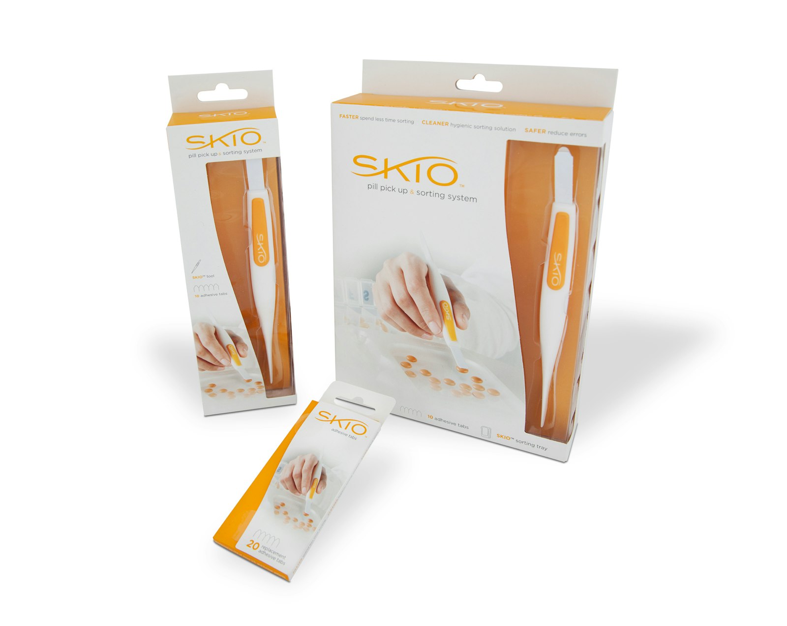
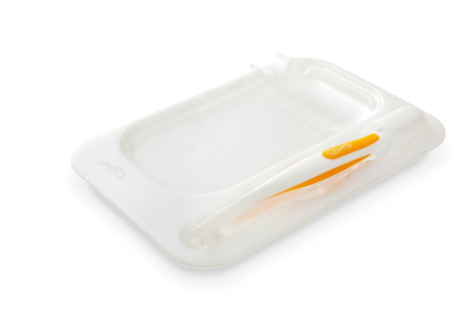
The identity, packaging and color palette needed to look simple, and easy to enhance what the product does for users. The motion of the “K” mimics the motion of pill sorting and object shape.
Testimonial
"We came to Capsule with nothing but a product in hand. The Capsule team immediately embraced our concept and thoughtfully took us through the branding process to final packaging design. I'm convinced that no other firm could have accomplished what they did. I have nothing but the highest regard for Capsule's innovative process, work ethic and understanding of market dynamics. One look at Capsule's finished product for SKIO says it all." — Len Walter, Founder and Inventor of Skio
Skio had to come to market looking trust-worthy and educational (to understand the invention and product). To do this, the packaging that potential customers interacted with had to be visible and almost feel as though they could touch it or pick it up. The imagery had to do the heavy lifting for the education aspect – picking up pills, sorting and placing into a weekly dispenser.