Minnesota Thunder
Overshadowed by its fellow professional teams, the Minnesota Thunder lived a quiet life in the Twin Cities – until they came under new ownership from across the pond. A place where football reigns, a pigskin could be an ingredient for haggis, and the word “soccer” is a sin. Minnesota had a soccer team, but it wanted a football club. Capsule was charged with the creation of a new team logo and identity system to signify the steps they were taking to become a team recognized amongst the sport leaders.
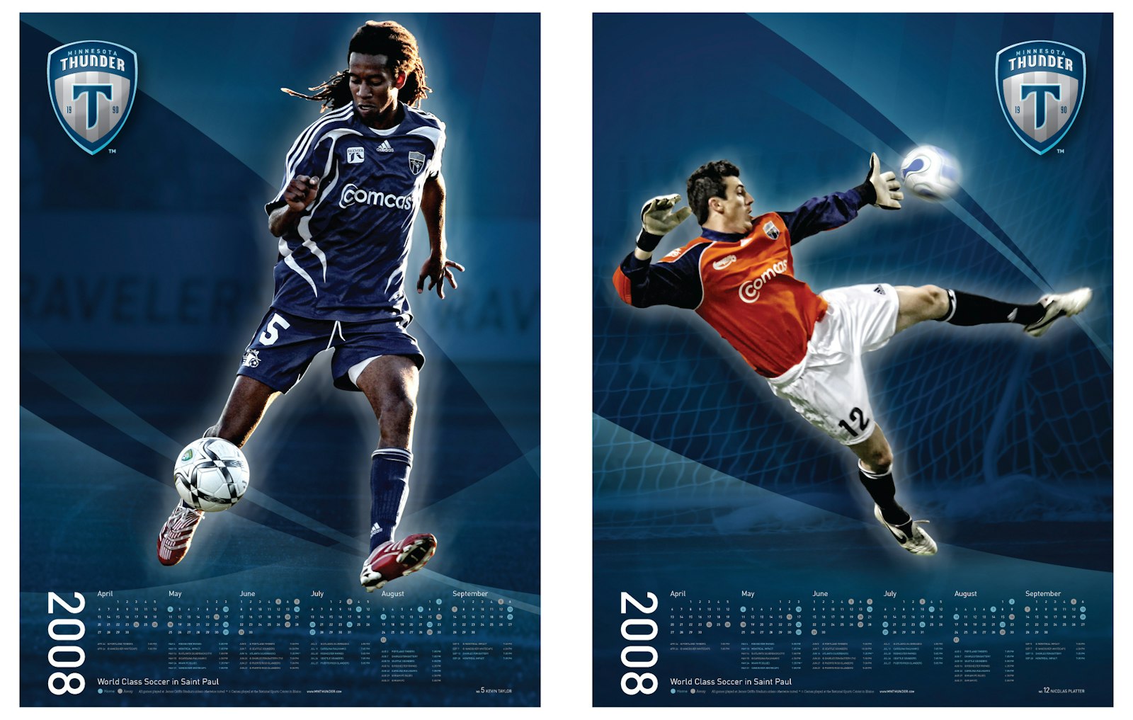
Once Capsule located where the new logo was to lie within the spectrum, the design team went to work. The colors were updated to a more mature palette of various shades of blue, leaving the bright yellow behind.
The new logo took the shape of a traditional European shield that framed a “T” which was designed to resemble the Thunder God Thor’s hammer while maintaining the letter’s true form. Vertical stripes in the background add depth and act as a visual cue to the shades of a thunderstorm.
The final design successfully intertwines European aesthetics with America’s modern taste and love affair with their mascots.
Testimonial
“We are really pleased with the new identity Capsule developed. We wanted to include our eighteen-year-old history and combine soccer’s traditional roots with a modern, sleek feel.” — Manny Lagos, President, Minnesota Thunder
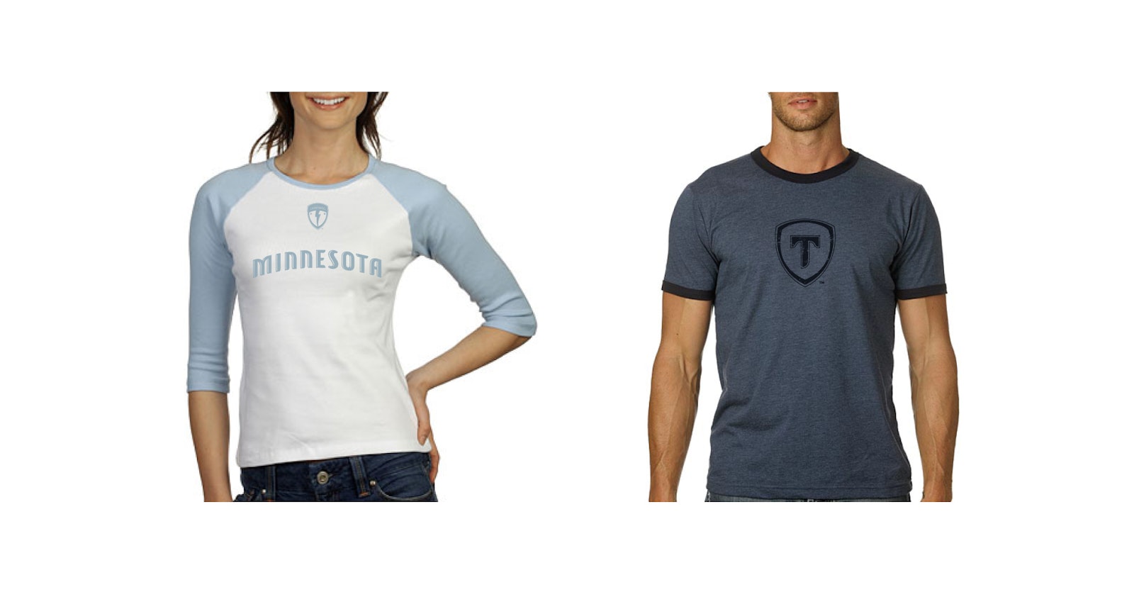
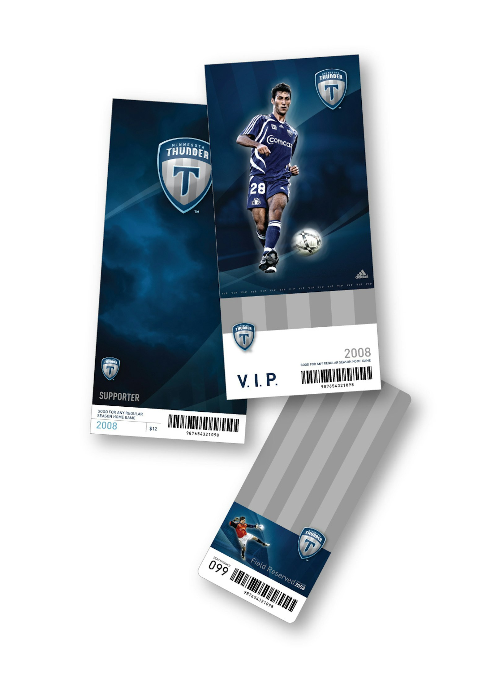
Capsule carried over the new color palette and elements from the logo to all of the Thunder’s communication and marketing materials, from t-shirts to website and the managements’ business cards. All aspects of the Minnesota Thunder create a cohesive look.