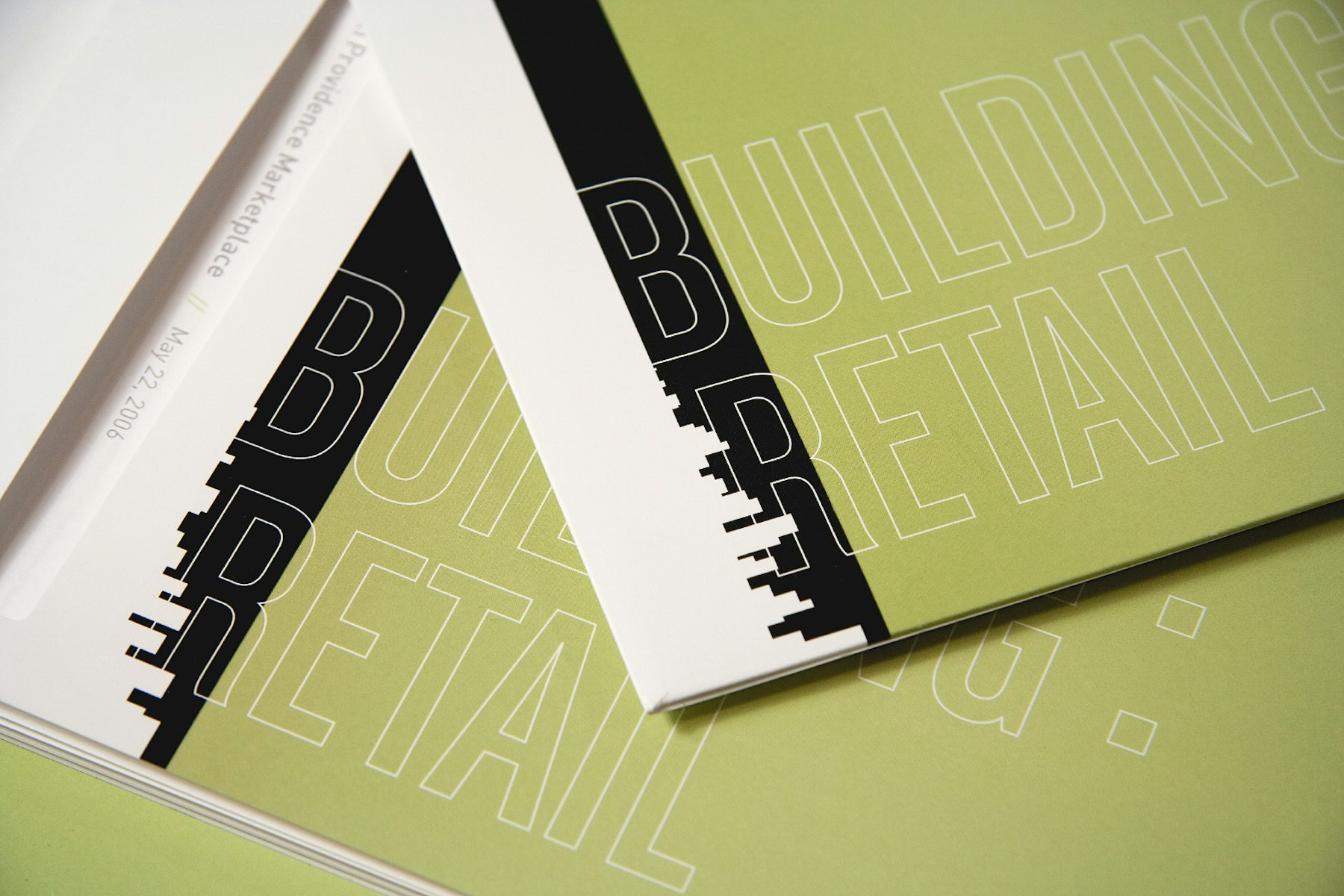
The resulting rebrand did not affect the logo, yet made a dramatic change to the place that Edens & Avant occupied in the retail development world. The solution was conceptual, intriguing and confident; vastly differentiating E&A from competitors who consistently use a common and uninspiring visual language.
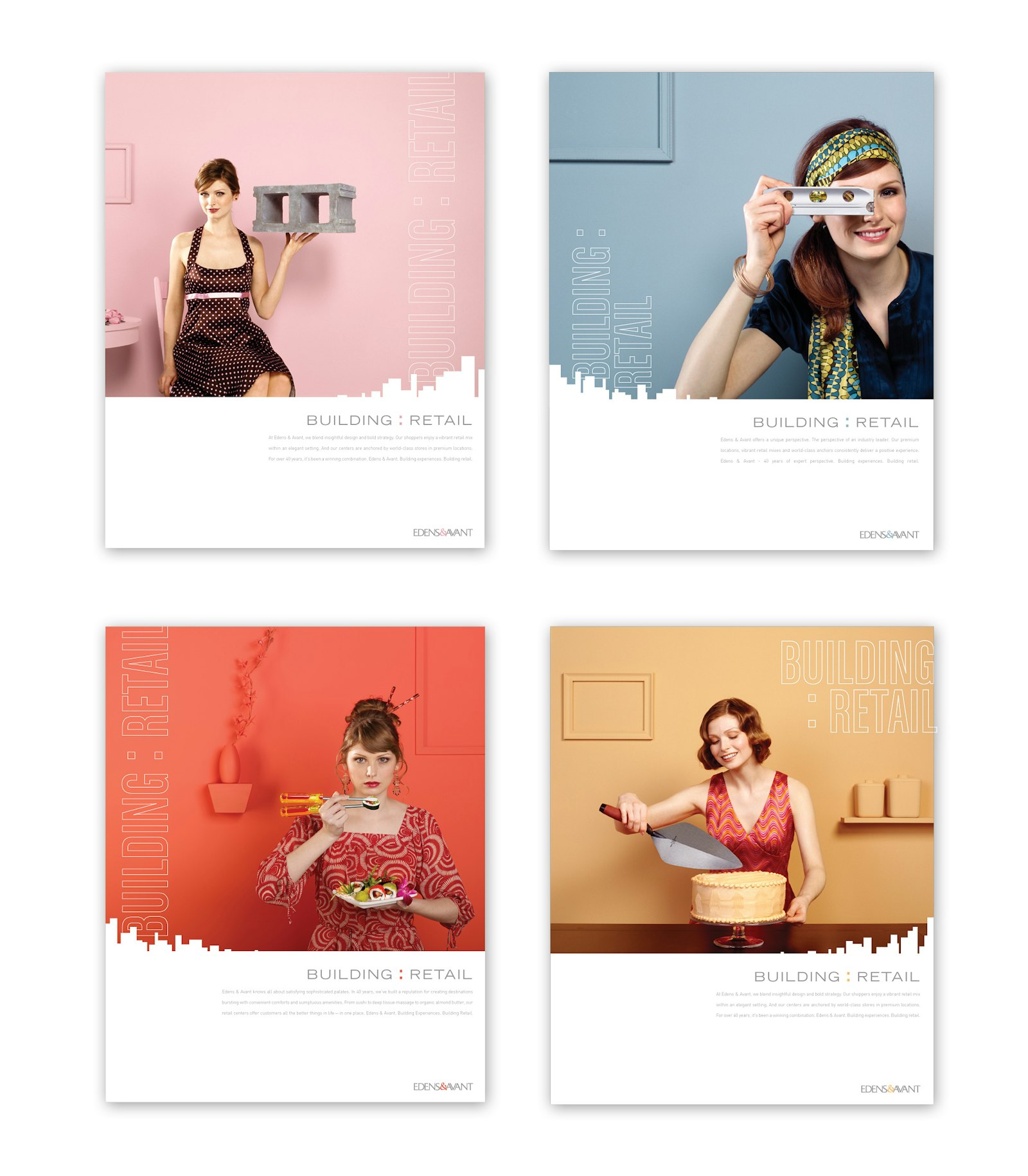
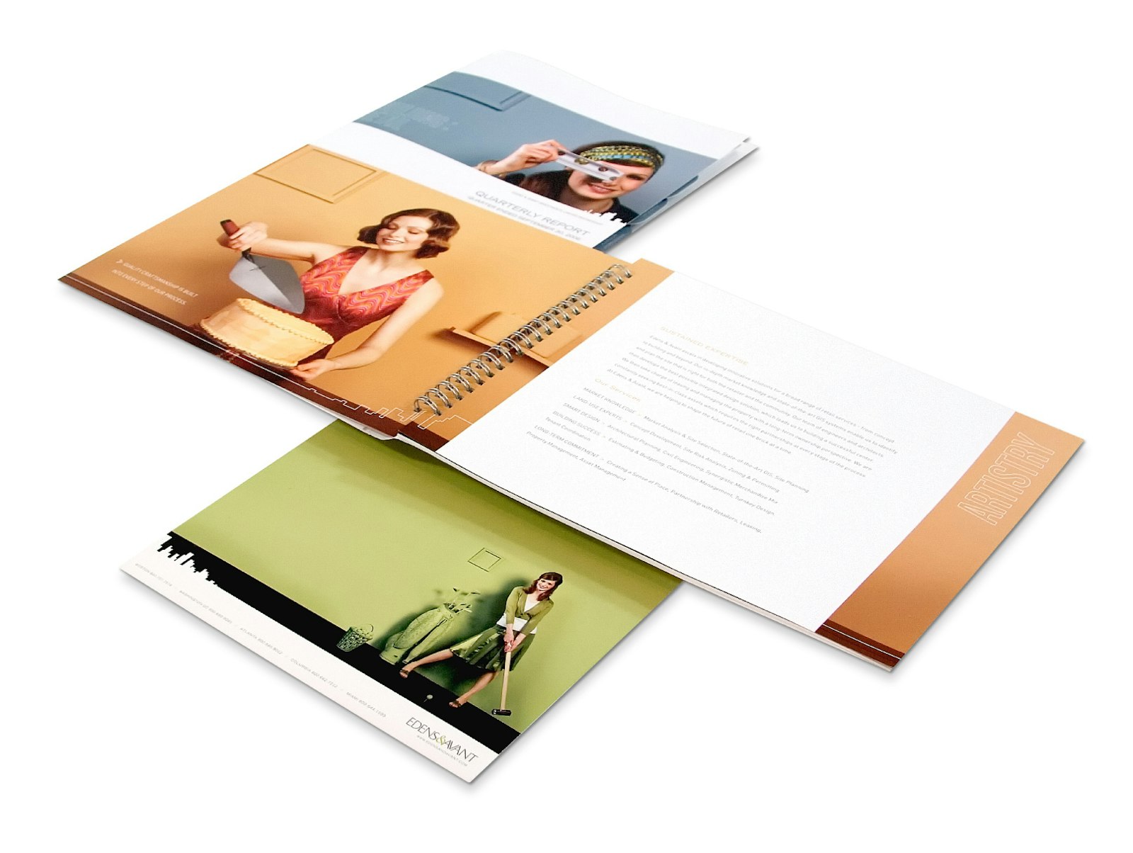
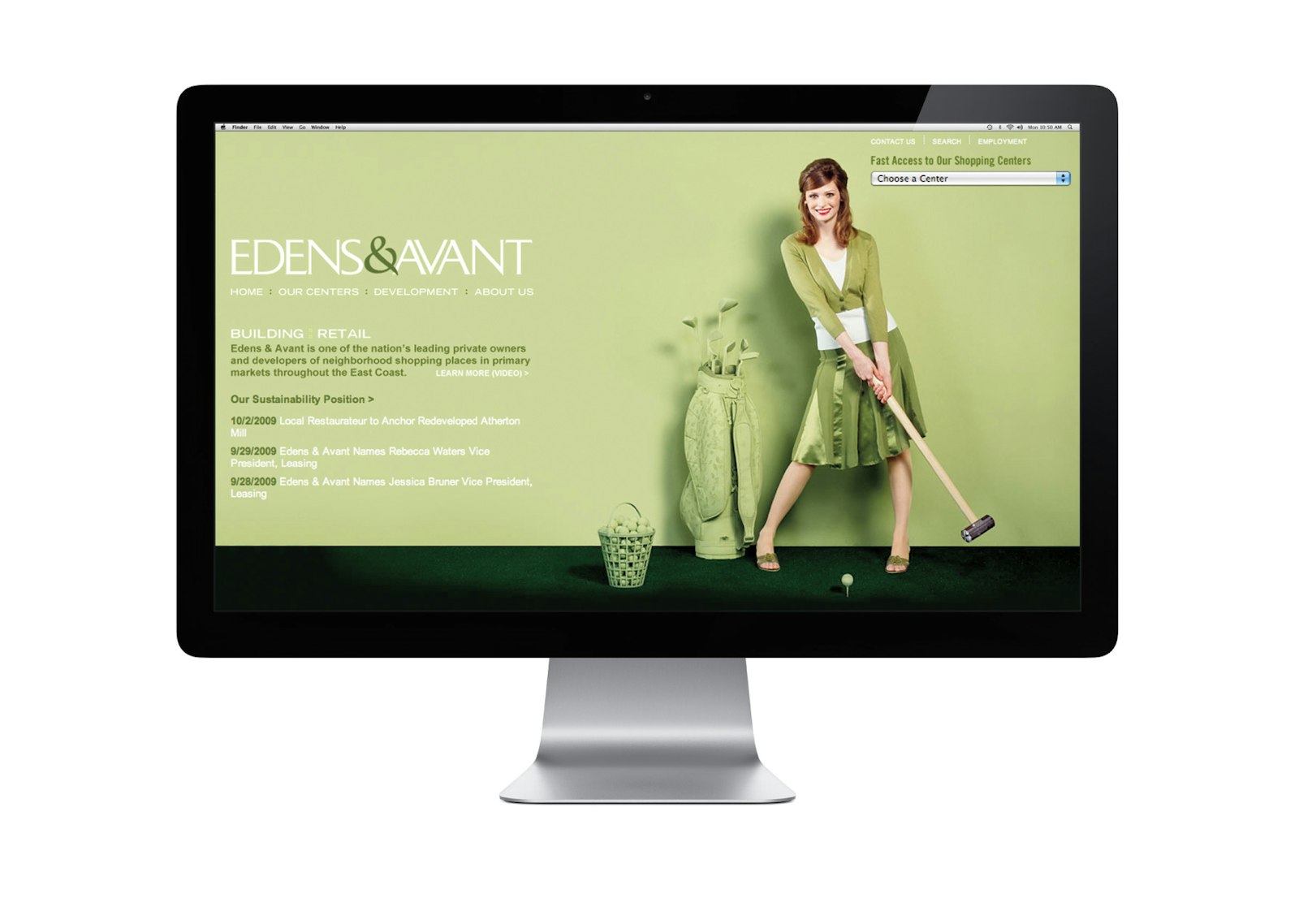
The elements of the system included a contemporary color palette, graphical elements alluding to the urban landscape and a monochromatic photography style with a wink. The written language focused on balancing a relationship between building and retail.
Testimonial
“Working with Capsule has been a joy – just a joy. Everything from their attention to design details to the photography art direction to the copywriting – just a joy.” — Tracy Jones VP Marketing Edens & Avant
The result included a hard financial impact on the contribution communication efforts made in the business. And, the softer impact was in projecting confidence in who they were and how they were different.