Hope for the best, Design for the worst

The road to brand hell is paved with good intentions.
When you’re in the business of creating, it’s best to recognize just how grave a responsibility it is. Designers of anything, be it words, images, experiences or buildings, recognize that even ideas filled to the brim with good will and meaning will flop if hypotheticals aren't asked and unknowns left unconsidered.
Even when your design has the most altruistic-y of altruistic causes you must evaluate how so called improvements or features can go haywire. Creators must be careful to consider every potential bump in the road before they’ve even pulled out of the driveway. Sure you can build and launch a state of the art facial recognition system to protect your city, but if you hadn’t considered the possibility that human bias could be passed back and forth from organic matter to neural network, you might be sunk. And it’s better to be sunk in the safety of harbor than out at sea.
We’re not even going to mention Juicero.
It’s not enough to bring life to a creation using just color theory and the golden ratio as guides. Looking good isn't enough. You need to factor Murphy’s Law into every step of the process. This is a critically important, yet often overlooked, tenet of design thinking. If it ain’t broke, don’t fix it, but if you see any potential of it breaking on down the way, fix it early.
In our little North Loop office, we’re all too aware, whatever can go wrong will.
When we design products or packaging we’re on par with the most fretful of mothers in considering what could go awry. This includes considerations around pilferage, wear and tear, product recognition and readability. We think about sustainability and what the materials we use mean for our planet. We think about dazzling consumers with their first use while also meticulously planning around making product reuse just as exciting and easy. In our recent foray into the world of chocolate we’ve even had to consider melting in relation to our design. We deliberate on functionality, affordability, sustainability and aesthetic in equal measure, making sure the proper balance is held between these factors while also ruminating about prospective pitfalls and misinterpretations throughout the entire process.
But this obviously, goes beyond product and packaging design.
It’s astounding how many brands pen heartfelt, feel good messaging that has not a single iota of congruence to their personality or history. Or worse, spread mission-oriented sermons on problems they as a brand have clearly contributed to or caused. All just to have something nice to say. Pardon the pontification, but if you haven’t considered who your brand is and what it stands for before writing a message, step away from the keyboard. Think of the ways this message could be misconstrued. Think about what customers take away if they only read the first sentence and not the whole paragraph. Think of how your message changes if it’s translated into another language. Think about the implications of where your message shows up.
Obviously, visual design is not immune to the ravages of Murphy’s Law. Issues of appropriation, bad taste and context are all common dragons in need of slaying when creating something visual. In any instance of visual design there is one foundational law of nature that endures like a cockroach in a nuclear apocalypse. If you create something that looks even vaguely inappropriate, human beings will find it. They will laugh at it. And they will share it on the internet. This, of course, goes for logos as well. My editor won't let me share a link to a collection of said logos (something about “our firm having been founded with a classier sense of humor”) but if you do a cursory Google search I’m confident you’ll find it.
Okay fine, my editor never reads these anyways. Here.
Even the best of designers need sounding boards or some system of checks and balances in order to hold multiple perspectives and view their design in a different light. As a creative in any field, it is your responsibility to seek out challenging and dissenting views as well as being the person who gives them. To be clear, I’m not telling you to indiscriminately throw grenades at every dream and idea you come into contact with, no one likes a Debbie Downer. While it’s important to carefully examine and be vocal when you foresee conflict, the best design thinking uses rationality, not demagoguery.
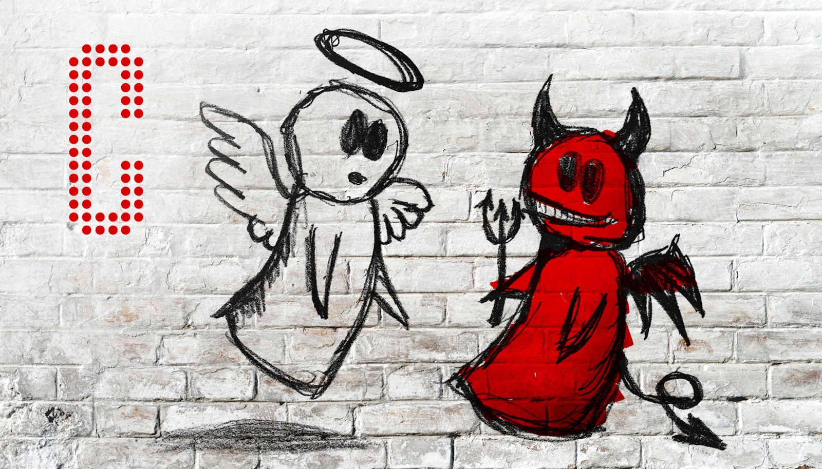
When the abstract and avant-garde are familiar friends in your day-to-day work, it's a unique challenge to put yourself behind someone else’s irises and consider different perspectives on your design. Mundane or outrageous, these perspectives need to be carefully weighed in order to achieve the proper balance of form and function. While valuable, the angel of good intentions on your right shoulder only gets you so far. You need to utilize that nay-saying, scrutinizing devil on your left shoulder in order to discover the weak spots.
As they say, the devil is in the details.


