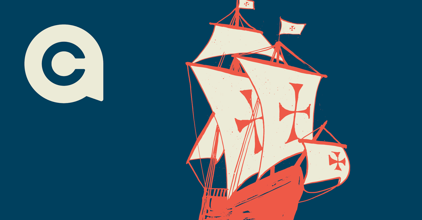
Could Christopher Columbus navigate your packaging?
Helping shoppers chart an easier course in the navigation of your packaging experience.
Landmarks are valuable. They help us find exactly what it is we’re looking for.
When it comes to branding and design, there’s a distinct advantage to knowing what “landmarks”, whether in the form of visual triggers, messages, contextual cues or other stimuli, will transfigure a shopper into a buyer. Yet, because their informational appetites are constantly changing, most brands don’t know how a shopper consumes the map of information on their packaging. Having a consistent brand language helps convey confidence and makes it easier for a loyal customer to find you again.
So, when do you leave the Old World for the New? When is it time to finally update your packaging? “Right before the sales start to drop like an anchor” is probably the best answer, but this occurrence can be a swift shift in the winds that can be hard to spot, and even harder to adjust course in when happening.
There exists a gap in navigational knowledge, further expanded by the pandemic, between how a shopper consumes a package and what a brand leader knows. This gap exists because the shopping experience is constantly changing in a highly competitive, multi-channel environment for brands and their packages. Many brands only change their package design once they’ve experienced a multi-year doldrum and have tried everything else. This stability benefits the consumer and brand owner, until something new comes along, representing the conflict between stability and flexibility in a package system design.
Here’s an old story of something new coming along.
We, as a young team in 2000 were given the opportunity to look at liquid dairy, and specifically, how people bought milk. Our research revealed common patterns, like having a farm scene on most packages and color coding for skim, one percent, two percent and whole milk. These had become navigational tools for shoppers and common visual language for brand owners. The category was a commodity, but more importantly, the behaviors had become commoditized.
The team at Schroeder Milk was compelled to make a dramatic change with the introduction of new packaging. The intention was to bring loyalty to a category where it was rare to find anyone requesting a specific brand of milk. The design used a nugget from our research, if you’re a skim consumer, a 1 or 2 percent mistake at the shelf was very annoying. And, the reverse was equally true.
Navigation between options was essential and yet got very little emphasis on the packaging design. The new clean, simple, elegant design was tested and consumers believed it was healthier, cleaner and generally better milk. The package reflected the product inside and improved the experience for the shopper.
This is a great example where sales and distribution go up when navigation is fixed and Columbus reaches the new world (well, new to him and his sailors). There are too many stories of brands sailing off the edge of the world because their loyalists were left adrift.
If you’re wondering what could be done to improve sales of your product, look to the package design, some constructs may be old and broken. And, reach out for some perspective, we spend a lot of time in the aisle.


