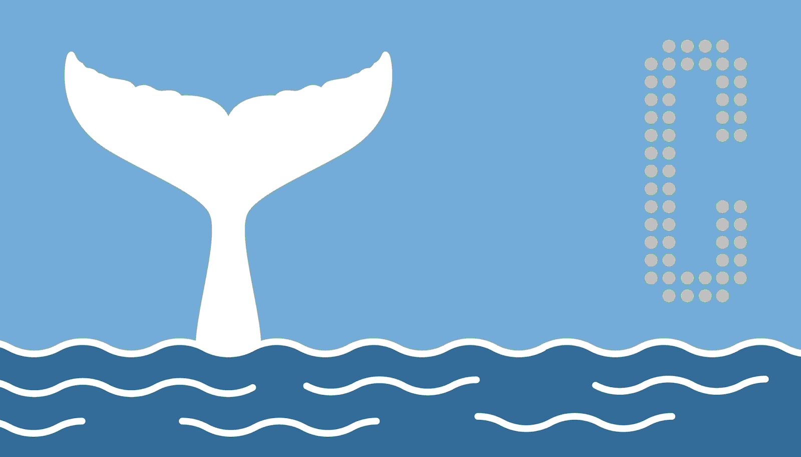
A Whale of a Metaphor
How symbols sink or swim.
One of the greatest allegorical works of all time, Moby Dick, was released 168 years ago.
And I still haven’t read it.
No spoilers. I don’t want anyone telling me that the whale was dead the whole time.
Despite being a tad behind on my 19th century classics, I do feel that I’ve picked up on some of the main themes from Herman Melville’s defining body of work.
Well, I’ve at least picked up on a theme that you apparently have the right to assign whatever meaning you like to the titular white whale. Despite being based off of a real life whale named Mocha Dick (not kidding), people have been giving their own meaning to the big fish for well over a century. And despite a handful of the more literal readers out there, Moby Dick has become more symbol than whale.
Say what you will about loose analogies, but that white whale is a symbol that still holds a huge amount of meaning to countless individuals across the globe.
As someone who works daily with symbols in the context of brands, I often wonder what makes them last. Many symbols have fallen defunct in the last 168 years and I’m curious how this one, in the form of a monstrous mammal, has lasted for nearly two centuries. What would Vineyard Vines need to do in order to have any chance of matching that kind of iconic longevity?
As I ruminate on what makes symbols last (and if anyone still names their kid Ishmael) a few considerations come to mind on what can capitalize or capsize a symbol:
1. Overuse Fatigue - Moby Dick is 168 years old. Add a 3 to the end of that and you get the number of exclamation marks (!) Herman Melville used in his epic tale of Man vs. Whale. 1,683. Say what you will about the exclamation point or whether it was overused in this context, but the fact is, just like human beings (and whales probably) symbols can get worn down over time when they're used too much. Consider label fatigue. When symbols, be they in the form of word or icon, are displayed over and over and over again on any and everything you see, your brain becomes very adept at taking the easy route in navigating messages and filtering out the banal. When overused, symbols become as muted and unremarkable as the many billboards you drive by on your daily commute.
2. All Words & No Deeds - Just like meaning can be diluted with overuse of a symbol, a symbol can be drained or emptied of its meaning through inaction or misrepresentation. None of the many metaphors assigned to Moby Dick would work without at least some realistic grounding or provable aspect to show why that metaphor was drawn. In short, if your claims have no "blubber", your brand will flounder. Some amount of action or tangible attribute is needed to back a symbol up. Take product greenwashing as an example. When iconography or certain certification phrases are used without any tangible tie to the claims they make, the symbol loses integrity and gradually begins to be ignored. Perhaps you’ve wondered if "Fair Trade" is actually fair, I certainly have.
3. Flexible Context - The big white whale can represent so many different things to so many different readers. God, fear, the sea, nature, fate, evil, fishing… Okay, maybe the last one isn’t a huge stretch, but Moby Dick has proven itself to be a symbol that can stand for almost anything under the sun if you try hard enough. I think that’s part of what’s made this particular symbol able to hold its own for so long. When a brand allows you to attach your meaning to a symbol (dare I say even makes you work a little to do so), the impact is not only more emotional, it’s more memorable. When Nike promotes its mission of inspiring every athlete in the world, it’s careful to add a noticeable asterisk to the word athlete. Attached to that asterisk? A stipulation that “If you have a body, you’re an athlete.” When Nike lets its consumers assign their own meaning to the word athlete instead of rigidly defining the word through a handful of specified sports or activities, consumers are able to more accessibly form emotional connections to the symbolism of the brand.
There are many considerations to make when trying to build a symbol that can swim instead of sinking - with the three above just being a sample. Symbols take energy to build and fill with meaning, and must be carefully groomed and maintained to ensure they aren’t too inclusive or exclusive. If you put in the time, they can last long past what you thought would be a natural life. This is what Moby Dick has taught me.
I wonder how much I would’ve learned if I’d actually read the book.


