Thrivent Financial
Thrivent Financial For Lutherans approached Capsule in 2012 with a large initiative. The not-for-profit organization was opening their coverage to a broader Christian member base and dropping the “for Lutherans” from their name. The need for Thrivent to work with Capsule? We were hired to help them identify this new position in the marketplace. They needed a partner to explore their potential and help ease them into this change by removing a great deal of unknown and uncertainty.
Testimonial
“Capsule’s thoughtful approach and caring consultation helped us through a significant brand transition. The team was smart and sophisticated in their methodology, and their expertise helped us navigate all elements including research, strategy, design and execution. We are very happy and proud of the results.” — Susan M Zima Director, Brand and Creative Services
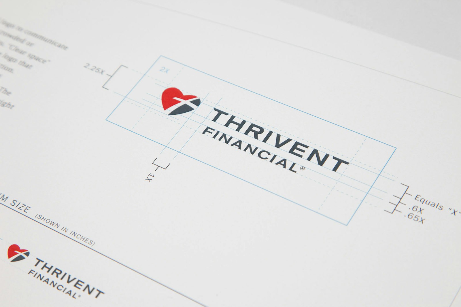
the logo
The new logo includes a heart, which represents caring and generosity. The cross symbolizes faith, and the path-like arc of the cross represents a journey through life toward financial security, connecting faith and finances for good.
Our process included extensive interviews with executive leadership, marketing staff, members, field representatives and clients along with review of years of existing primary research. With this background information and insight, we began ideation around messaging and a refreshed mark and tagline. The initial design concepts were shared with executive leadership and tested nationally in participatory focus groups.