THE Solution
Excitement within the ophthalmology industry made it imperative that the brand experience was working just as hard as the device was, starting with naming the device, all the way through to the brand’s digital experience. Holding the keys to unlocking better outcomes for those with glaucoma using unique, innovative (and microscopic) technology, MicroOptx required a full go-to-market rebrand to help launch their revolutionary product.

NEW BRAND, NEW VISION
The tiny device needed a strong name that instilled trust and peace of mind for patients and practitioners. Using insights and strategy laid out in the Foundations process, Capsule and MicroOptx landed on Beacon, a pillar of safety, hope and optimism in the midst of a dark situation. Bright outlooks were further communicated in the Beacon and MicroOptx brand story, through a logo and messaging strategy. Both were able to give the brand an authentic, credible and hopeful voice, and a personality with a little more wit than your run of the mill medical device company.
SEEING DOUBLE
Capsule then redesigned its parent brand, MicroOptx, with an updated mark, visual system and brand guidelines that worked cohesively next to the new Beacon brand across all mediums.


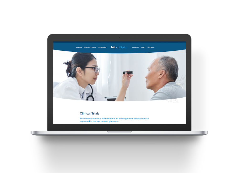
A WEBSITE FOR SORE EYES
To create a more user-friendly experience for the Microoptx team and its audiences, Capsule rebuilt the Microoptx website, transferring the brand to an entirely new CMS and designing a website that transformed it from twinkles in the eye into stunning digital experiences. The new site features brand and product messaging, with a focus on putting revolutionary science and product craftsmanship in terms that were more readily understandable and trusted for practitioners and patients.
Testimonial
“We engaged Capsule for a full-on brand development and execution exercise, including a new website. I was immediately impressed with their ability to work creatively in a high tech, highly regulated environment. The collaboration between Capsule’s creative team and our scientists was next level. My expectations in terms of both value and quality of work were far exceeded – I look forward to working with Capsule again.” — Chris Pulling, CEO, MicroOptx
The Result
MicroOptx and Beacon are a perfect vision of a successful brand hierarchy solution, showcasing consistency between brands and accessible visual and written language that clearly conveys a complex piece of technology to multiple key audiences. But, don’t take our word for it, see it for yourself.