Gulf Pacific Rice
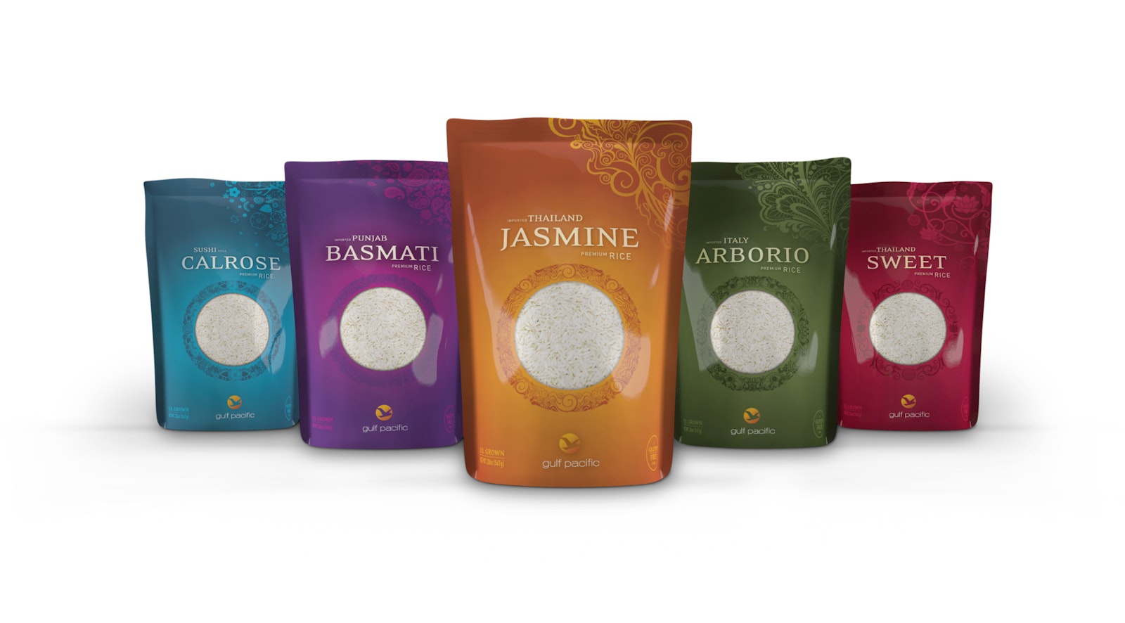
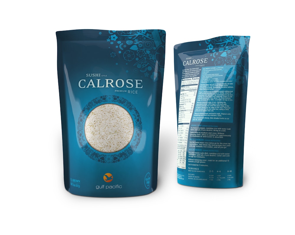
Rice has become a commodity product. Gulf Pacific Rice wanted packaging that gives this essential food the credit it deserved. Our illustrator took inspiration from the myriad of cultures that rely on rice and a staple part of the diet, creating beautiful artwork unlike anything else you’ll see in the rice section of the grocery store. The jewel-toned color palette is also highly unique to the category.

Capsule’s design directive was to consider the heritage of the brand while moving it forward into our current century with a sophisticated design aesthetic. The color palette was chosen in concert with the illustration styles to set the rice apart from the heritage brands in the rice category.

Testimonial
"What I like about Capsule's approach is the time they spend understanding the company, the personalities, the product or service and the underlying business first before lasering in on a name and mark. The end result is holistic and appropriate." — Peter Reis, Marketing Director at Gulf Pacific Rice Co
As part of this design effort, the Gulf Pacific logo was updated and elements of the package were influenced by the new logo shape and colors. The varieties, Calrose, Basmati, Jasmine, Arborio and Sweet Rice were given enough distinction from the other varieties, but also had design elements that tied the concepts together. The result on the shelf is not just a “billboard effect,” but a beautiful, engaging display for the Gulf Pacific brand.

The final package is bundled and ready to be printed, filled and stocked on a shelf near you. Capsule is proud of scenarios where we have clients who return to our team for additional work because of the results they achieved on previous projects. Gulf Pacific is a great example of design delivering results.