Byerly’s
Byerly's offers its customers an unparalleled shopping experience with wide carpeted aisles, elegant lighting, an outstanding selection of gourmet and specialty foods and attentive service. Designing and launching a new identity was seen as the ideal method to communicate the investments and improvements being made to this icon of Minnesota retailers.
It all started with Byerly’s defining their brand in robust academic terms. Then, the ethnographic research conducted provided the insight for how the brand strategy was going to manifest itself in the marketplace. Because the most influential touch point in the Byerly’s brand is the store experience, the research took place there. Observation and one-on-one interviews were used by Byerly’s to gather insight into the current brand experience.
Benchmark retailers like Williams-Sonoma, Old Navy, Barnes & Noble and Volkswagon were studied using ethnographic research and analysis methods. The results were used to better visualize how the Byerly’s experience was changing to be more contemporary and relevant to current shoppers. This knowledge became the foundation for creating a new brand identity reflecting where Byerly’s is going instead of where it was.

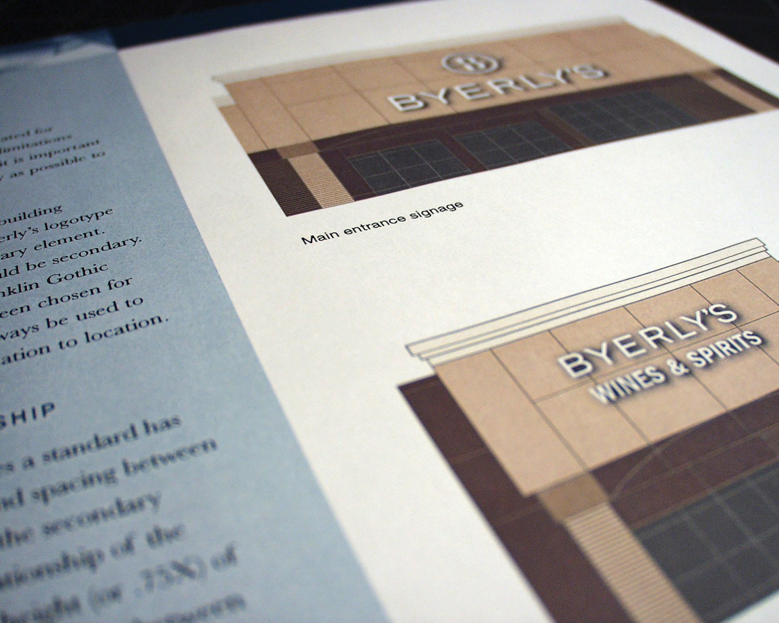
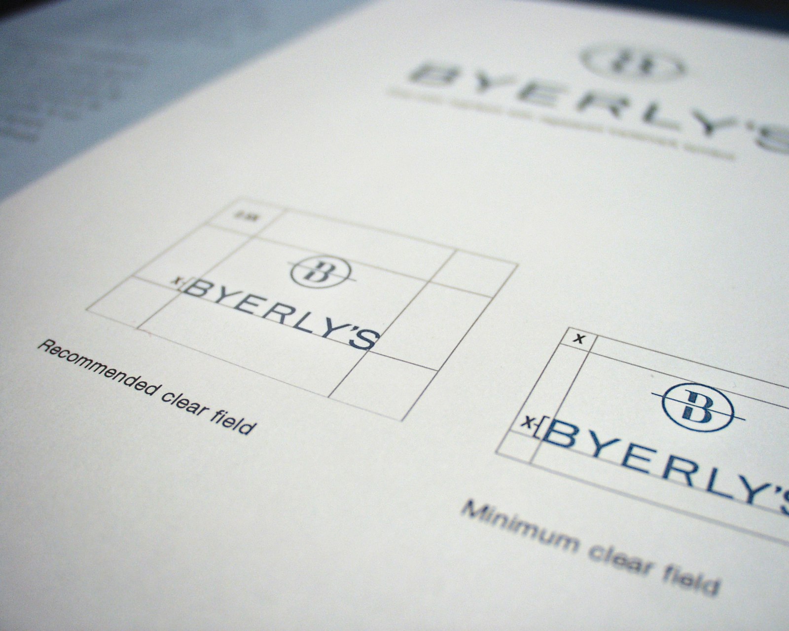
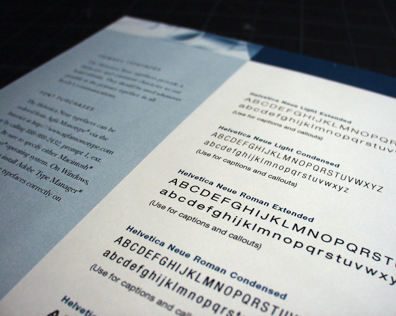
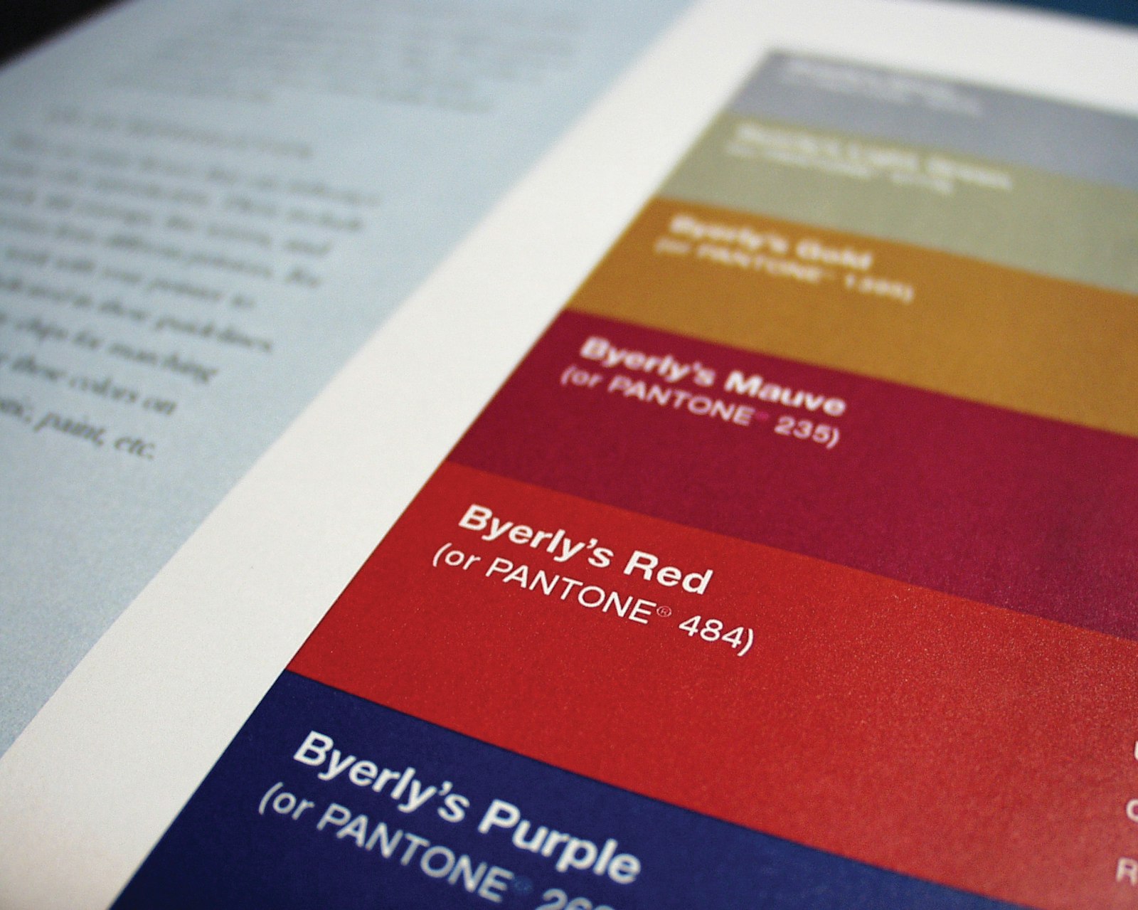
Maintaining the proper presentation of a new identity helps build value in your brand. One way to make sure your brand does not lose equity is to ensure the consistent application of your mark and other elements related to your visual system. The Byerly's guidelines were designed to provide implementation consistency when either internal or external partners created branded material.
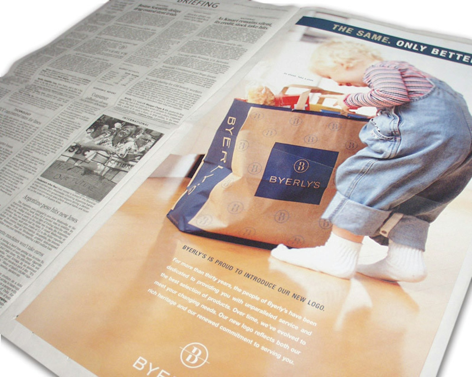
The launch ad was run as an announcement to the community that something had changed inside their local Byerly's. This, in combination with a publicity campaign, brought in new customers and significant financial results store by store.
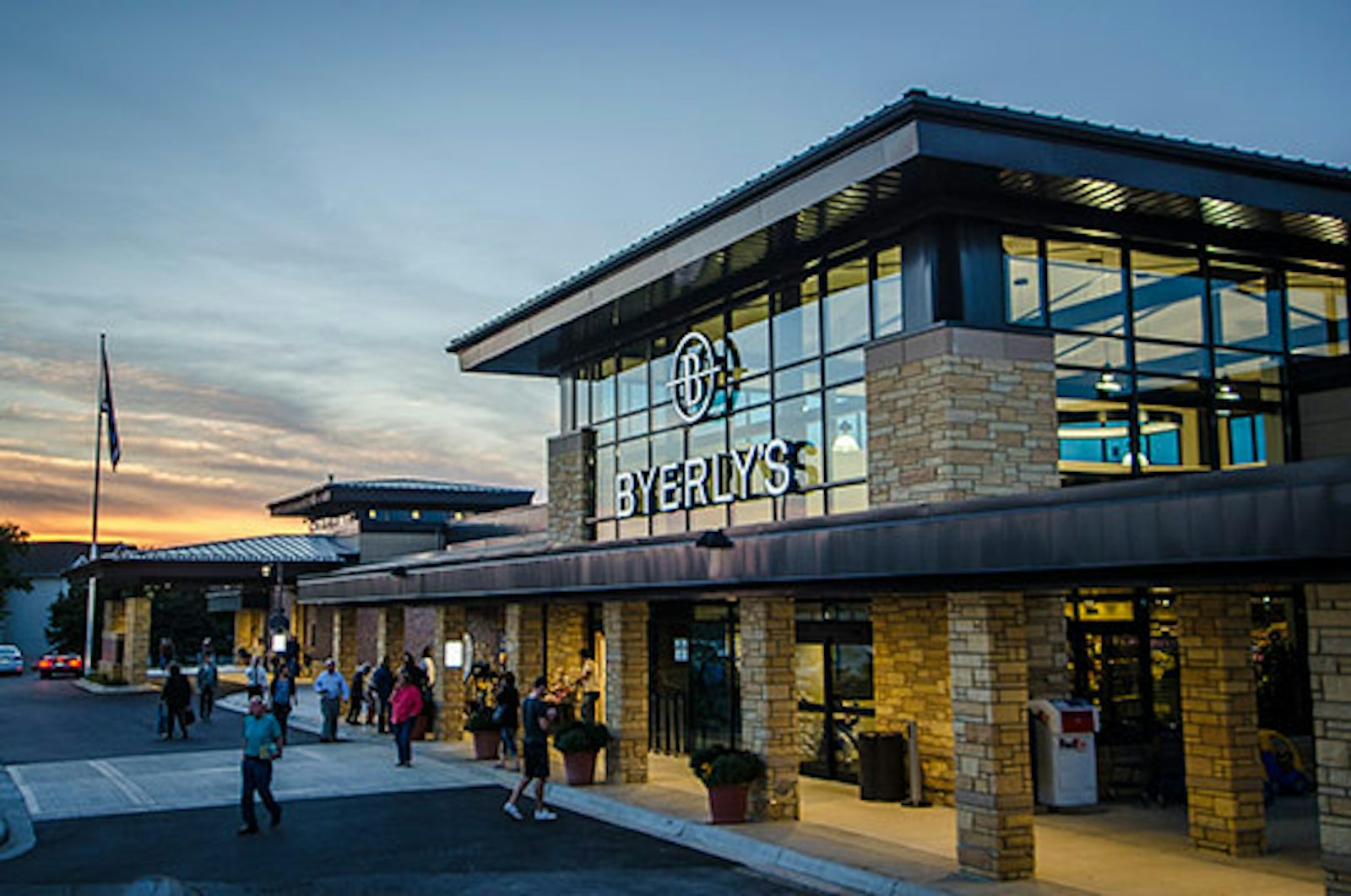
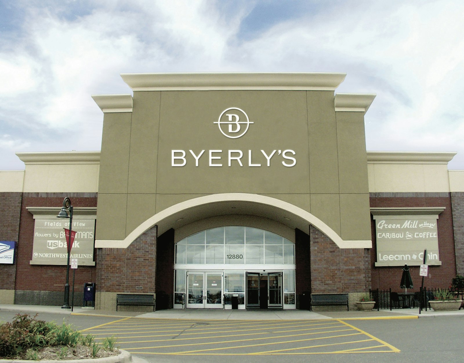
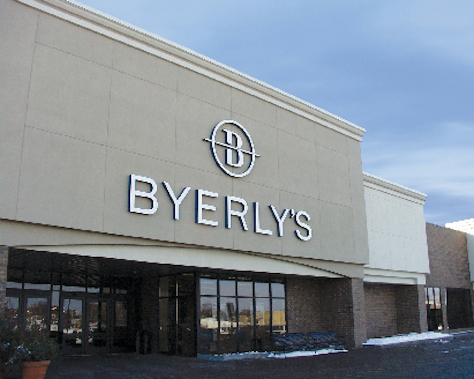
The signage package was designed to cover all the requirements a store would encounter. The results were visible when the light switch flipped on.
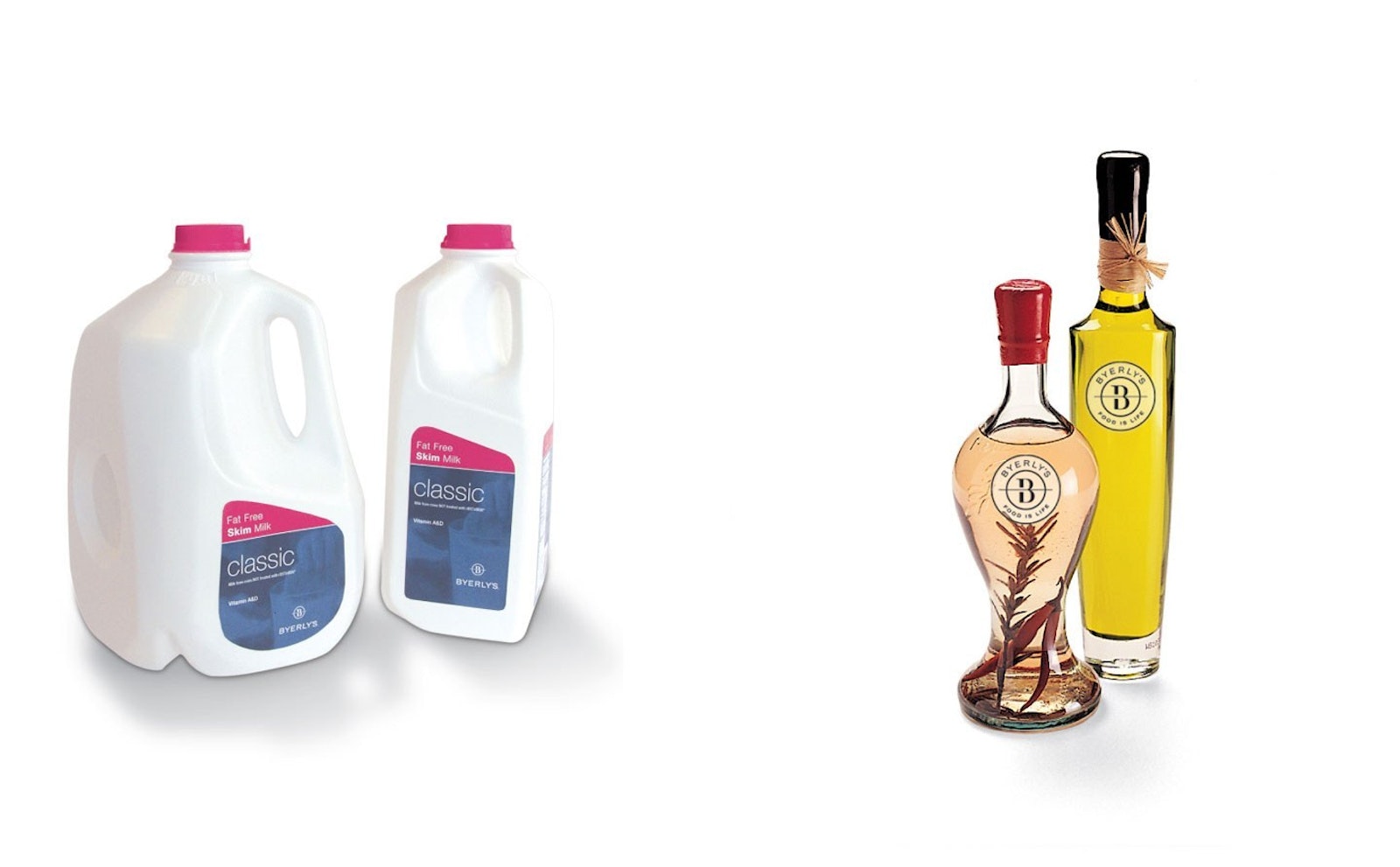
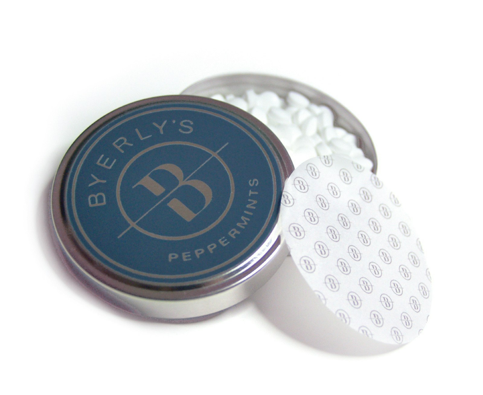
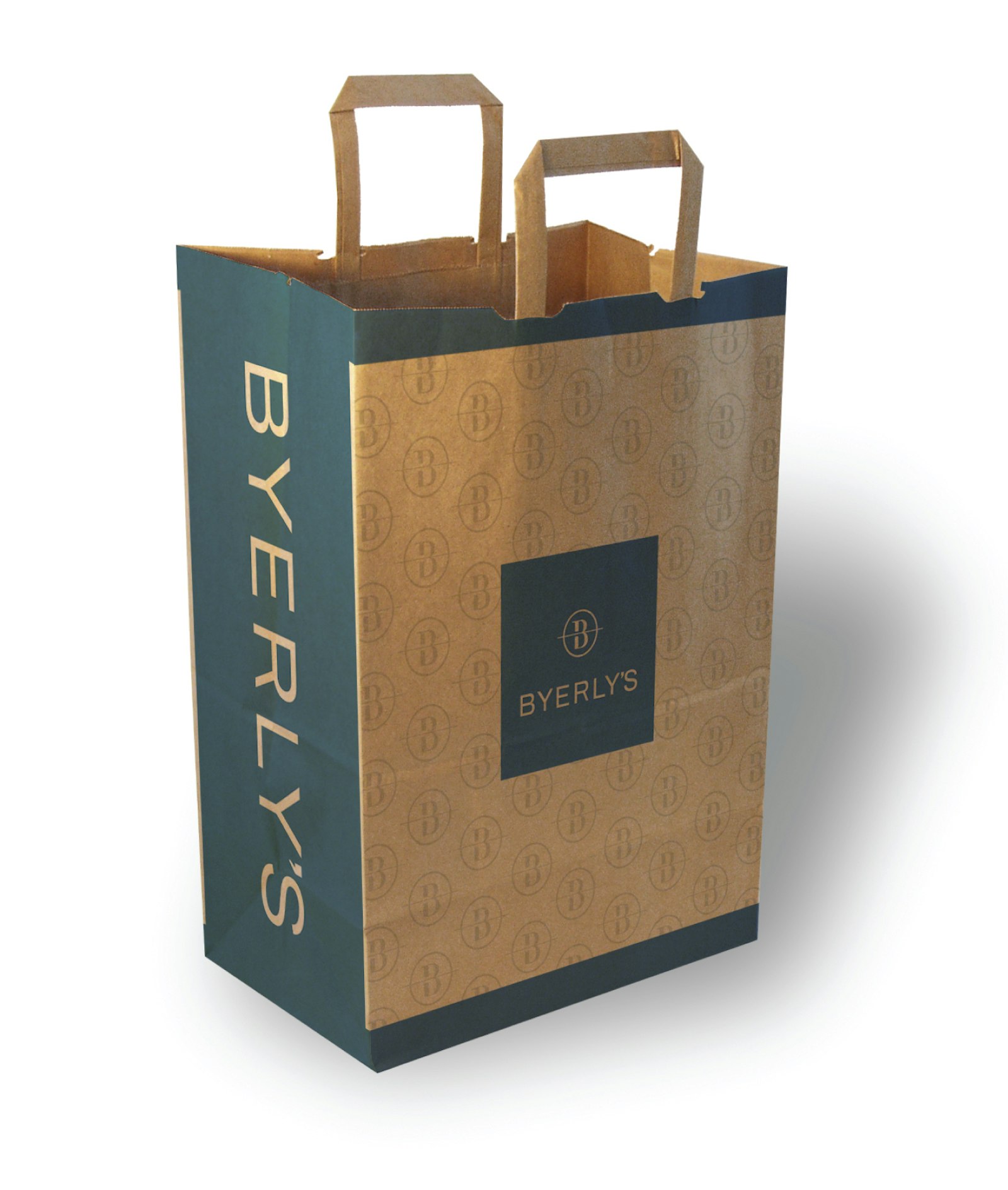
Private label packaging was designed as well as a plan for taking the Byerly's brand out of the "opening price point" positioning in private label.
Testimonial
“Byerly’s may be just a regional grocery chain, but its signature logo and commitment to service have helped the Minnesota retailer become one of that area’s most well-respected brands.” — VM+SD Magazine, Visual Merchandising and Store Design